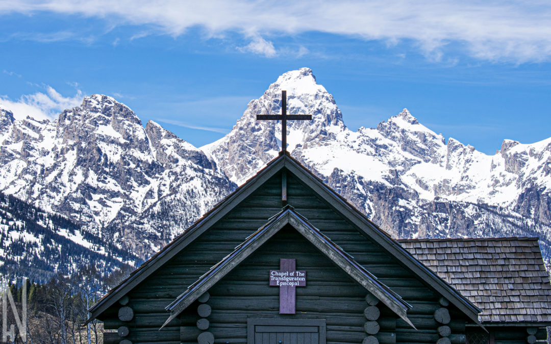
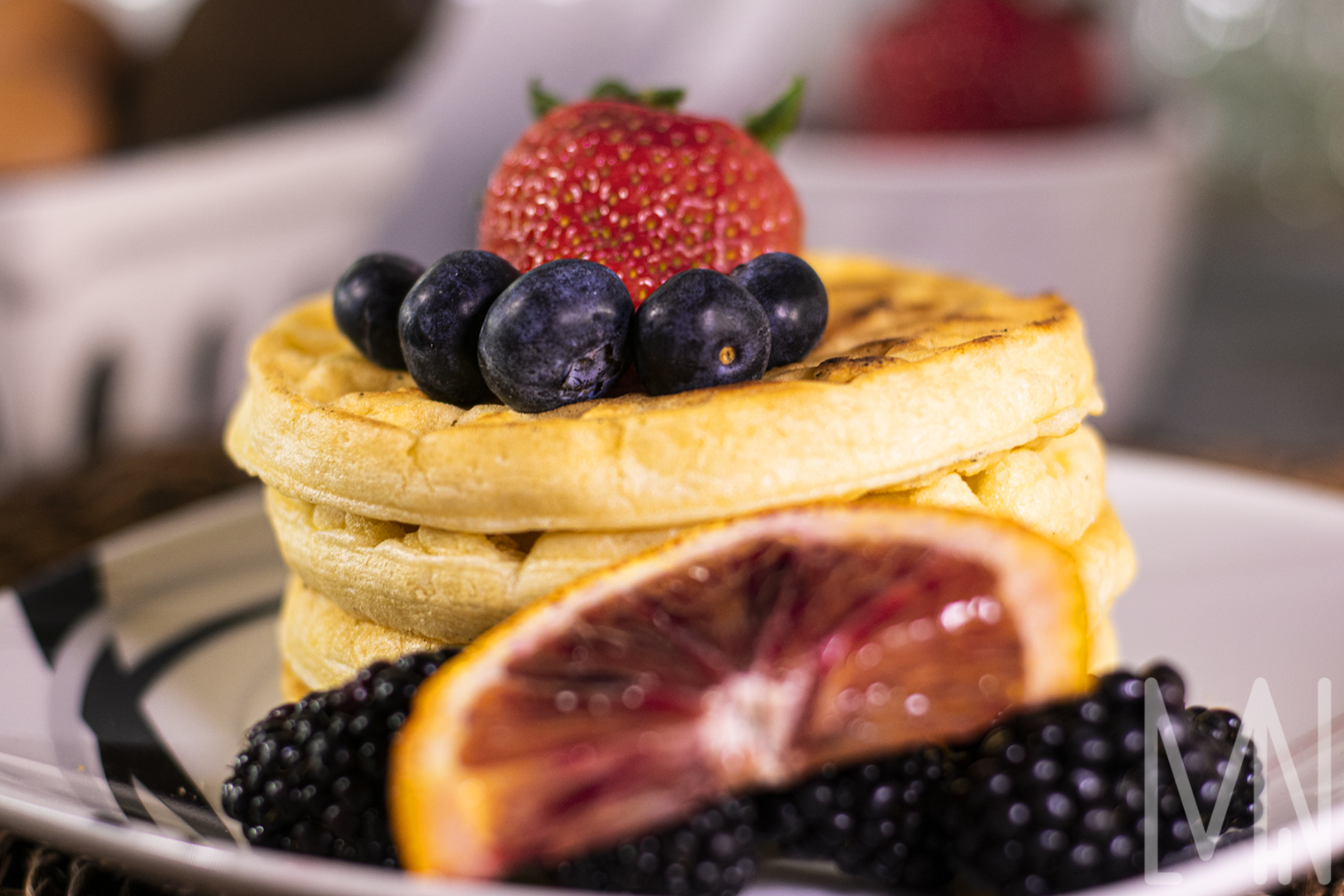
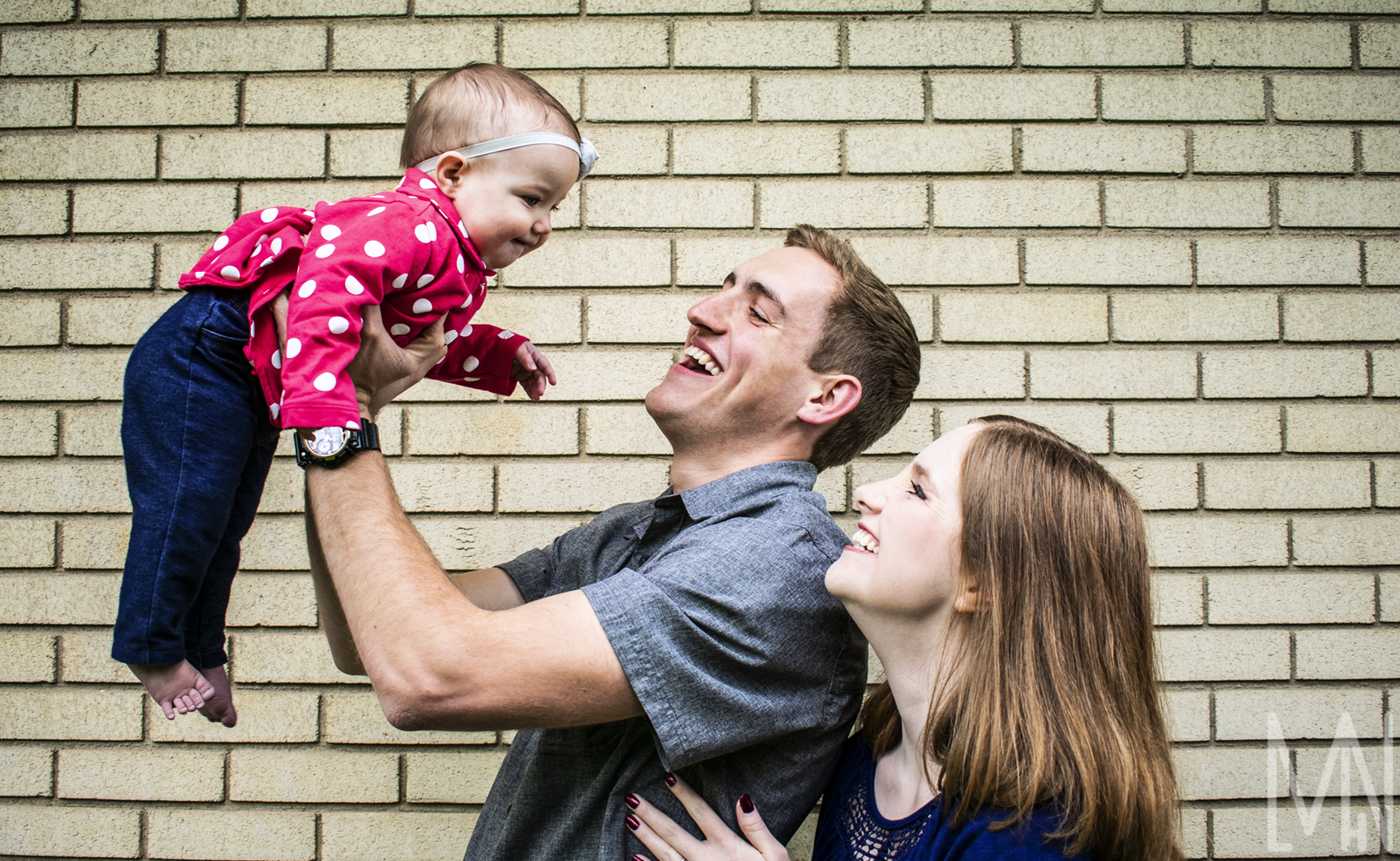
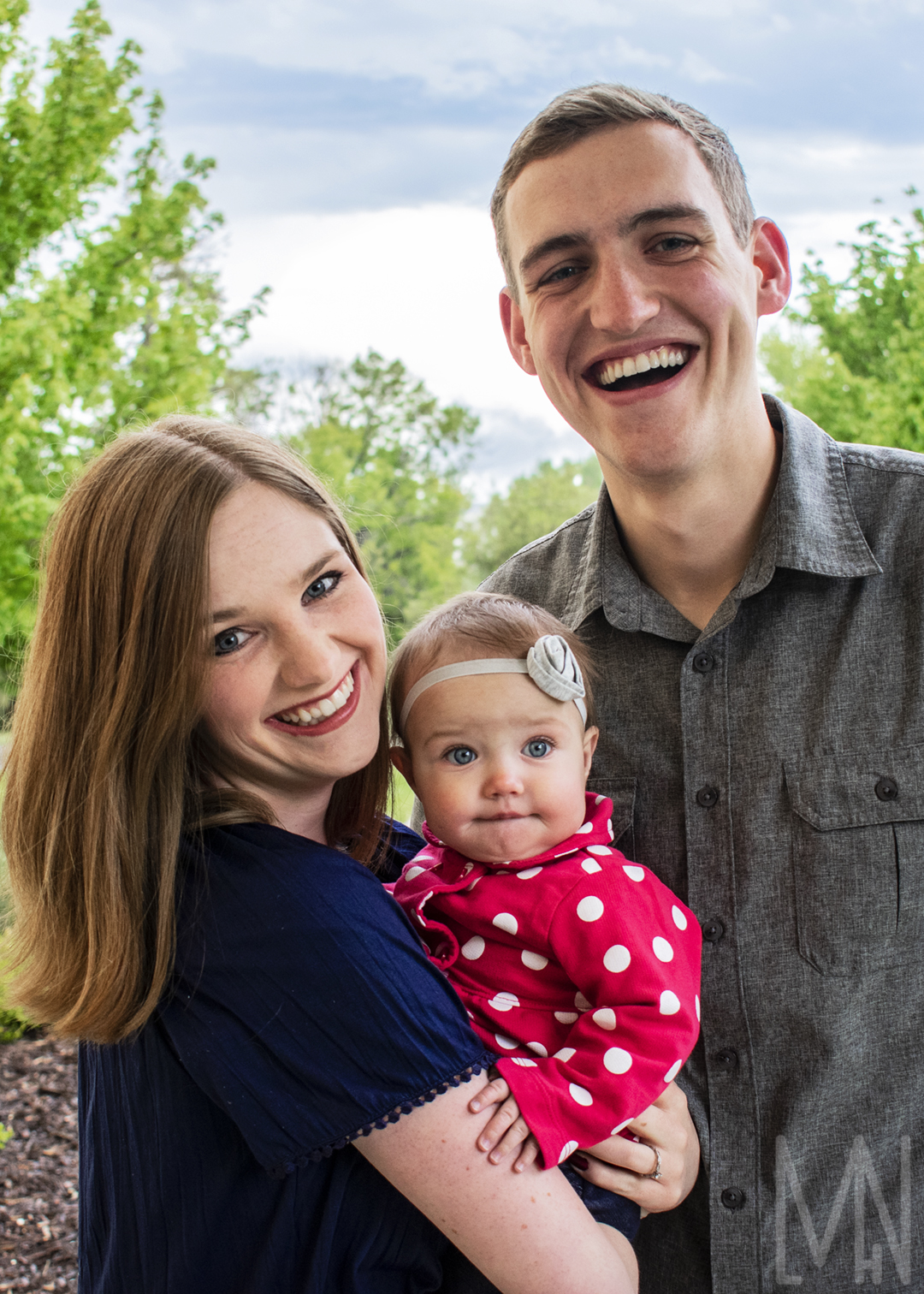
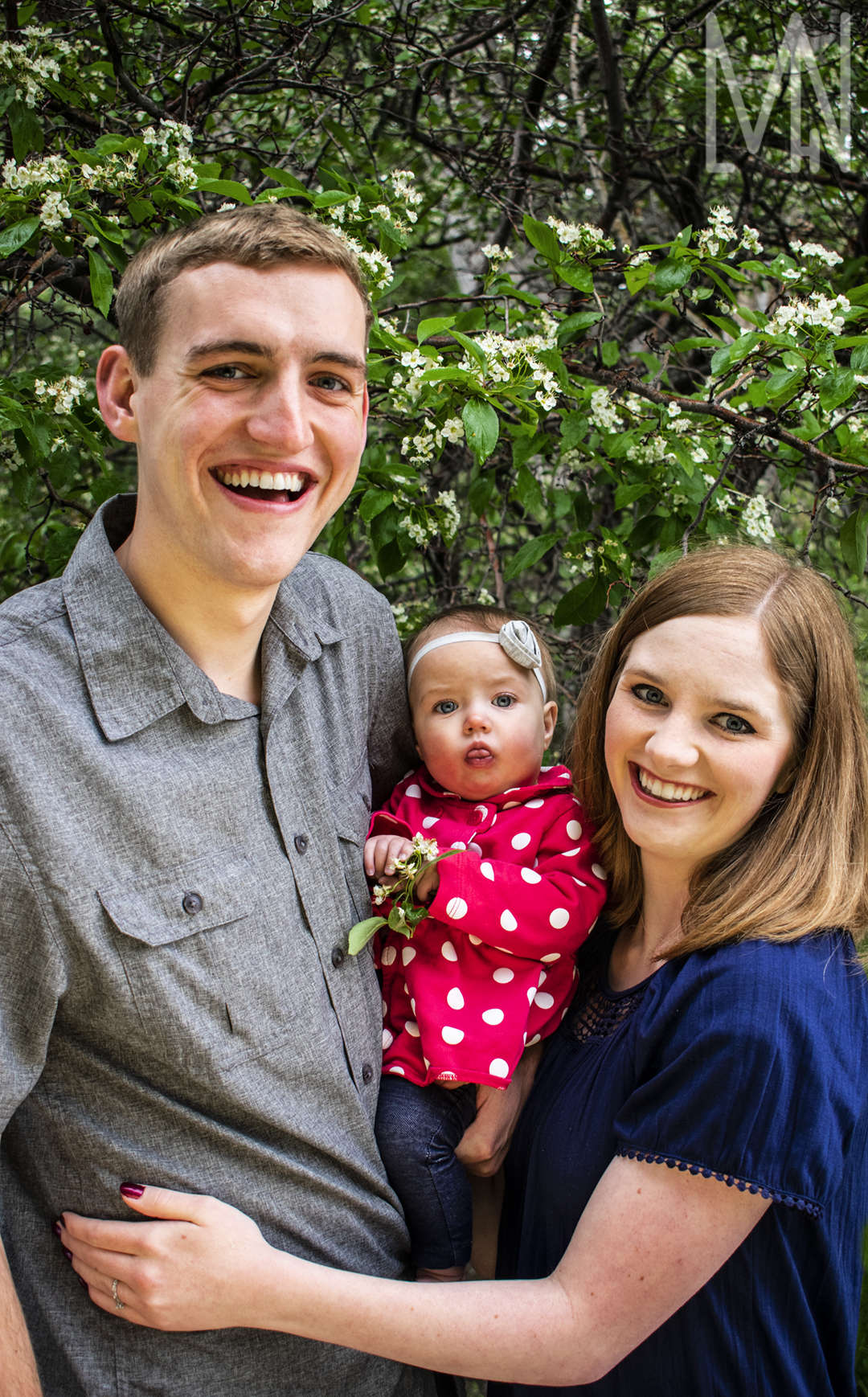
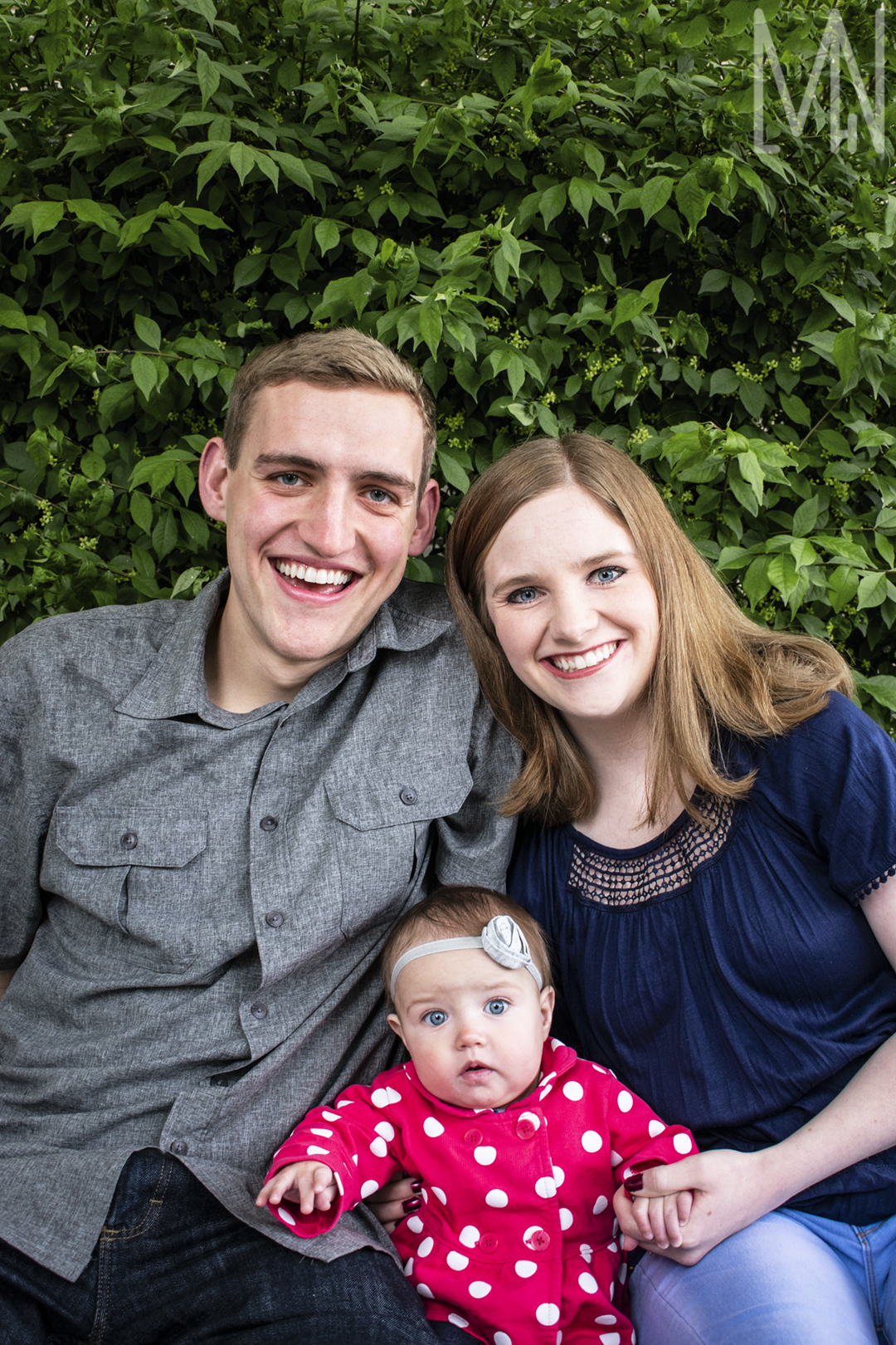
Blog
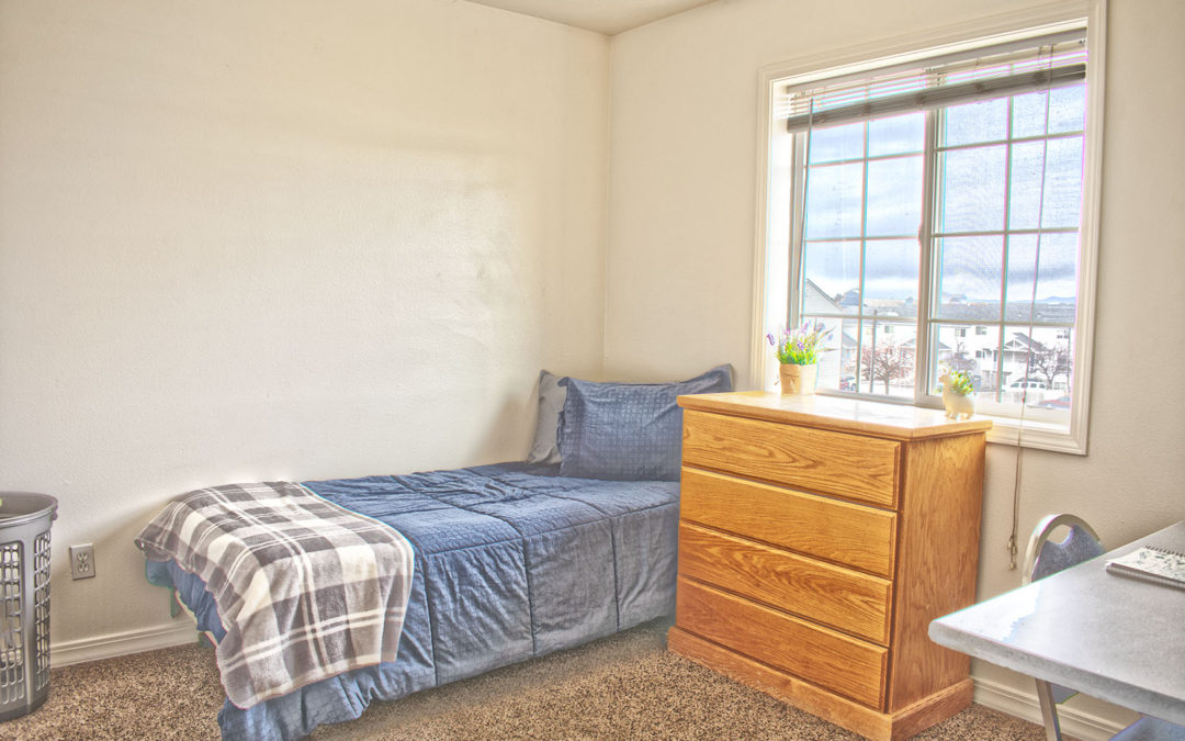
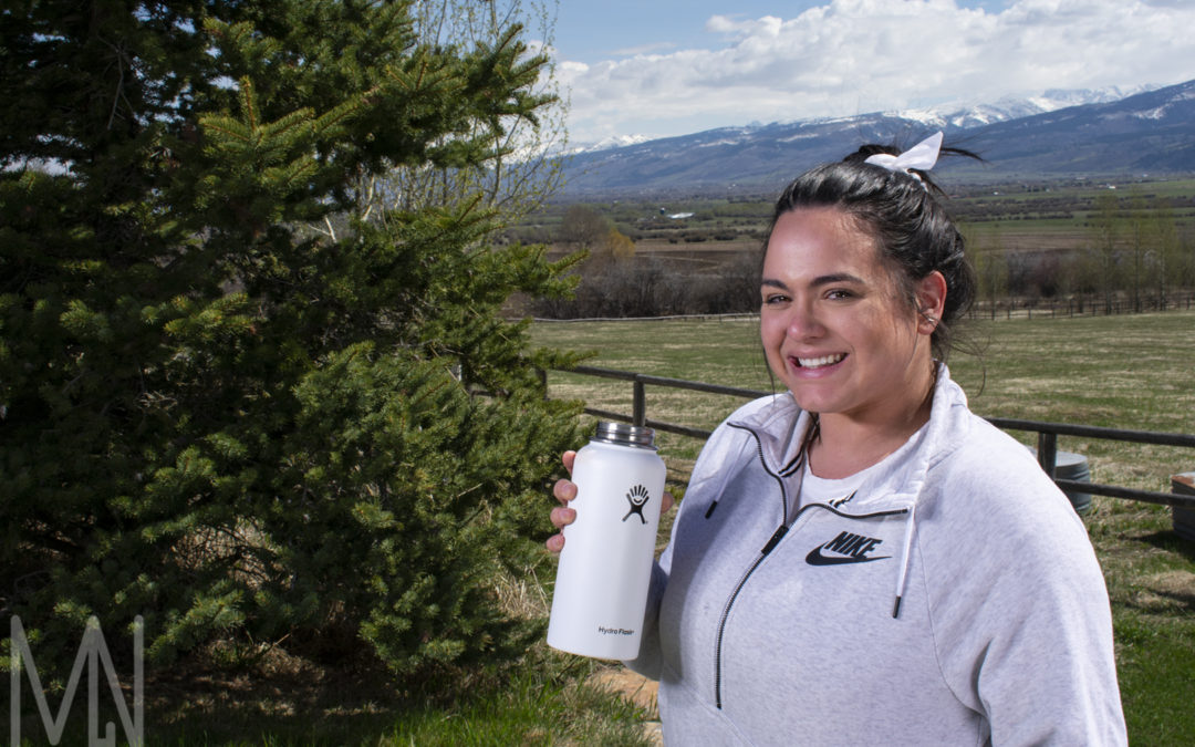
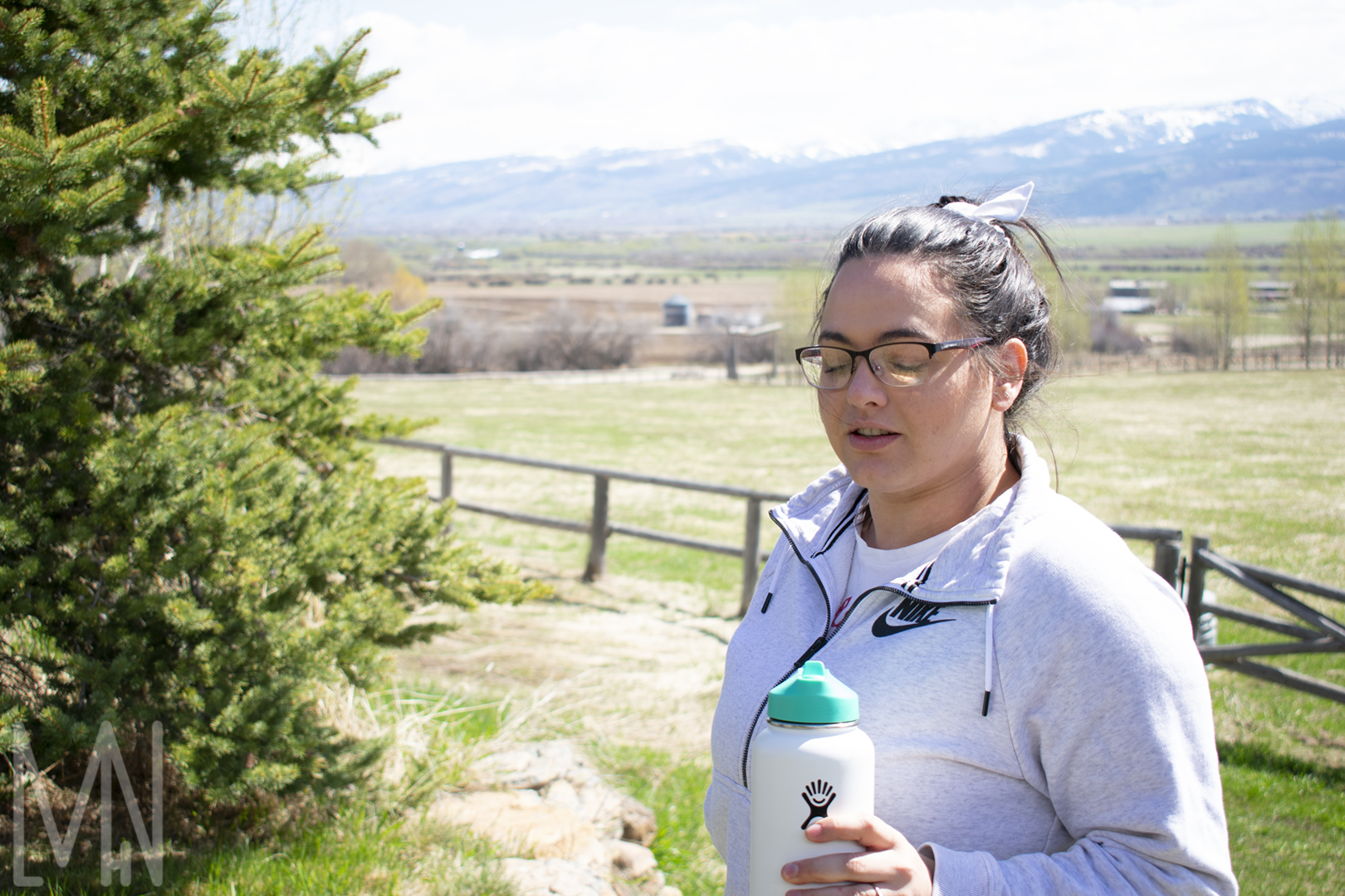
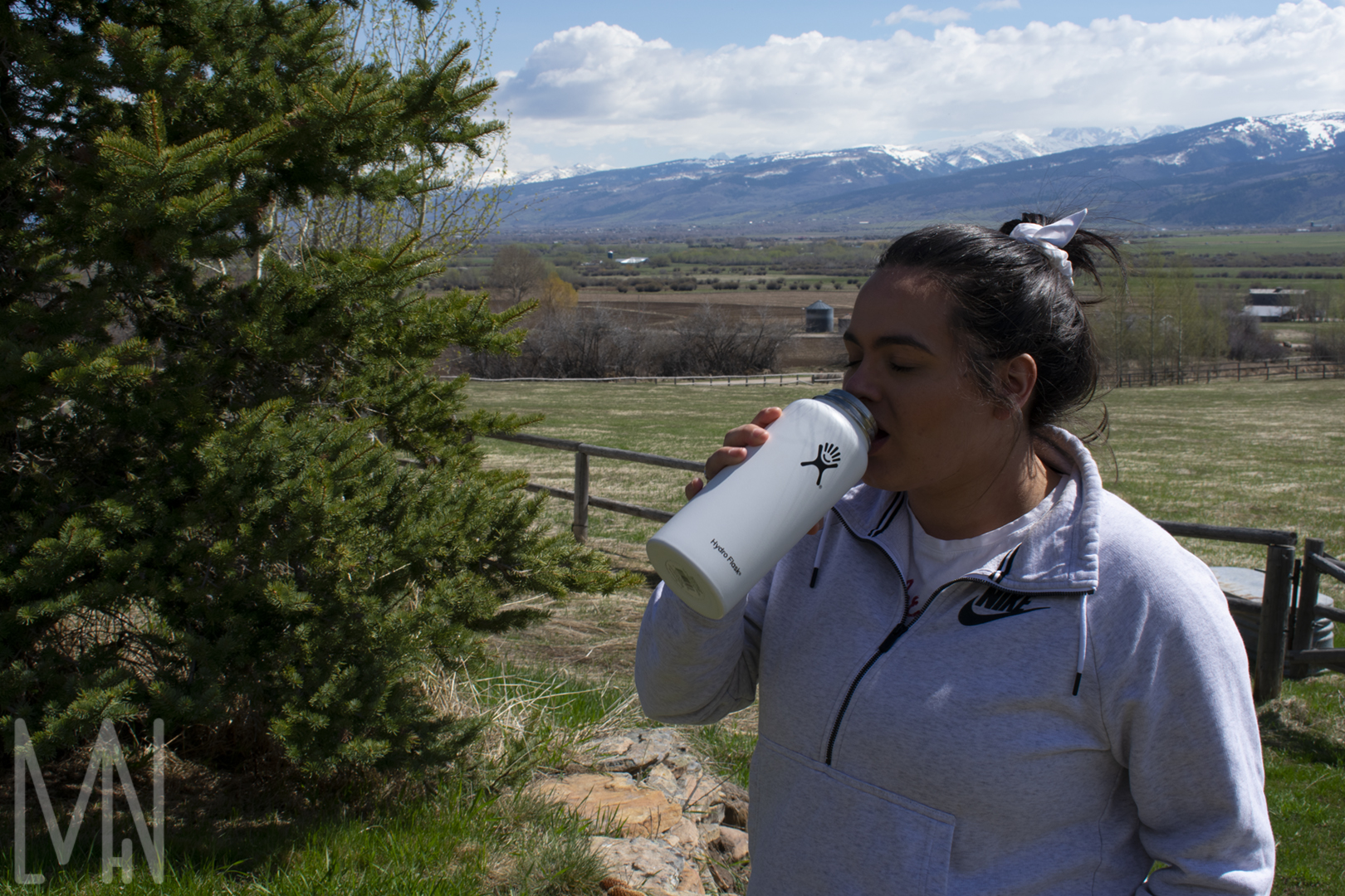
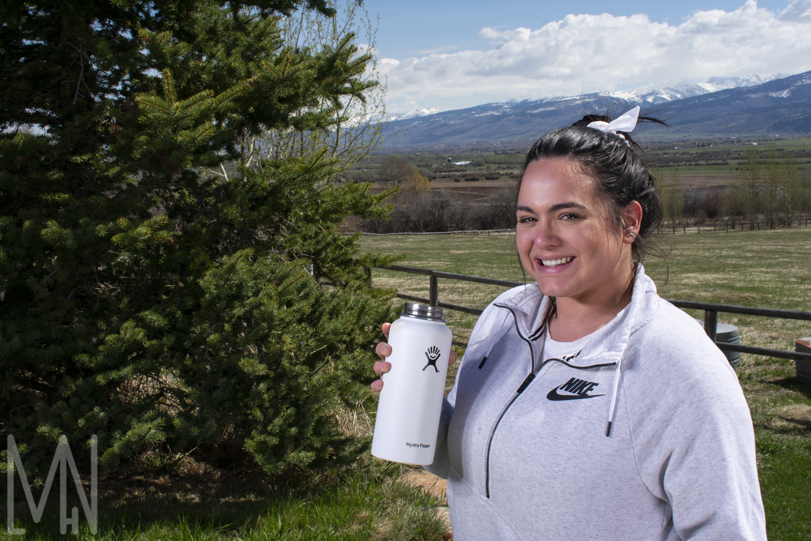
Sundance Apartments
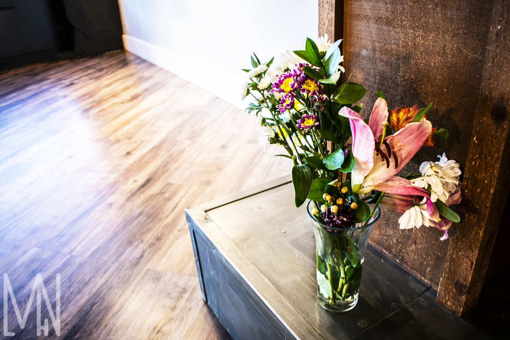
Sundance Apartments Photography
Real Estate Photography has quickly become a favorite for me. Something else I loved about this project was that I had the chance to design a website for this property as well. You can view that HERE.
Given that it was Winter when I shot this particular property, I didn’t take many images outside. I really wanted to capture the outside light to show the depth of the apartment but needed to find a way to balance the light. In real estate photography, they also state that a wide lens helps capture an apartment much better. I was unable to acquire a wide lens for this real estate shoot so I used the basic lens that I had and merged photos together to balance the light with an HDR shot. Each real estate image is three images blended together. This way I was able to capture the light inside as well as the light outside. I was never taught much about real estate photography so this seemed like the best option.
This real estate shoot went fairly quickly as there was only one apartment available to shoot. The rest of the building was under construction. I made sure to photograph this unit when the sun was setting to better help me balance the light inside and out. Overall, I was very happy with the quality of my images given the construction happening around me.
You can visit https://rentalsinrexburg.com/ to view a few other sites with my real estate photos.
Scroll below to see all my real estate photos from the Sundance Apartments photoshoot.


Learn more about the property here: https://sundancerexburg.com/
Sundance Apartments Website
Sundance Apartments Website
I was asked to design a website for Connextion Property Management’s new property Sundance Apartments. We ended up using an Entrata site instead to ensure ease of accepting applications and payments with the website (as they already had that set up with Entrata) but I wanted to share the final product through this video.
This was a brand new property with nothing to start on. The owners asked me to quickly make them a website so we could start signing contracts for the Fall Semester right away. I designed this website in under two weeks. In order to increase SEO, I made it so that the website would require as many clicks as possible. I also was sure to include lots of pictures and keywords to increase SEO. The owners were more involved in this design so it didn’t have the same feel my superiors and I had pitched to them. We ended up making the website more sleek and dark.
I enjoyed using Divi and some of the pictures provided to help increase my SEO and design a website according to my client’s needs. I later took pictures of Sundance which are now mostly being used on social media. The owners son took a few pictures of the property so those took precedence over my photos. If you’d like to see all of those pictures and learn how I made them, you can click HERE.
View the video below to take a tour of Sundance Apartments and learn a little bit about the SEO and design choices I made.
View more properties at Connextion and try to find a few more images I took at https://rentalsinrexburg.com/
Also, check out the university I helped students find housing for at https://www.byui.edu/
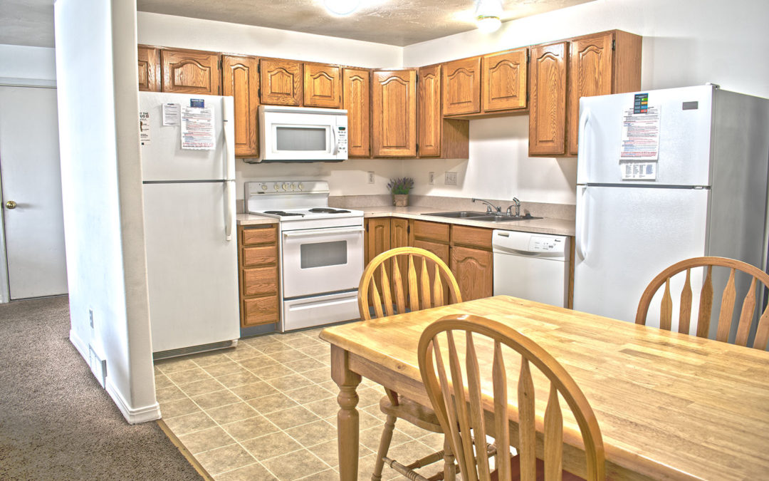
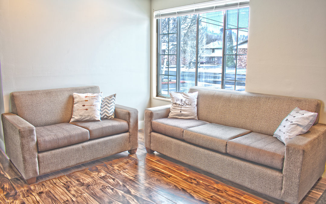
Camden Apartments
Camden Apartments Photography
Real Estate Photography has quickly become a favorite for me. Something else I loved about this project was that I had the chance to design a website for this property as well. You can view that HERE.
Given that it was Winter when I shot this particular property, I didn’t take any images outside. I also found myself working in a very dark apartment with nothing but yellow lights, a camera and a tripod to help me. In real estate photography, they also state that a wide lens helps capture an apartment much better. I was unable to acquire a wide lens for this real estate shoot so I used the basic lens that I had and merged photos together to balance the light with an HDR shot. Each real estate image is three images blended together. This way I was able to capture the light inside as well as the light outside. I was never taught much about real estate photography so this seemed like the best option.
This real estate shoot went fairly quickly as there was only one apartment available to shoot. The apartment was very well laid out which made things easier. It also happened to be a cloudy day so balancing the light outside for this real estate shoot was relatively simple.
If you would like to see my work on the old Entrata website (different from the site I built), please visit https://www.camdenapts.net/
You can also visit https://rentalsinrexburg.com/ to view a few other sites with my real estate photos.
Scroll below to see all my real estate photos from the Camden Apartments photoshoot.
Bedroom


Bathroom


Kitchen


Living Room


Hallway

Camden Apartments Website
Camden Apartments Website
I was asked to design a website for Connextion Property Management’s property Camden Apartments. We ended up using an Entrata site instead to ensure ease of accepting applications and payments with the website (as they already had that set up with Entrata) but I wanted to share the final product through this video.
This was the first website I designed as it was the website that needed to be updated the most. It is a popular property and rarely needs help filling but the website needed better navigation. In order to increase SEO, I made it so that the website would require as many clicks as possible. I also was sure to include lots of pictures and keywords to increase SEO. The Camden Apartments website that is currently running does not have as many SEO opportunities which is why we designed this site in the first place. People were finding the site before I had even finished it because the SEO was working properly.
I enjoyed using Divi and some of the pictures provided to help increase my SEO and design a website according to my client’s needs. I later took pictures of Camden which are now being used on the Entrata site. You can view a few of those below. If you’d like to see all of those pictures and learn how I made them, you can click HERE. You’re also welcome to visit the Entrata site at https://www.camdenapts.net/.
View the video below to take a tour of Camden apartments and learn a little bit about the SEO and design choices I made.
View more properties at Connextion and try to find a few more images I took at https://rentalsinrexburg.com/
Also, check out the university I helped students find housing for at https://www.byui.edu/
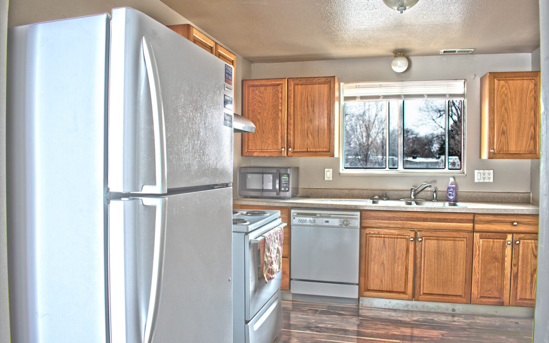
Alta View Apartments
Alta View Apartments Photography
Real Estate Photography has quickly become a favorite for me. Something else I loved about this project was that I had the chance to design a website for this property as well. You can view that HERE.
Given that it was Winter when I shot this particular property, I didn’t take any images outside. I also found myself working in a very dark apartment with nothing but yellow lights, a camera and a tripod to help me. In real estate photography, they also state that a wide lens helps capture an apartment much better. I was unable to acquire a wide lens for this real estate shoot so I used the basic lens that I had and merged photos together to balance the light with an HDR shot. Each real estate image is three images blended together. This way I was able to capture the light inside as well as the light outside. I was never taught much about real estate photography so this seemed like the best option.
This real estate shoot went fairly quickly as there was only one apartment available to shoot. The apartment was quite small as well which made things easier. It also happened to be a cloudy day so balancing the light outside for this real estate shoot was relatively simple.
If you would like to see my work on the old Entrata website (different from the site I built), please visit https://www.altaviewapts.com/
You can also visit https://rentalsinrexburg.com/ to view a few other sites with my real estate photos.
Scroll below to see all my real estate photos from the Alta View Apartments photoshoot.
Bedroom


Bathroom


Kitchen


Living Room


Alta View Apartments Website
Alta View Apartments Website
I was asked to design a website for Connextion Property Management’s property Alta View Apartments. We ended up using an Entrata site instead to ensure ease of accepting applications and payments with the website (as they already had that set up with Entrata) but I wanted to share the final product through this video.
When designing the website, we had to consider that this property would soon be opening up to women. Up until this point, the property had house men in both houses. Now, this BYU-Idaho approved complex would be housing men in one house and women in the other. In order to increase SEO, I made it so that the website would require as many clicks as possible. I also was sure to include lots of pictures and key words to increase SEO. The Alta View website that is currently running does not have as many SEO opportunities which is why we designed this site in the first place. People were finding the site before I had even finished it because the SEO was working properly.
I enjoyed using Divi and some of the pictures provided to help increase my SEO and design a website according to my client’s needs. I later took pictures of Alta View which are now being used on the Entrata site. You can view a few of those below. If you’d like to see all of those pictures and learn how I made them, you can click HERE. You’re also welcome to visit the Entrata site at https://www.altaviewapts.com/.
View the video below to take a tour of Alta View apartments and learn a little bit about the SEO and design choices I made.
View more properties at Connextion and try to find a few more images I took at https://rentalsinrexburg.com/
Also, check out the university I helped students find housing for at https://www.byui.edu/
Washington State Organized Retail Crime Alliance (WSORCA) Logos
Washington State Organized Retail Crime Alliance (WSORCA) Logos
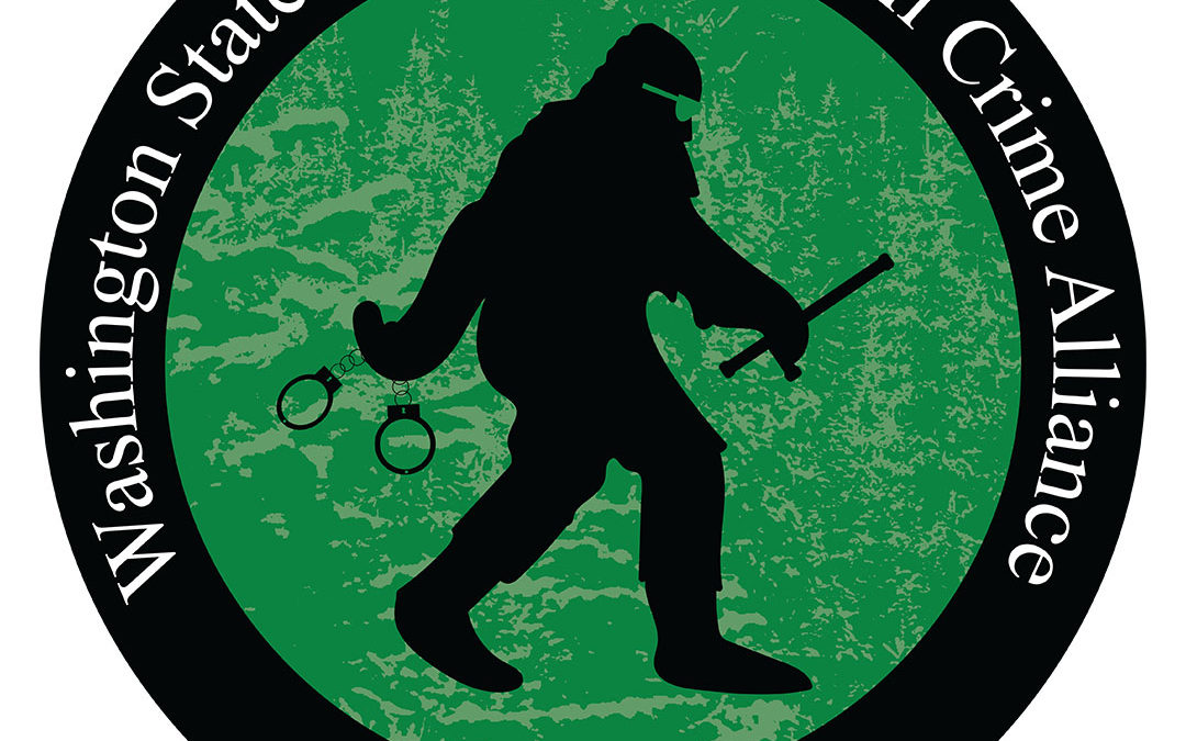
I was approached by the President of the Washington State Organized Retail Crime Alliance to design a new logo for their organization. The Washington State Organized Retail Crime Alliance (or WSORCA) is apart of a national group known as the Organized Retail Crime Resource Center. Each state has their own logo that best represents who they are and where they are from. It can be difficult to create one logo that best represents a state company. I decided the best way to make sure my client was satisfied with my work was to create a series of logos he and his co-workers could choose from. Below are the six logos I created:

This logo was designed to be more serious and formal. The bar code represented the retail alliance and the state of Washington clearly shows what state is being represented. I placed it in a circle to make the design seem more like a seal. That same pattern is seen throughout my logos.
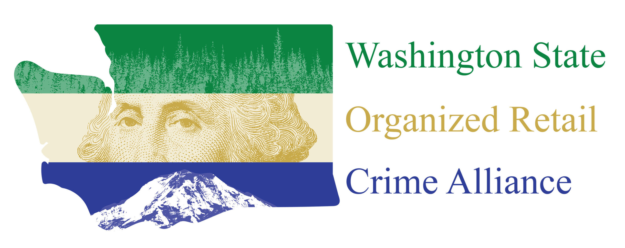
This second logo was designed to be brighter as well as more representative of the State of Washington. I pulled a free graphic design of George Washington to incorporate into the logo for speed and accurate depiction purposes. Below, I placed Mt Rainier and above, the famous evergreen trees of Washington. All very iconic representatives of the state.

This was one of my more fun ideas for the Washington State Organized Retail Crime Alliance logos. Bigfoot is believed to live in the Pacific Northwest and given Bigfoot’s strength and size, appeared to be a perfect mascot for a group dedicated to stopping crimes, even retail crimes. I added a few police-like symbols to represent their cause. The tree pattern in the background gave it some nice texture and again, showed the representative evergreen trees.

Mt Rainier is an iconic mountain/volcano in Washington State. It sits tall and majestically above the rest of the state. It has a quiet power about it which I felt perfectly represented the Washington State Organized Retail Crime Alliance and their more quiet yet powerful work. I tried to include some green in many logos as Washington is the evergreen state and this shade of green is prominant on their state flag.

For a more formal look, I created a badge-like star for this logo’s shape. I played around with some gradients until I felt I made the logo shine enough to pass as a badge. The state of Washington is also seen here to immediately identify the location of this alliance. The website is also located here and gives the state a little more purpose in being centered on the badge.

I wanted this final logo to have a more patriotic feel to it as this organization is nation wide. I felt the logo was a bit empty after including the justice scales and stars so I decided to add the state’s motto, Alki. This means by and by and is currently the unofficial motto of Washington State. There is no official motto for the state. I felt this presented a more unique and patriotic feel to the alliance. It also seemed to mesh well with our countries love of Greek/Roman architecture in our government buildings.
In Conclusion
It was a pleasure to work on these logos and explore so many different options and messages for the company. A specific logo of the logos shown has not yet been officially chosen for the Washington State Organized Retail Crime Alliance but as soon as one is selected, I will update this post. In the mean time, here is their website and other information about them. The logo of their choice will appear here shortly:
ORC: http://www.orcinfo.com/home.html
WSORCA: https://www.waorca.org/
Update:
A logo has been selected! The Washington State Organized Retail Crime Alliance took some time and rebranded to Washington Organized Retail Crime Association. After a quick edit to the logo of their choice, it is now on the main page of their website. Below is the final logo selected:

If you’d like to learn about the Organized Retail Crime association works, check out this article: https://www.senseon.com/blog/organized-retail-crime-affects-industry/

Christmas Gift Tags
Gift Tags for Christmas
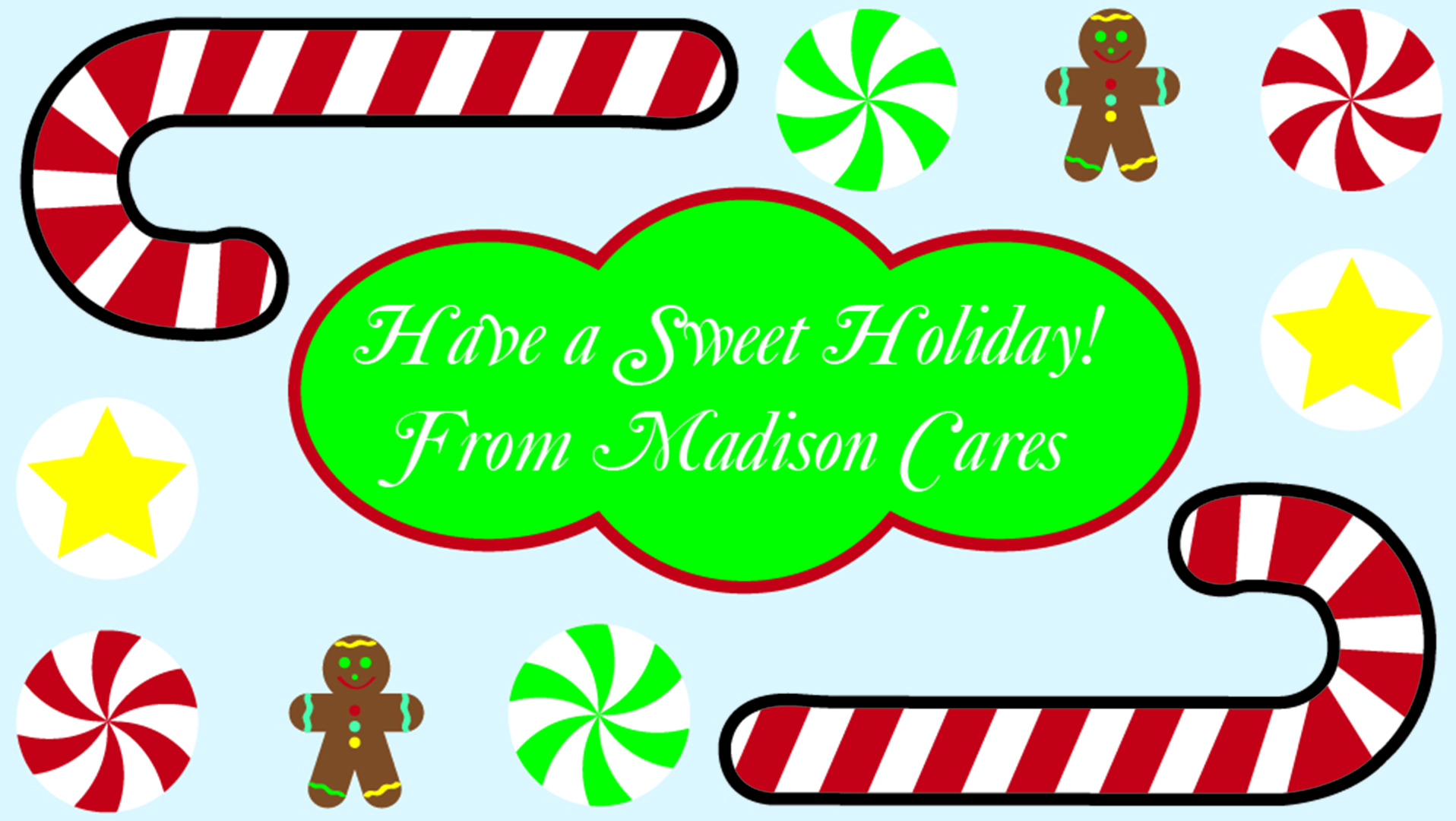
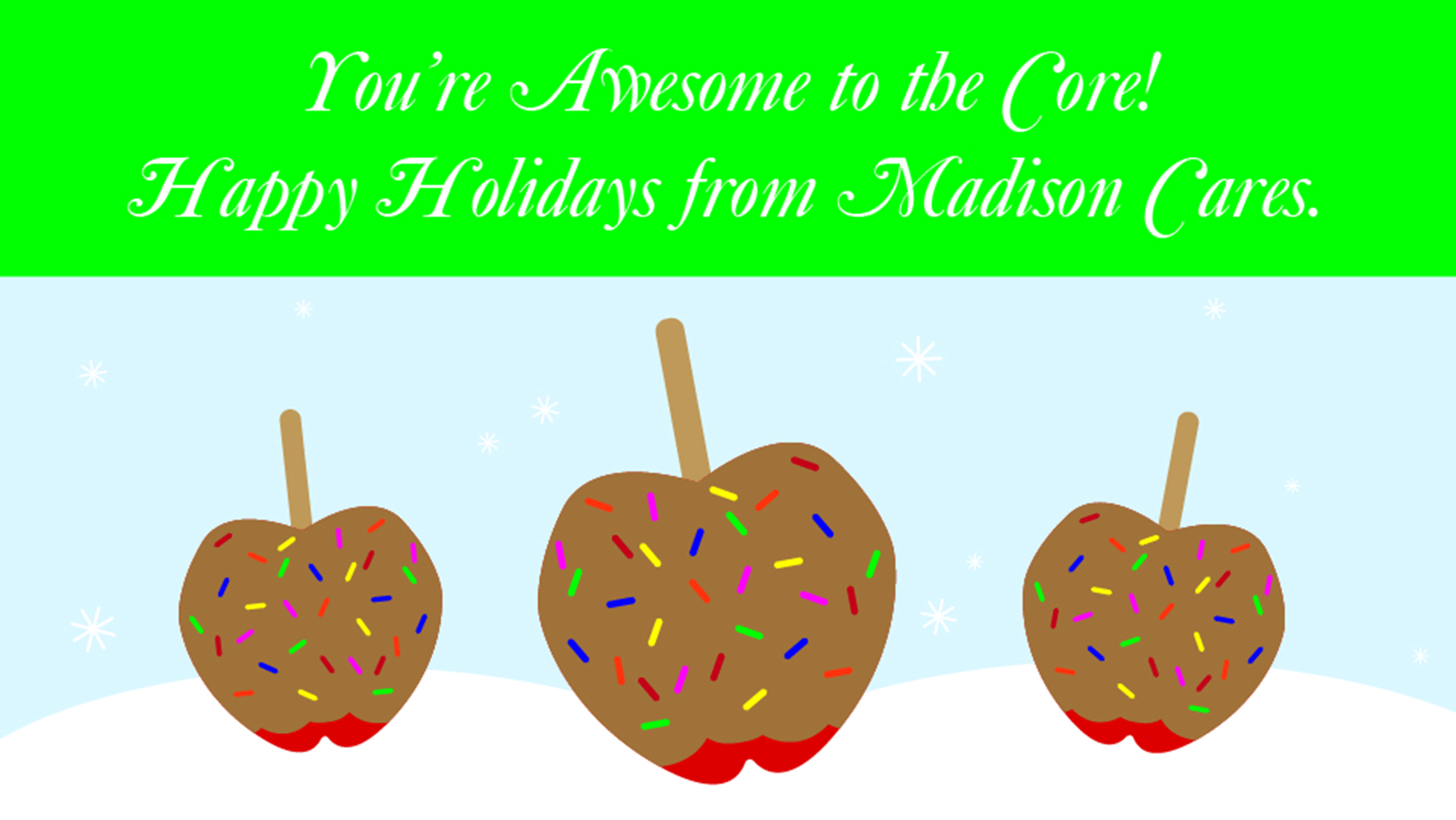
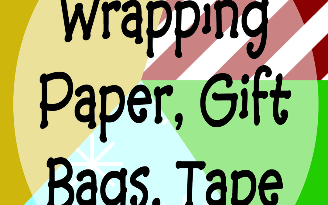
Madison Cares asked me to create a series of gift tags that could potentially be used for the staff Christmas gifts that year. They weren’t sure what they would be buying everyone yet so they asked me to try out a few different gift ideas. They really wanted puns to be involved in the Christmas gift tags too. From that, I worked to think of unique gifts and puns that would work together. In the end, I worked out five different ideas for the Christmas Gift Tags. My ideas below came from gifts I had received before for Christmas. We also live in a very snowy city so I tried to incorporate that idea into most of my designs for the Christmas gift tags. I was not informed which tags were used in the end but all were happily accepted by Madison Cares. Take a look below:


Christmas Ornaments
Madison Cares Ornaments for Secret Santa (Christmas)
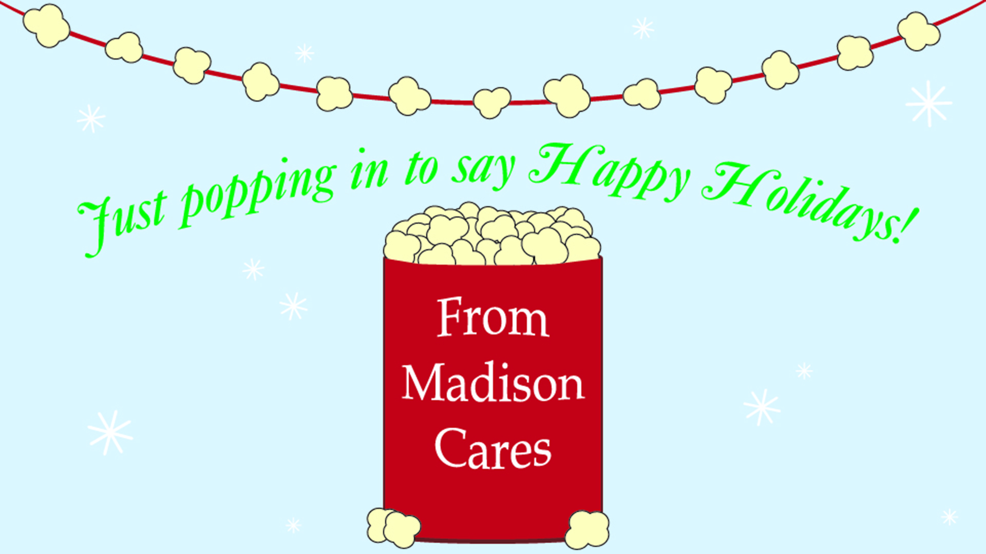
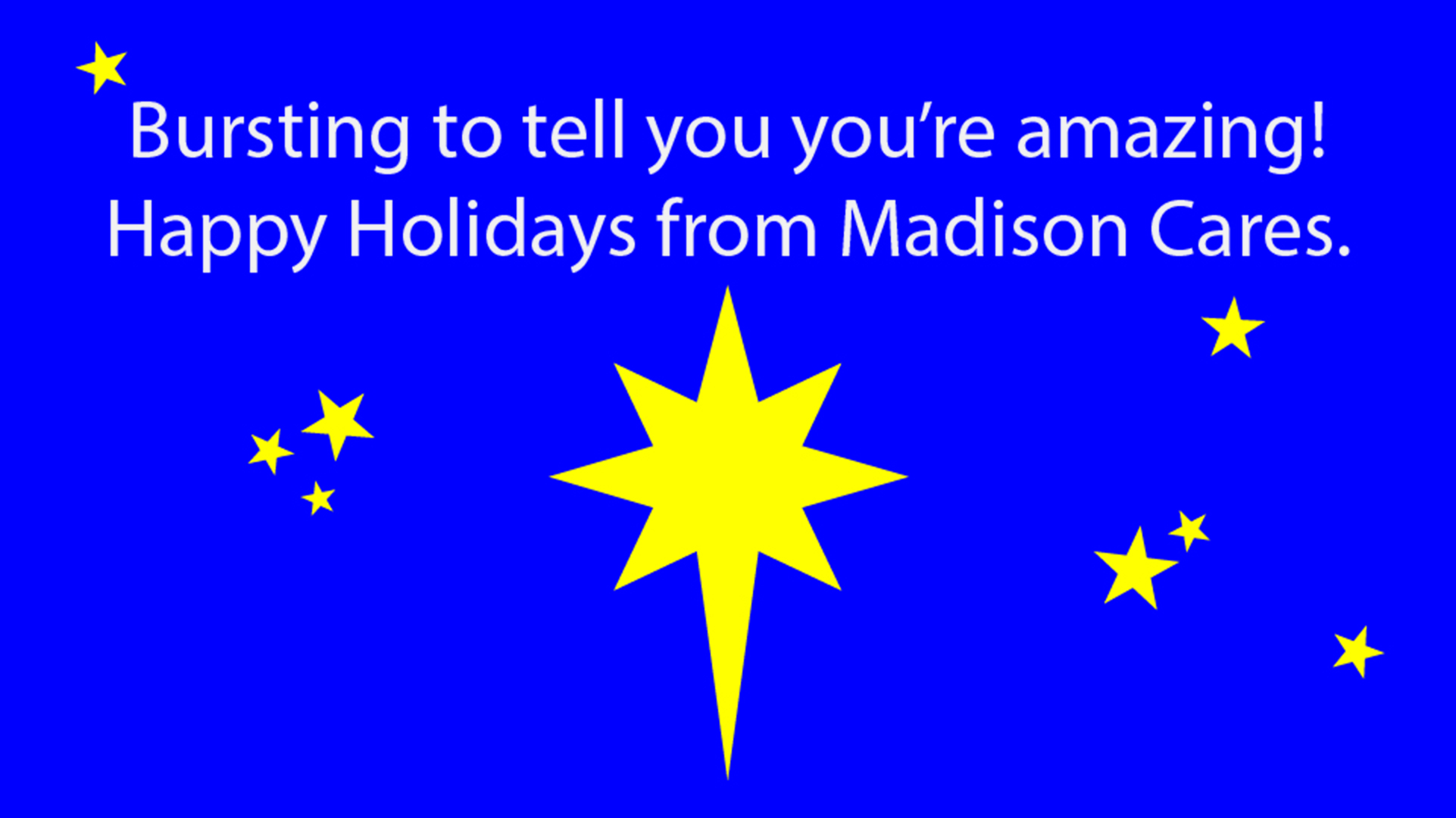
This ornament project given to me by Madison Cares was made to assist in the Secret Santa Project. The idea was to use graphic design to create paper ornaments to hang on Christmas trees in public places. On the back of each ornament would be a description of the Secret Santa project, what present to buy to help supplement those families who might not have enough, and where to drop off the gift once bought and wrapped. I helped coach two other interns and together we created many different and unique ornaments. Below are the six that I created. These were simply and quickly created given the time constraints but I believe each ornament reflects the Christmas spirit found in this Secret Santa project. In the end, we received many extra gifts from amazing individuals. We were able to provide all the families we took on with the gifts they needed. We believe this was our greatest donation amount ever received. I’m so glad I had such an awesome team to work with to create so many ornaments! It really helped us get those gifts we needed for Secret Santa.


Secret Santa
Secret Santa Graphics
Madison Cares asked me to create graphics for their Secret Santa event. Every year, Madison Cares selects around fifty families in the Rexburg, Idaho area who need some financial help, and provides some basic necessities as well as Christmas presents and decorations to those families. Often times, these families in need are matched with other families who go out and buy these necessities and gifts for the poorer families. They become their Secret Santa. Unfortunately, Madison Cares finds that not all families who need help are able to receive that help for various reasons. This is why I was asked to produce these graphics and create social media posts to reach out to those who might be able to donate extra gifts and necessities. I tried to give these graphics a Christmas time feeling. Secret Santa I believe encompasses the true meaning of Christmas and I wanted those who viewed these graphics to feel that too. Below you can view the four graphics I created an released over the four weeks of Secret Santa preparation.


Madison School District Holiday Logos
Logos for Madison School District for the Holiday
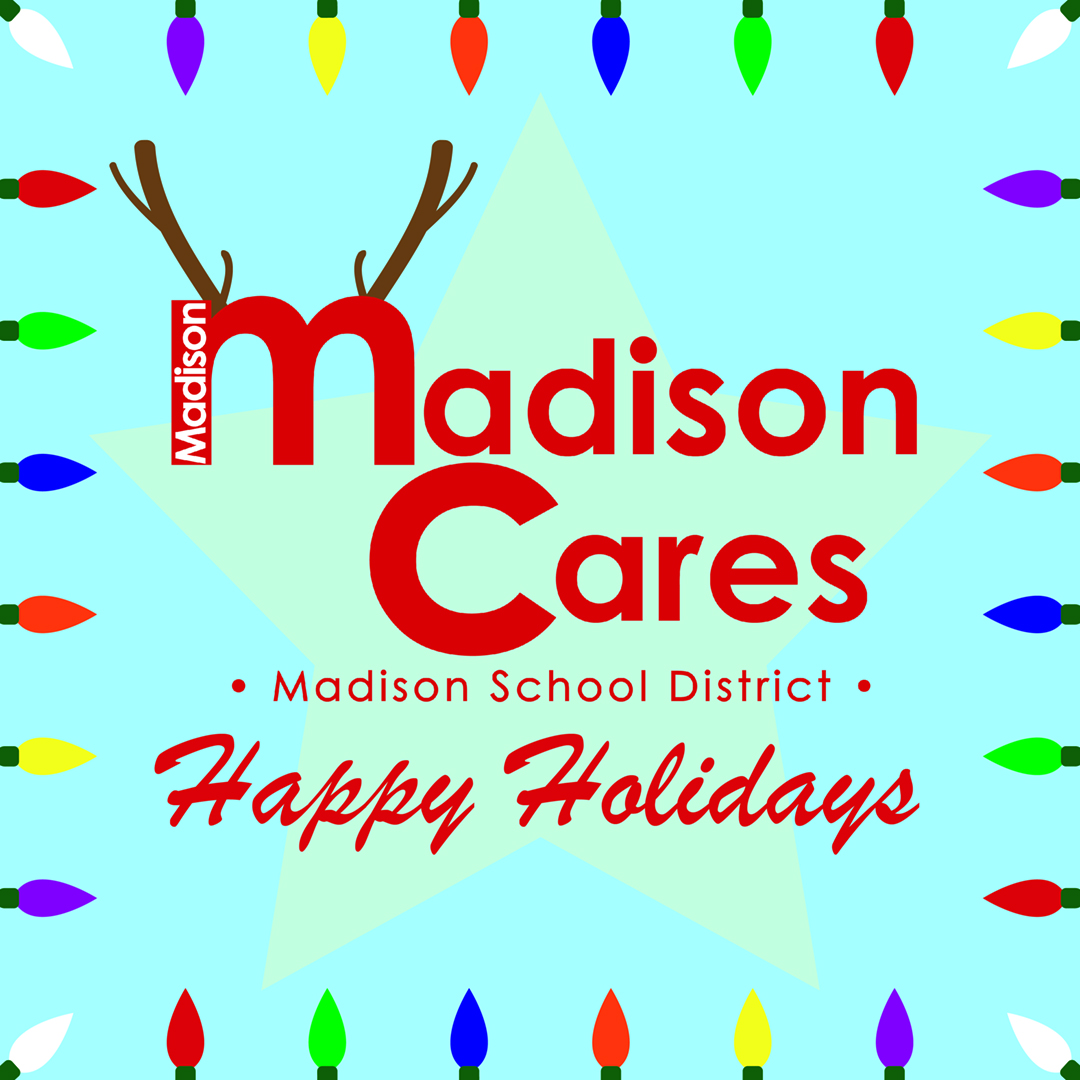
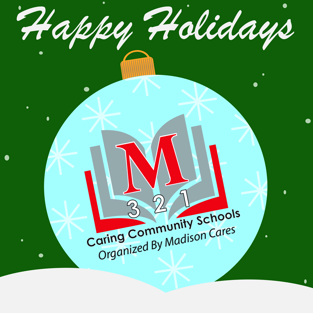
Madison School District #321 and Madison Cares (social media sites run by the same people) were in need of more Holiday logo options. Madison Cares asked me to try designing a few for them and below is what I came up with. I wanted to make some for the upcoming holiday seasons (which at the time were Thanksgiving and all holidays revolving around Christmas). I wanted to find a way to incorporate the Madison Cares and Madison School District logos into what ever holiday background I was creating. Autumn colors are some of my favorite colors to work with. Leaves are also a large part of autumn along with the famous turkey for Thanksgiving. I kept the color schemes the same for both the Madison School District and the Madison Cares holiday logos for Autumn to drive home the time of year. I even made Madison School District’s logo into a kind of turkey. For the winter holiday, I wanted to focus on the snowy weather (as that’s what Rexburg and Madison county is often famous for) as well as the beautiful lights that shine during the season. I decided to split the two up and use as many holiday colors I could. I also included some iconic holiday designs such as an ornament and reindeer antlers. Below are the find holiday logo results.
Want to see some more creative holiday logos? Check out Logo Maker’s page here.
Halloween Party Name Tags
Name Tags for the Madison Cares Halloween Party
Every year, Madison Cares works to create a fun Halloween party for it’s staff. They work hard so they play hard (as they should). This year, they decided to do a murder mystery party. I was chosen to host this party and to create name badges for each of the characters. This “Once Upon A Time” themed party had players with similar names to the classic fairytale stories so I used those doppelgangers to create name tags that best represented each character. Some had more detail than others depending on the size of the character’s name. The designs were kept small as to not detract from others reading their name. It was instead created to accent the name and to give all players an idea of who this character was supposed to be based on. It didn’t take long to brainstorm and create these ideas. Due to the time crunch, I did not have the opportunity to sketch these designs before creating them but I believe most kinks were worked out during the designing process. Below I have included every name tag created for the party.
Hello Week
Hello Week
Start with Hello Week was one of the greatest projects I had the opportunity to be apart of. Start With Hello (as explain by Madison Cares) is a campaign created by The Sandy Hook Promise that “…helps teach children, teens and young adults about social inclusion and how to become more connected with one another.” The Start With Hello campaign I was able to be apart of started on October 28th and ended on November 1st. In order to get the local school district excited, I was in charge of creating unique graphics that would help students, teachers, and parents understand what special activity they could be apart of to promote the campaign that day. The specific activities were decided by Madison Cares (of Madison School District #321) and I, alone, took these activities and made them into Hello Week graphics. My designs for each day of Hello Week were sketched out first before being put into illustrator. Each day for Hello Week and each graphic matching that day is shown below.
Day 01
Day 02
Day 03
Day 04
Day 05
Start With Hello Week: Visiting the Schools
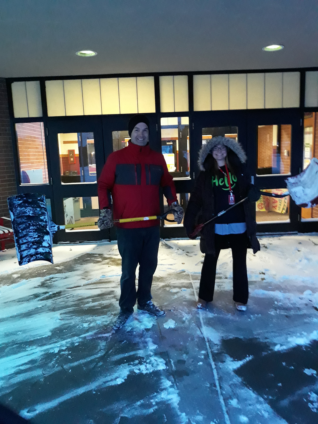
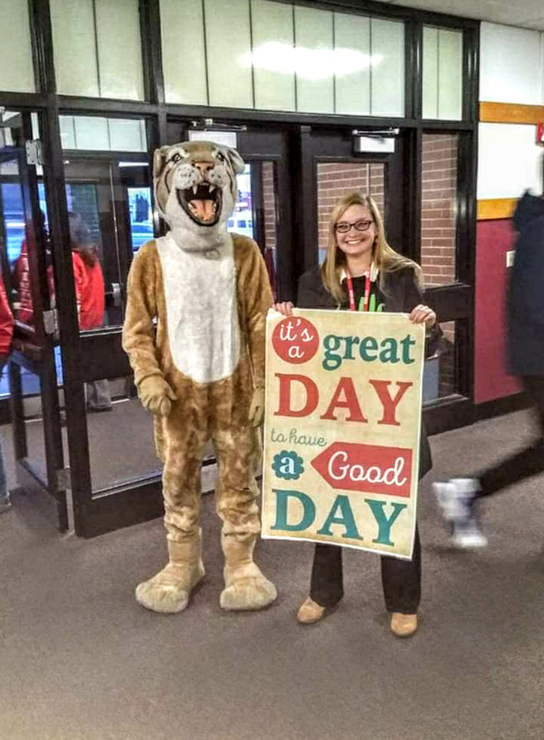
After the daily graphics were completed, all that was left to do was to visit the local elementary, middle, and high schools every day. We had a couple of snowy days right before Halloween but enjoyed promoting social inclusion. Changing someone’s life can be as simple as saying “Hello”. I felt so honored to be able to be involved in this campaign in many different capacities.
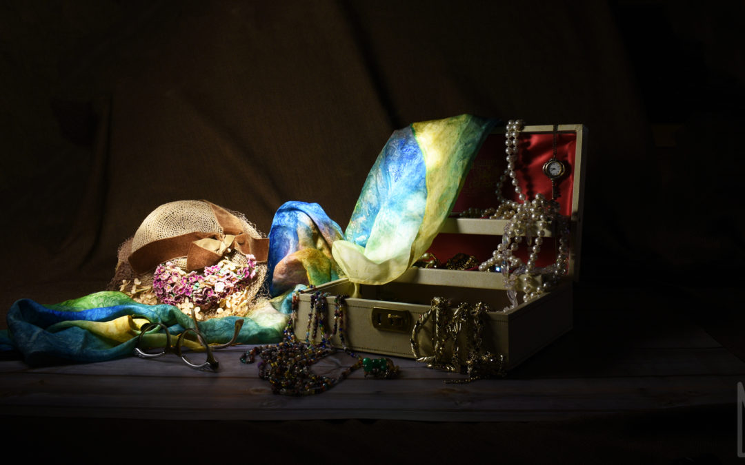
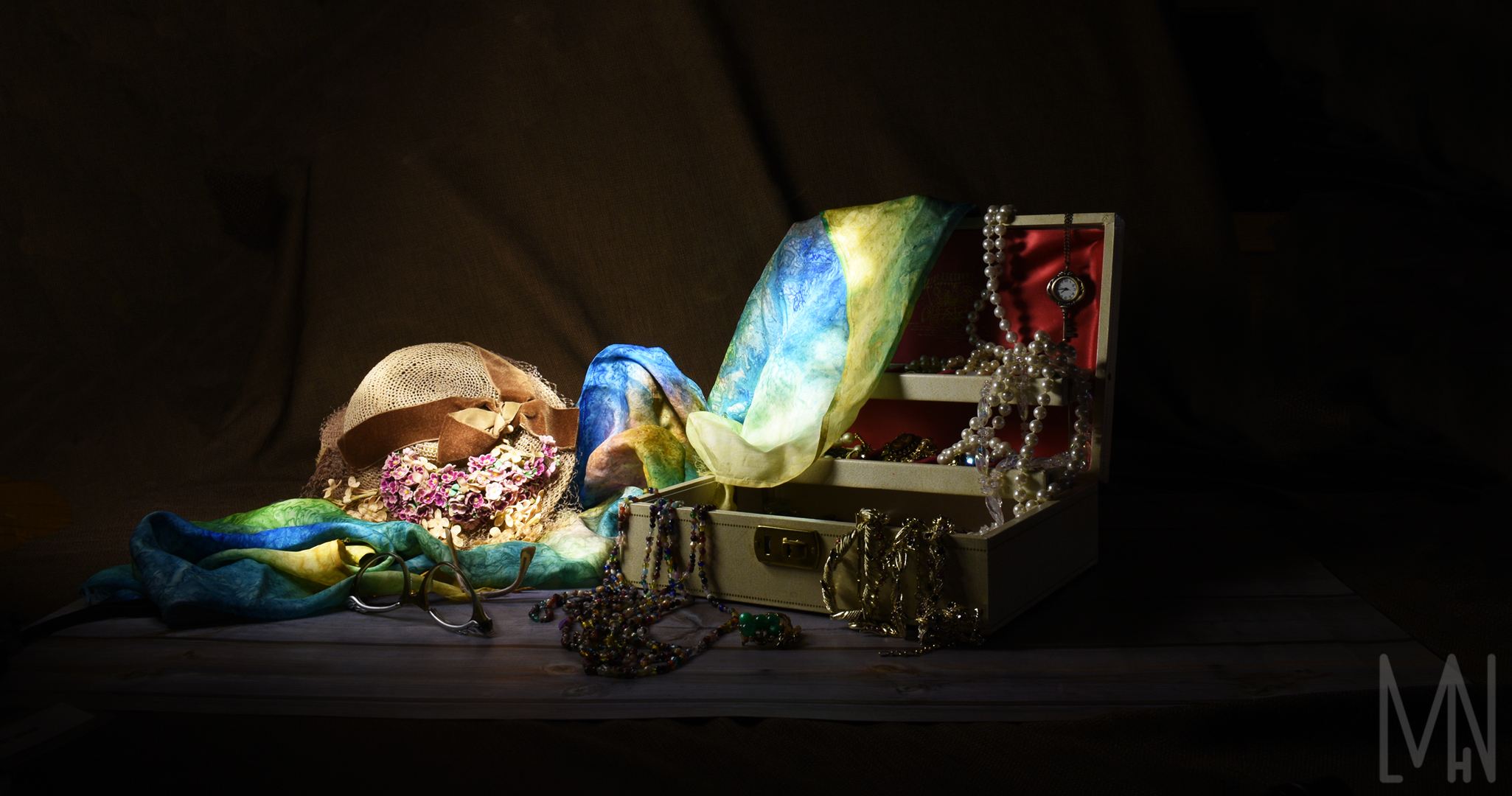
Hope Garden Locks
Hope Garden Locks
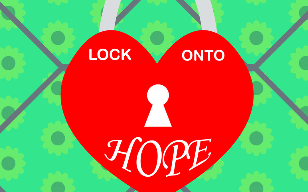
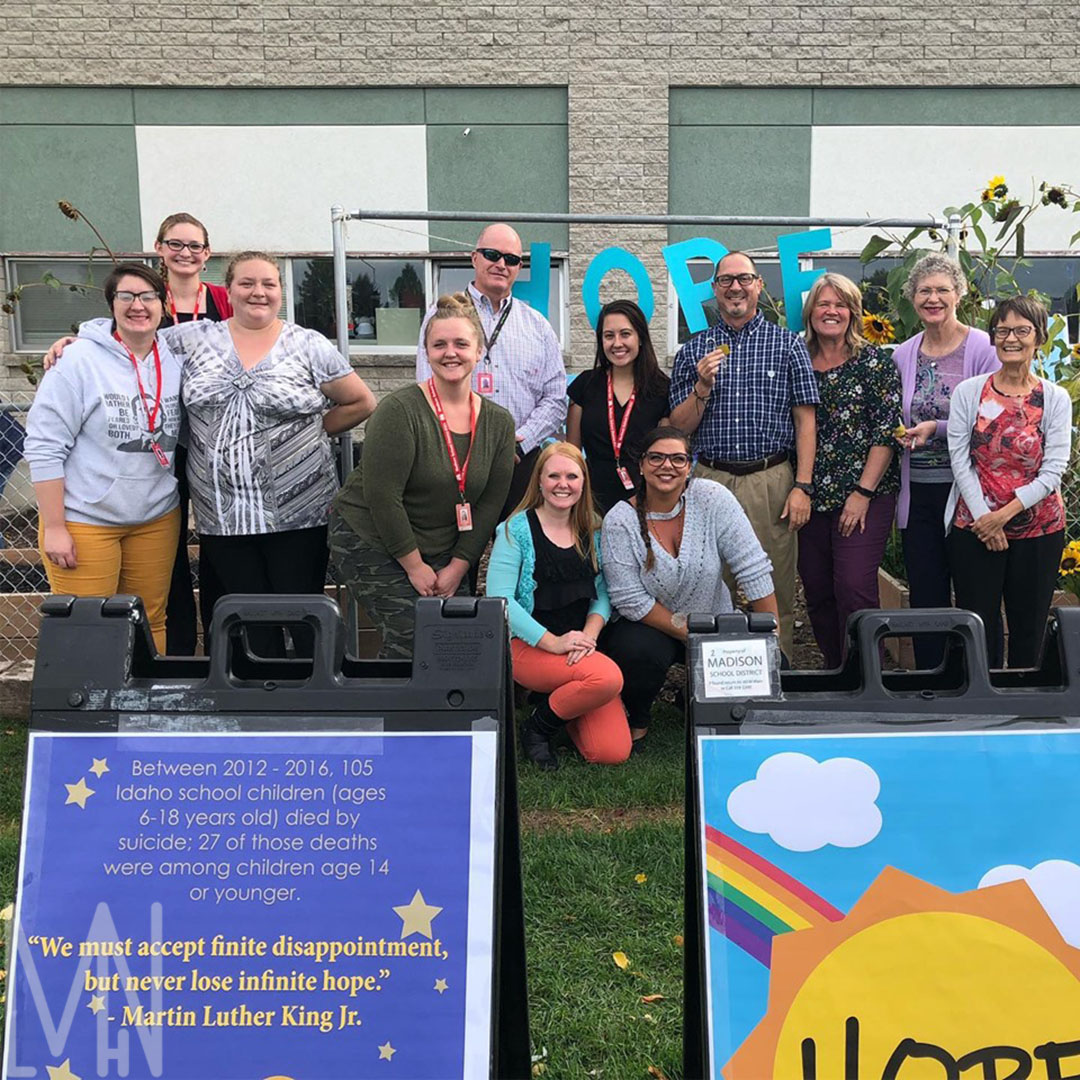
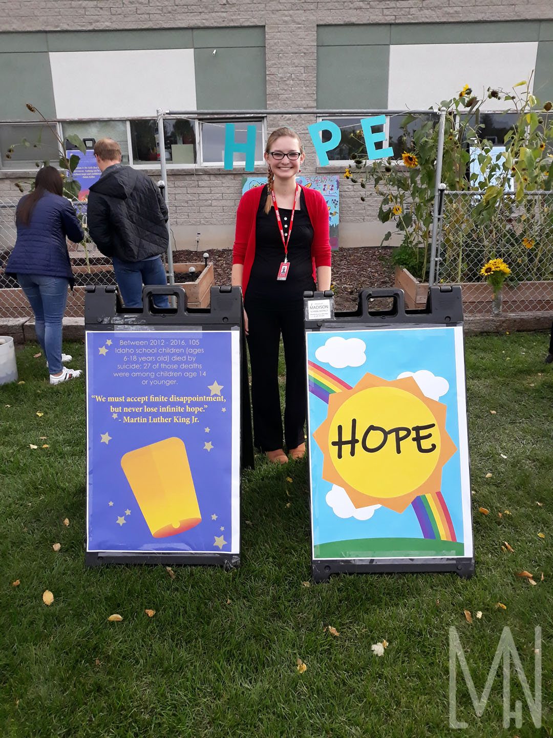
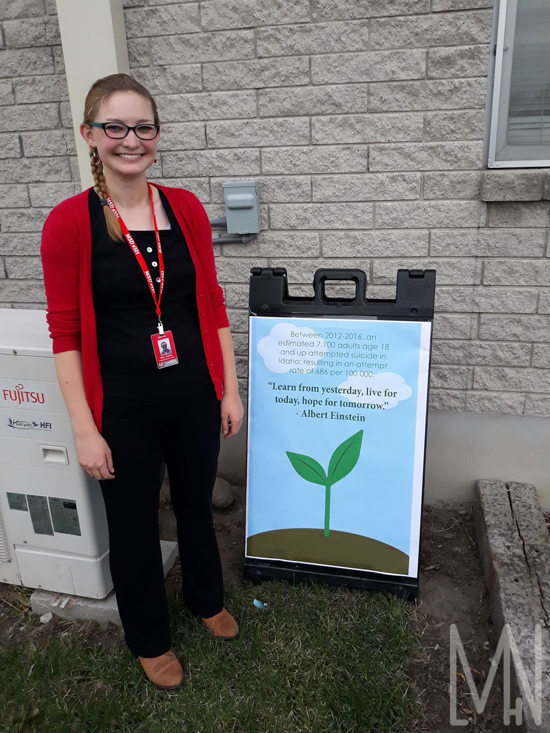
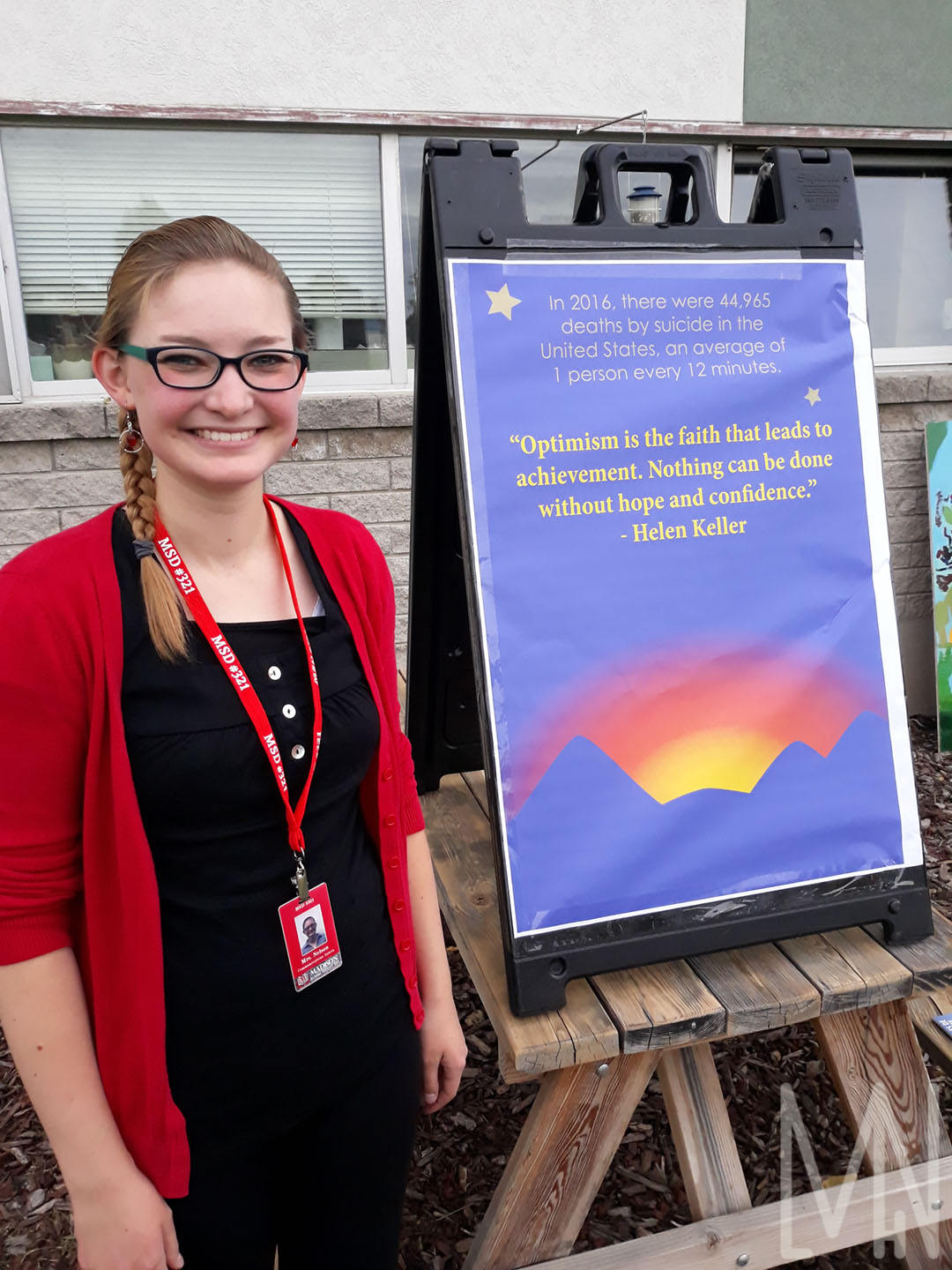
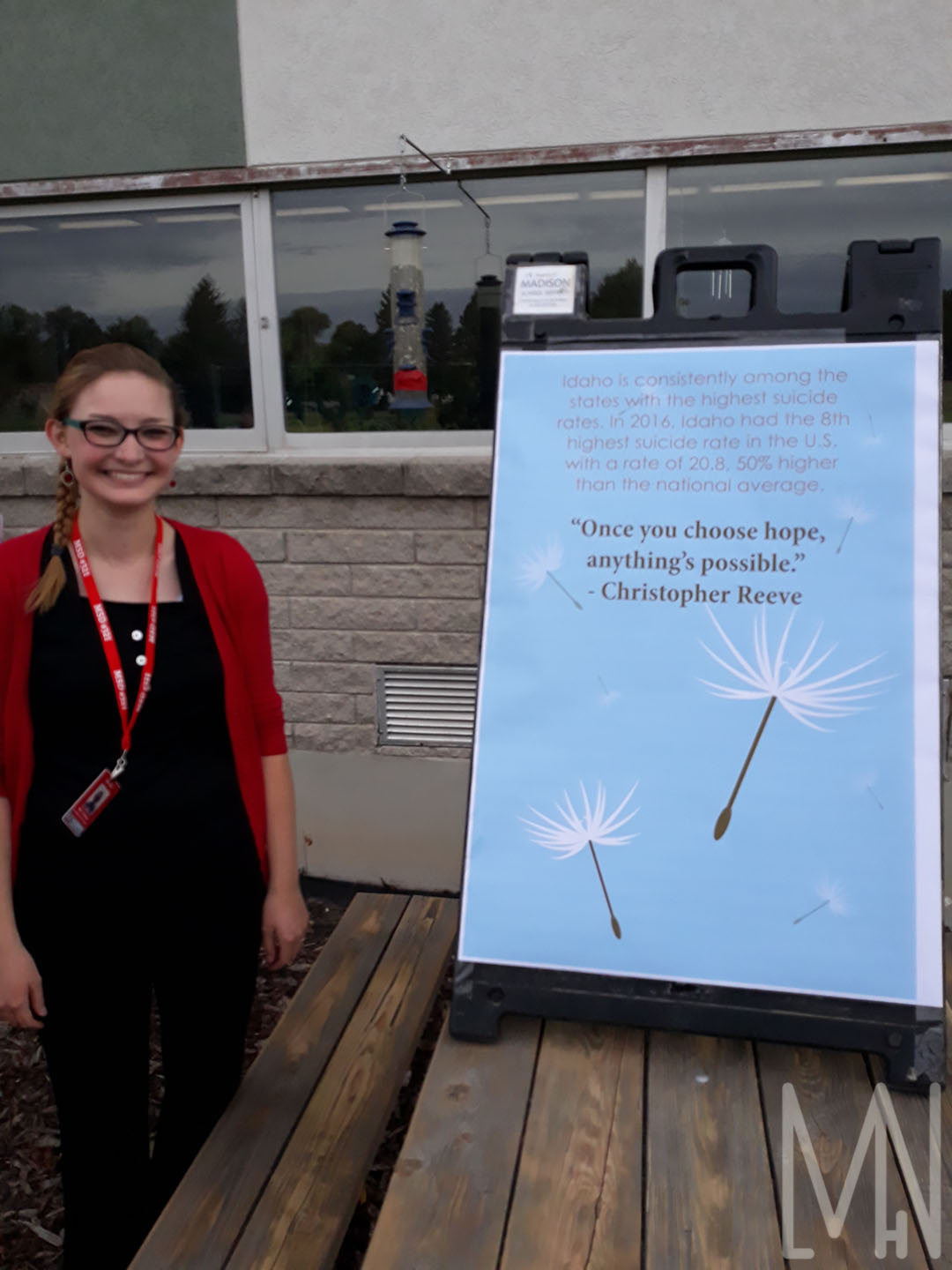
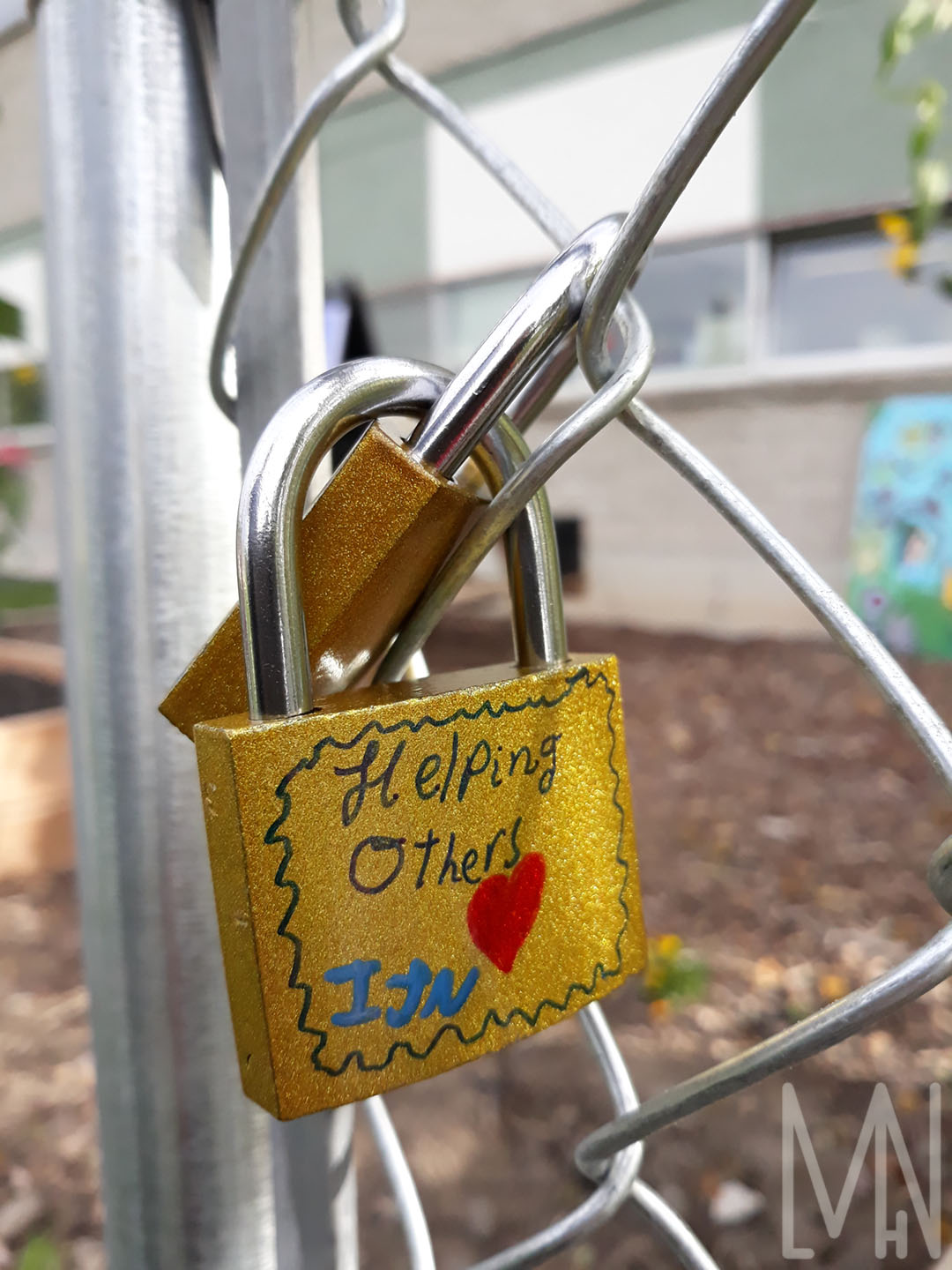
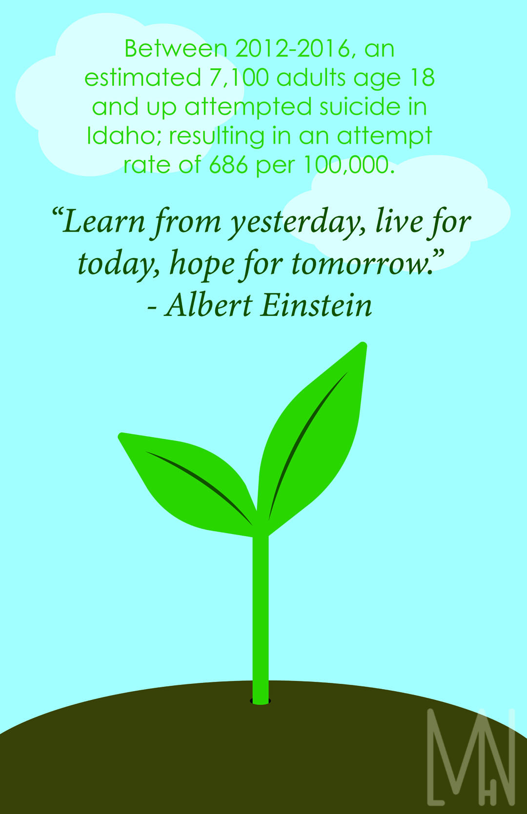
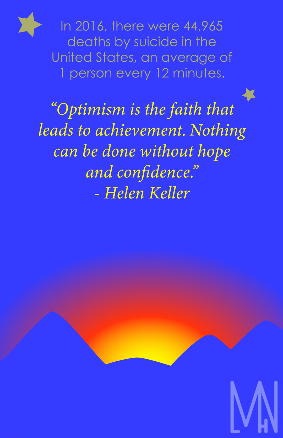
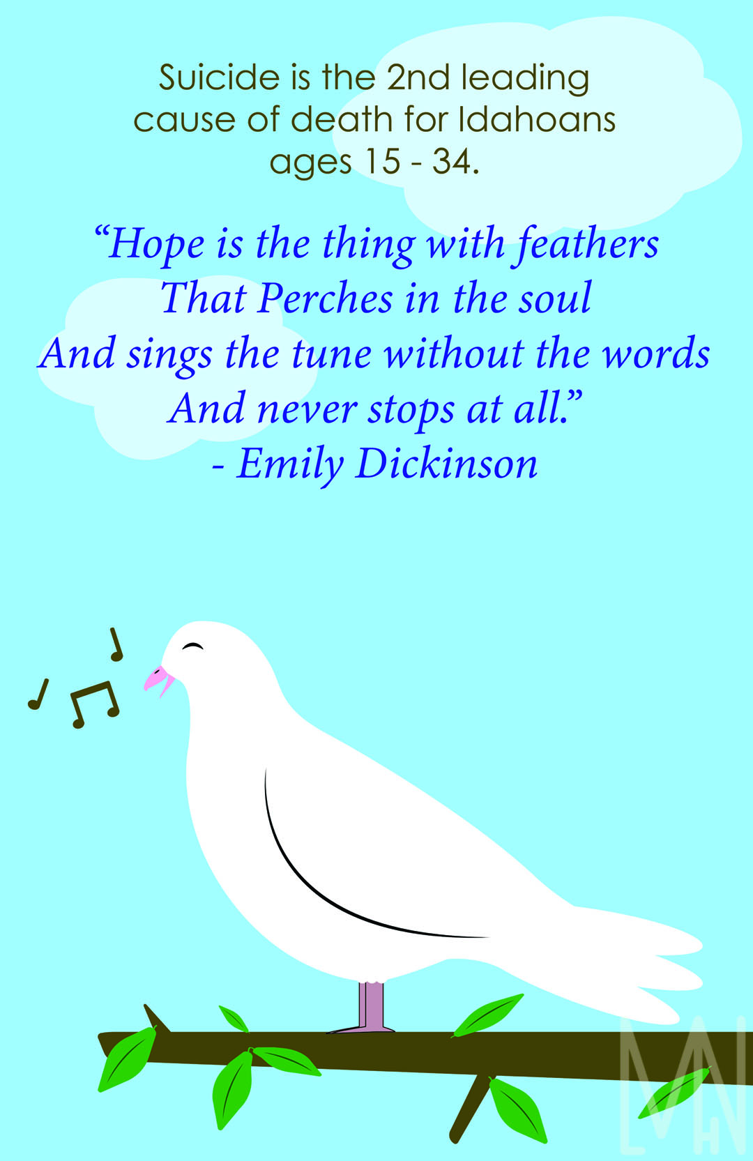
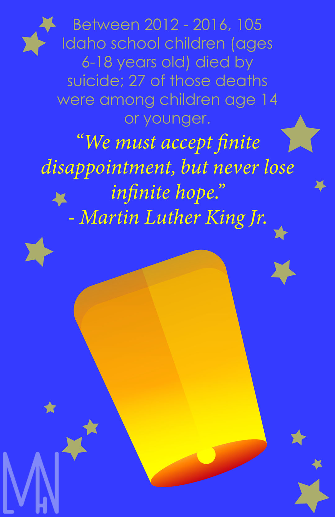
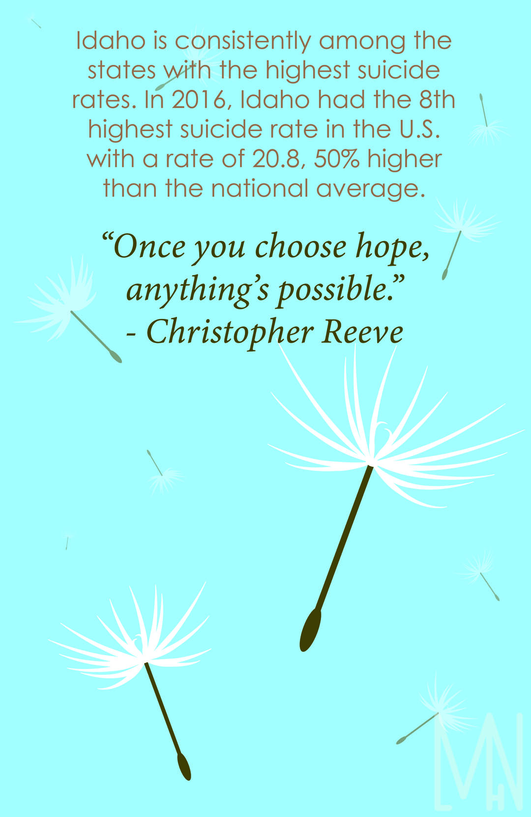
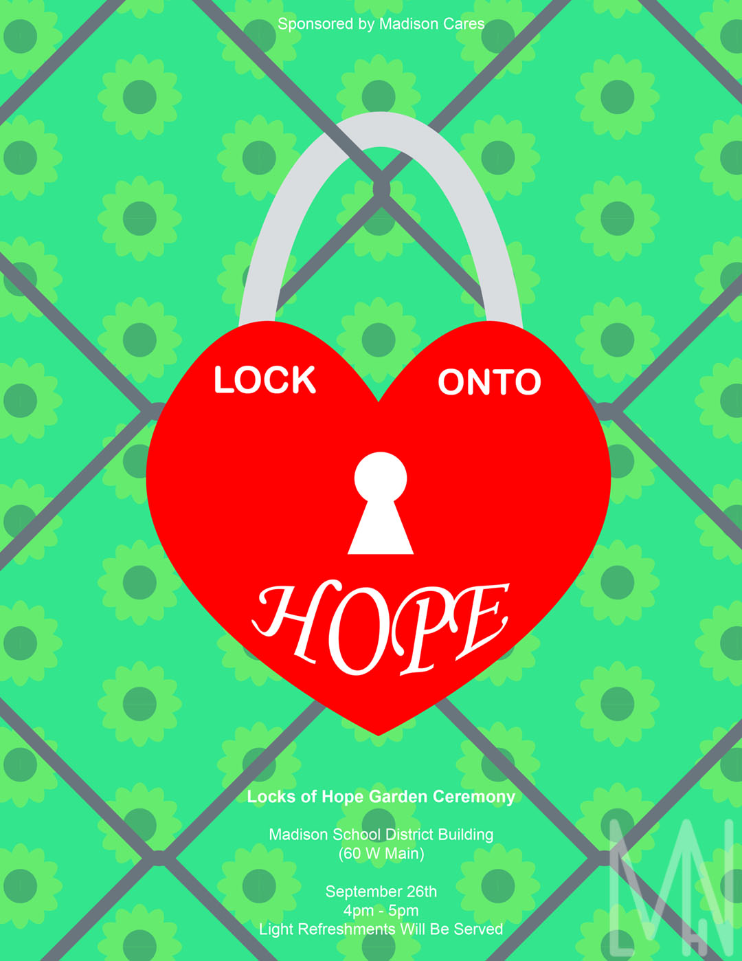
I’ve recently begun an internship with a non-profit organization called Madison Cares. They partner with Madison School District to provide mental health and family services/awareness to the community. I am an intern for the Marketing department and had the opportunity to design invitations and posters for the Hope Garden ceremony. Here, the community was invited to come write what gives them hope on the back of a lock, lock it onto the Hope Garden fence and throw away the key forever. My job in creating posters was to raise awareness of how common suicide is and what we can do to help prevent it.
I was first given facts and quotes that my team wanted me to base the posters around. I tried to pair up each quote and fact in a way that I felt best complimented each other. From there, I researched different symbols that represented hope. I came up with a plant beginning to grow, a sunrise, a dove (which represents both hope and peace), a lantern, and the seeds of a dandelion which are often associated with wishes. I wanted to keep the designs simple as to not take too much away from the main point of the quotes but recognizable enough that others would see and easily know what each object was.
For the invitation, I worked hard to make sure the invite would properly represent the importance of the event. I made the lock into a heart because I believe love and hope go hand in hand. I then created the fence behind it and created a sunflower pattern since all the flowers in our hope garden are sunflowers. This made the invitation feel bright and help others recognize the overall “feel” of the event.
The Hope Posters Printed
Hope Poster Designs
Hope Garden Lock Invitation
If you’d like to learn more about Madison Cares or The Hope Garden, you can visit http://www.mymadisoncares.com/ or visit The Hope Garden in person at 60 W Main St, Rexburg, ID 83440. The garden is behind this building just east of Broulim’s and west of the Public Library in town.
There are other hope gardens that people have built all over the world. Click here to see one made in Jamaica!
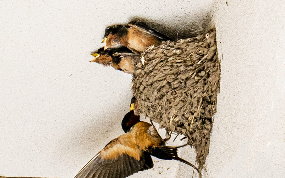
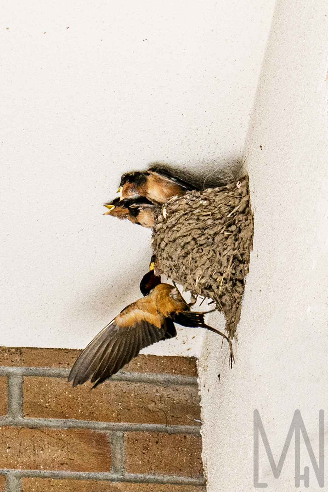
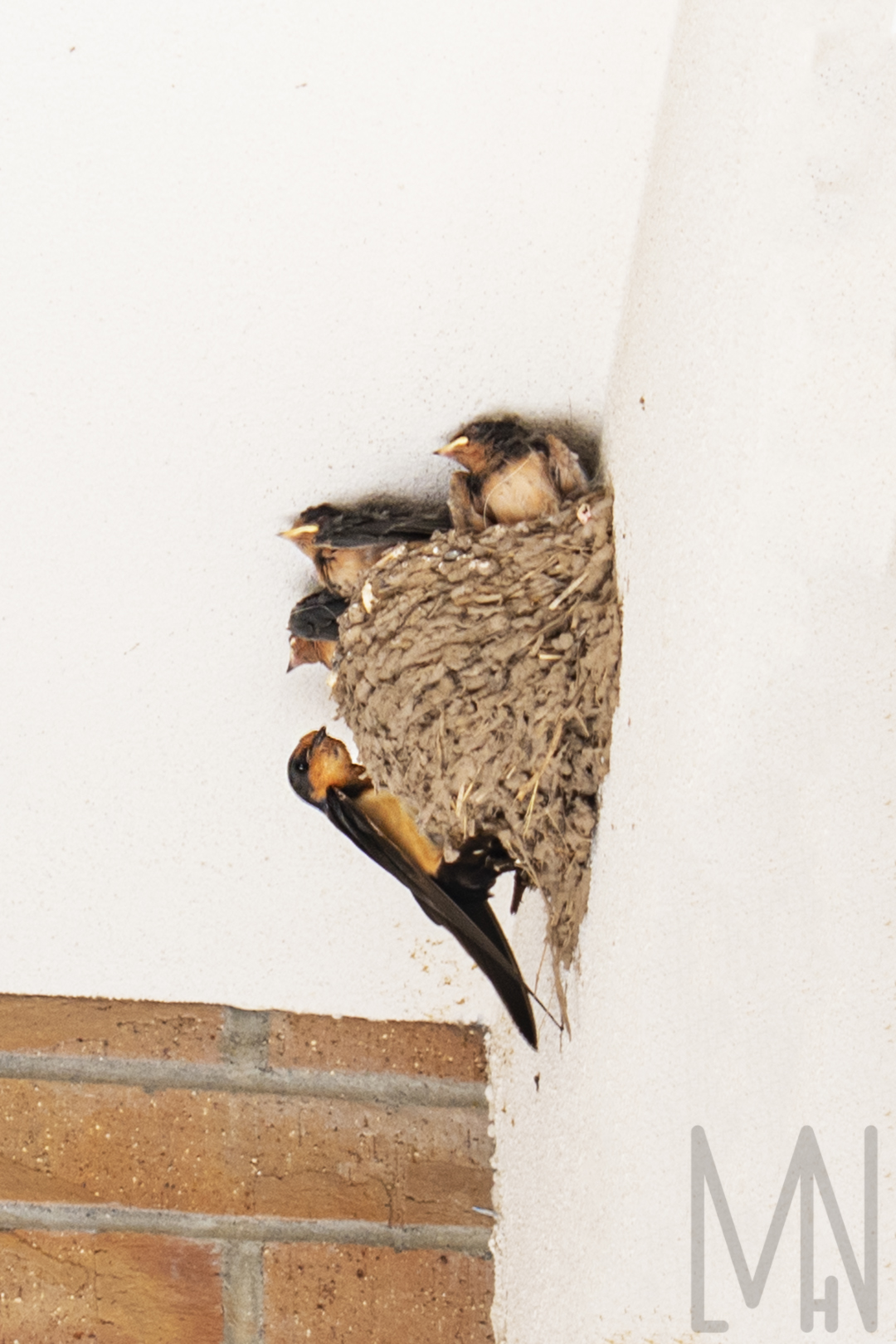
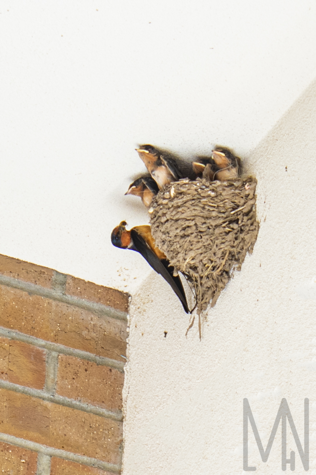
Baby Barn Swallows
Newborn Barn Swallows Aren’t Baby at All!
I was on my way to church one morning when I noticed something odd on the ground. It looked like a bunch of flower petals clustered together. Upon further examination, I discovered it was in fact, a ton of bird poop. Many of you may not know this, but if there is a great amount of bird poop on the ground, chances are, there’s a bird nest nearby. Sure enough, I looked up and discovered four little baby barn swallows! The funny thing was, these baby barn swallows weren’t baby at all! They were almost as big as their mother! I was fascinated by them but knew I couldn’t watch them with all these people around. It might disturb them. I came back a couple hours later after everyone had cleared out to capture these images. The amazing thing I discovered was both the mother and the father barn swallow were hunting down food for their babies. Barn swallows are confident birds and apparently work hard to care for their babies together. Barn swallows often mate for life making this small family of six, even more adorable. Baby barn swallows can often be found high off the ground away from predators. Barn swallows love to nest near bodies of water and are fairly adaptable birds. Next time you see signs of bird life, lift your head up and see if there’s a small family nesting above you!
Want to learn about raising baby barn swallows? Check out this page!
Best Portfolio Pieces April 2019 – July 2019
The Best Pieces in my Portfolio from April 2019-July 2019
My Personal Style can be hard to explain. Basically, I love being outdoors! My style involves capturing nature shots and wildlife shots. I love HDR (Bracketed) images and merging them together to create perfectly balanced/uniquely beautiful images. I enjoy portrait photography, product photography, and many other kinds of photography as well but my true passion is landscape and wildlife photography. Because of this, I believe a lot of my best work has come from photographing nature. My Comm 316 course (Professional Imaging) helped me discover this and now I’m doing what truly makes me happy. Check out the images below to see what I consider to be some of my best work! Feel free to comment your favorite and know that you can buy a lot of these prints through my online store.

Click here to learn more about setting up your online portfolio!
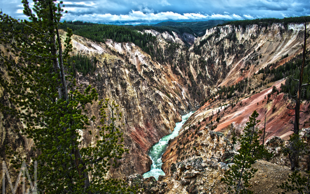
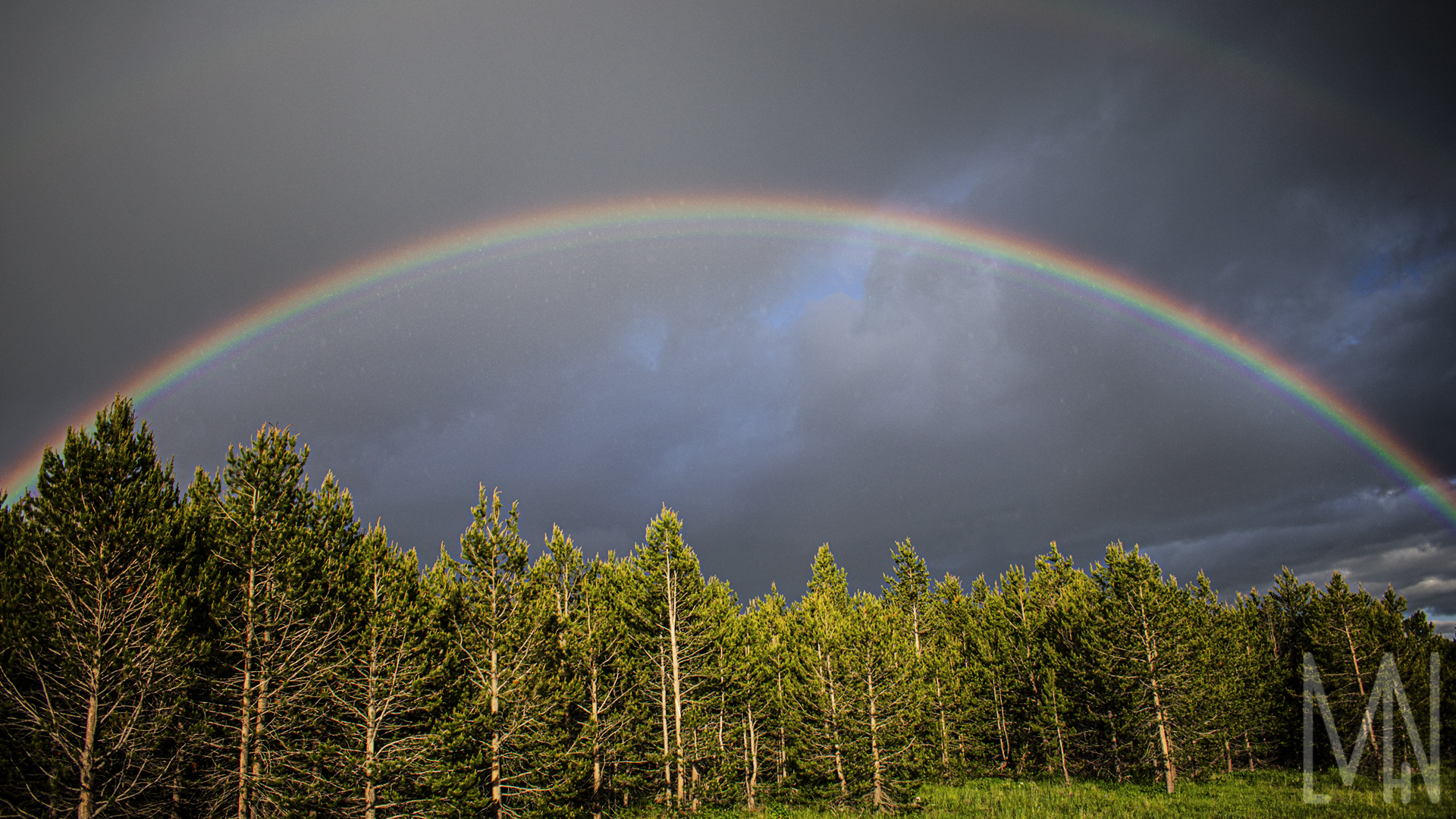
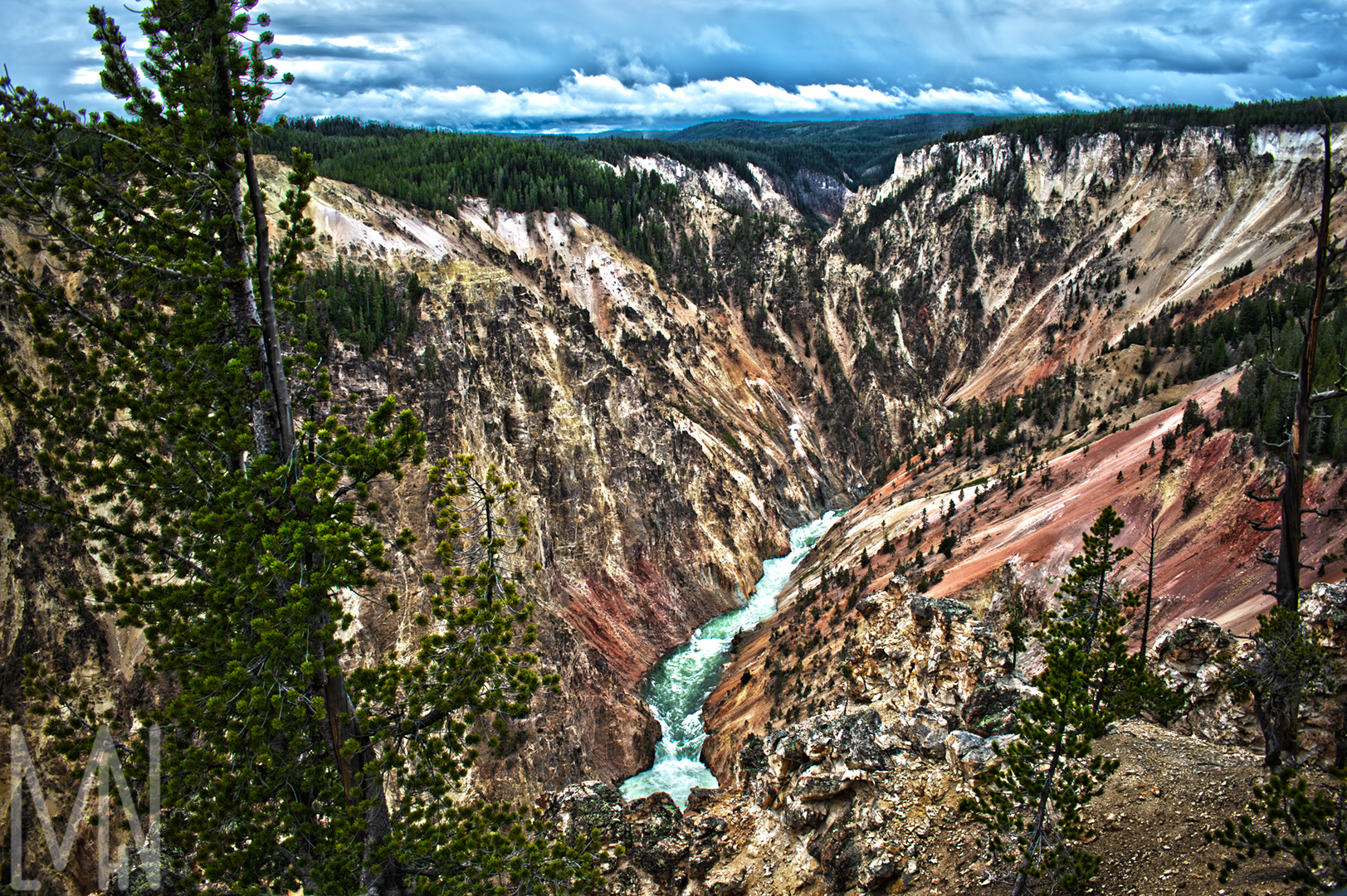
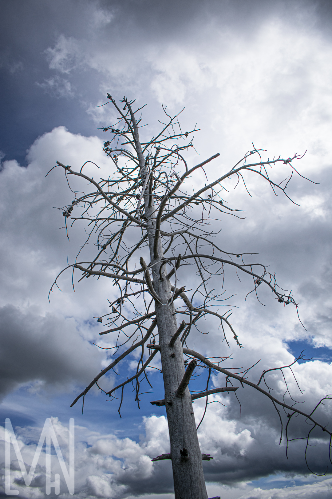
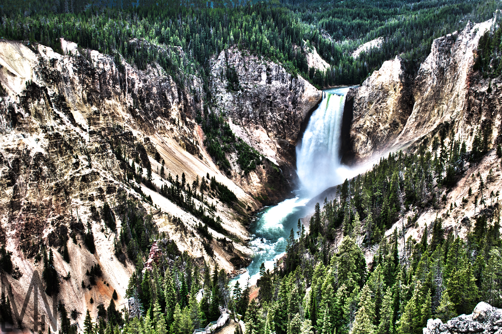
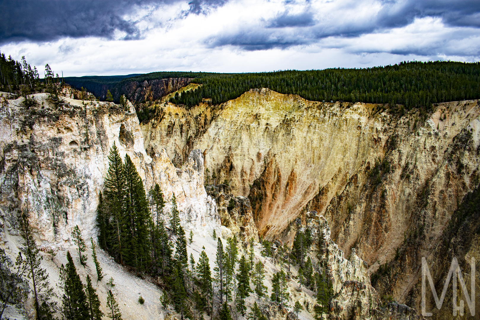
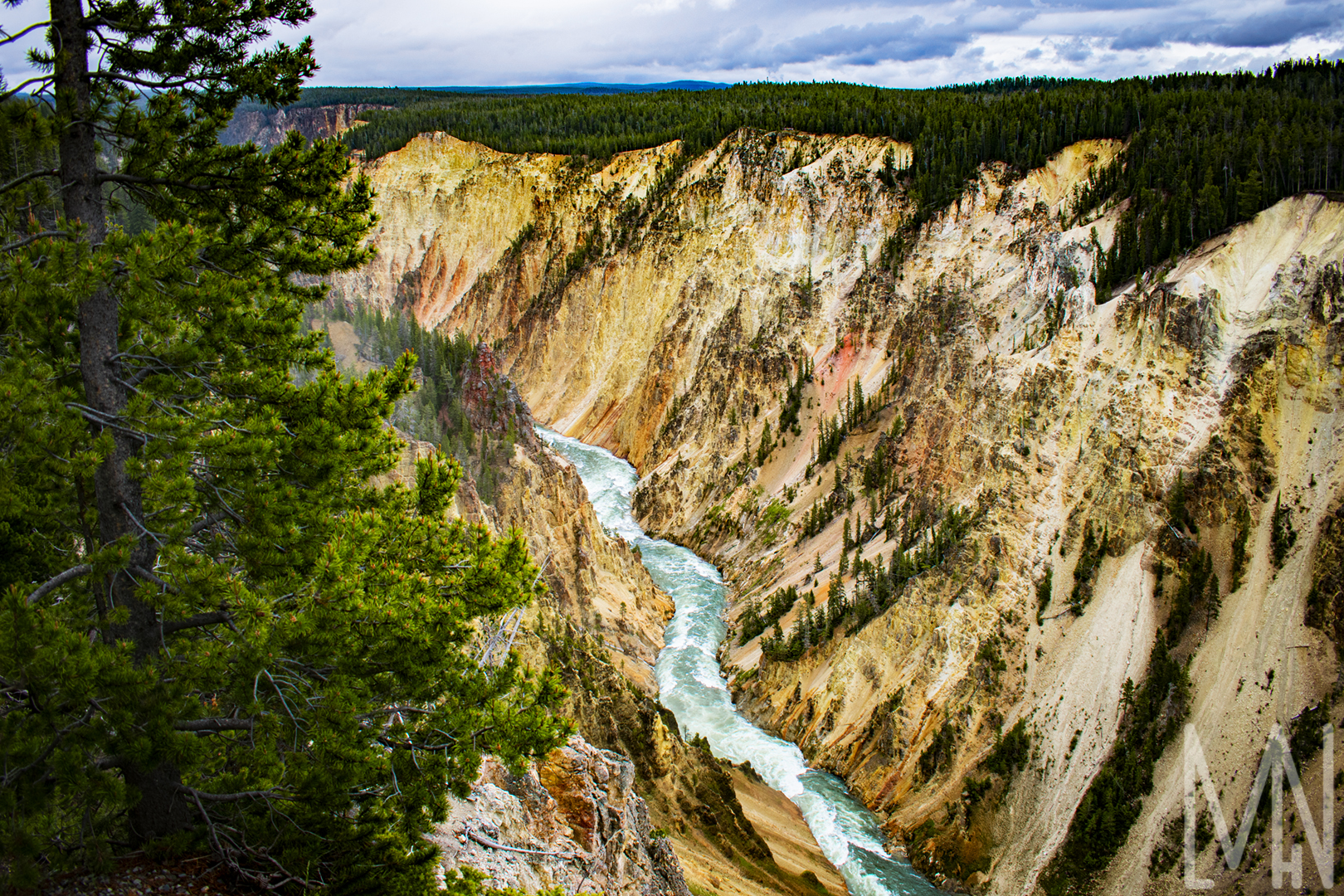
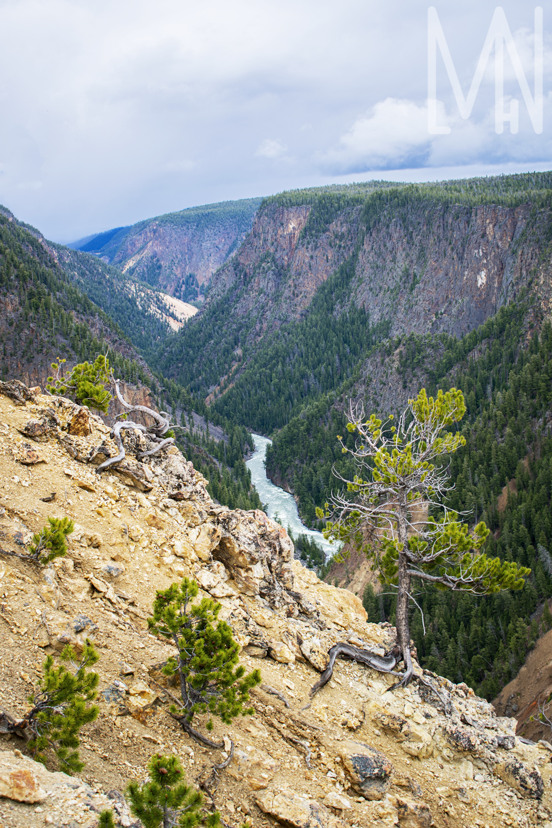
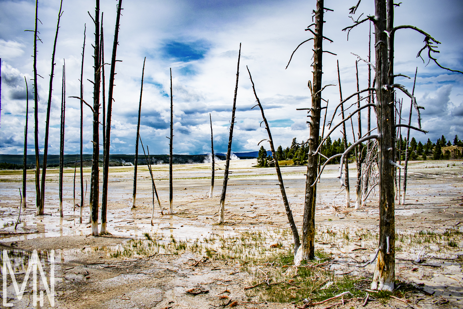
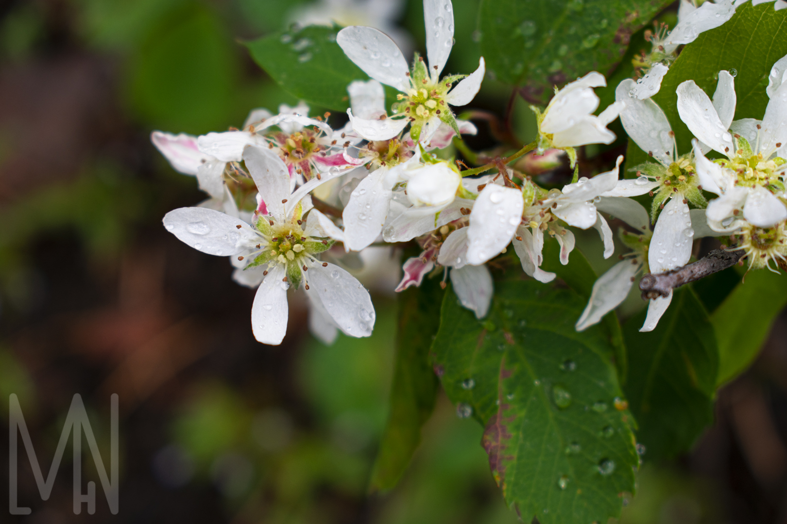
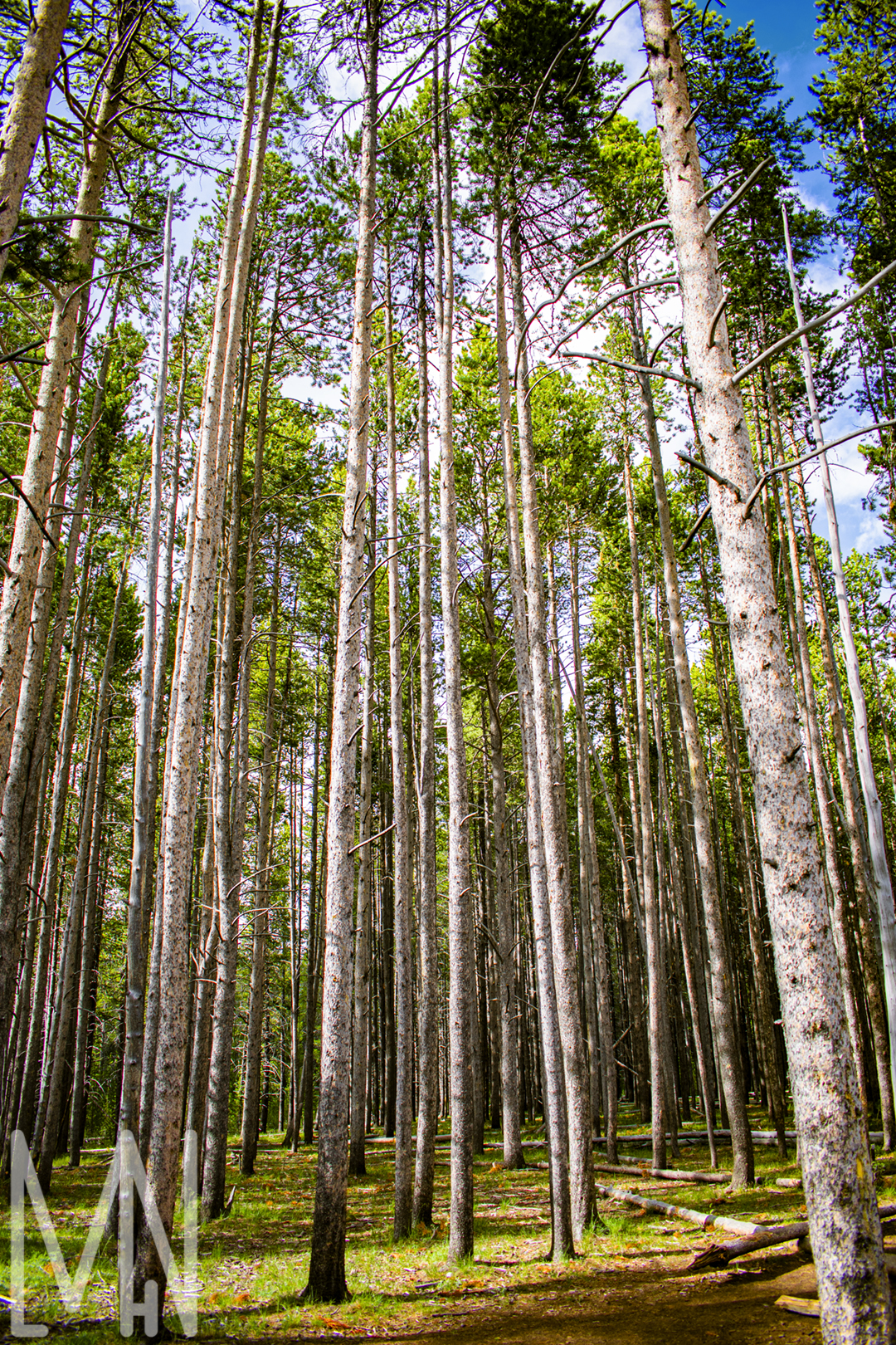
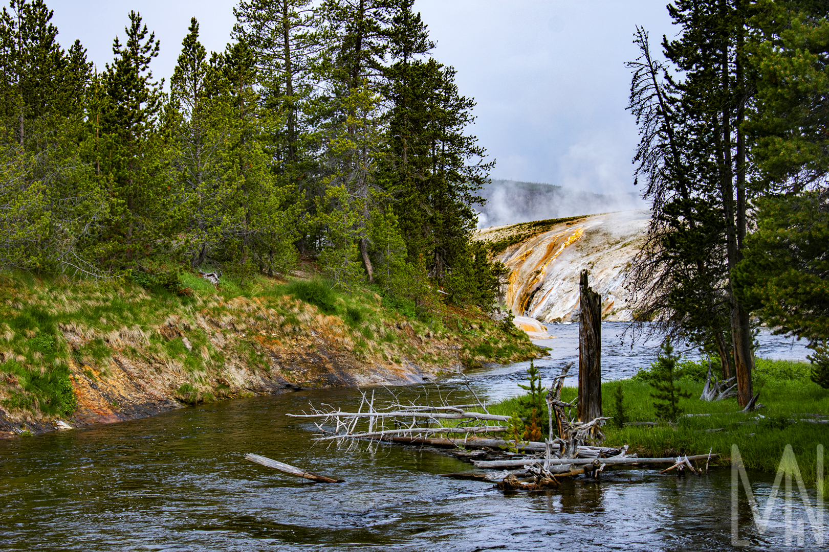
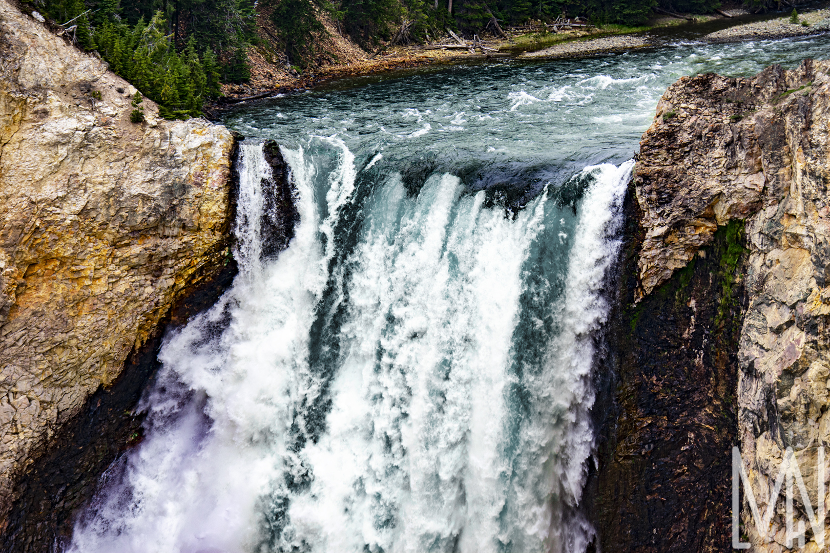
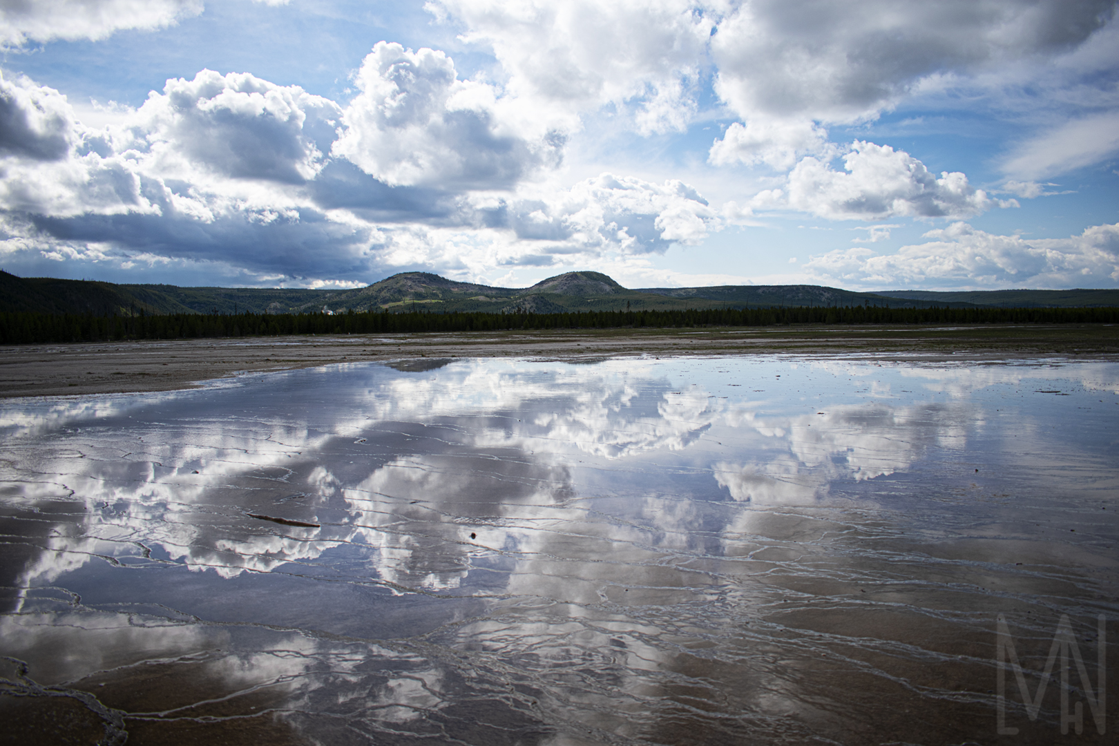
Yellowstone Landscapes and Plant Life
Landscapes and Plant Life in Yellowstone
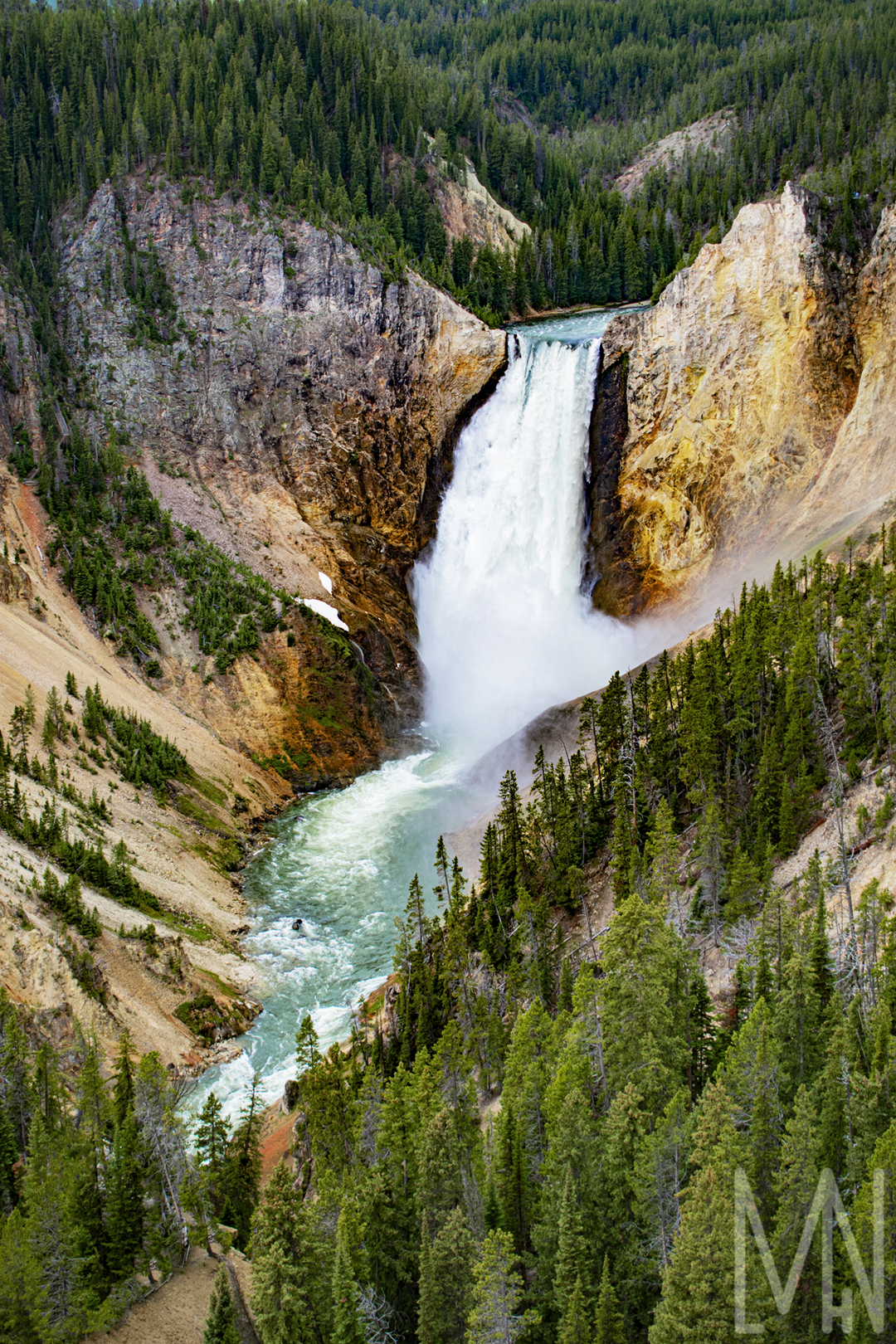
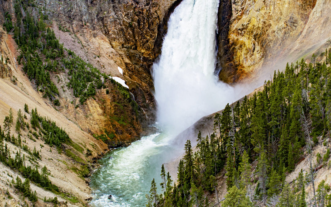
Part of my Personal Style Project was to capture and edit fantastic images in Yellowstone National Park. I was unable to put all of my images in one blog post so I’m dividing them up into sections. All of these landscapes and plant life shots include images not involving many hot pools or geysers. If you’re looking for Hot Pools and Geysers, click here! This series captures more of the natural beauty created by the Yellowstone River and amazing/unique plant life in the park. Some of the trees you’ll see below look almost petrified. From all the hot water and minerals in the ground, many of them died from the powerful hot pools. On the other hand, you’ll find many trees and flowers thriving elsewhere from the rich, volcanic soil. Yellowstone is a rare piece of Earth where you can find mysterious/scientific occurrences. If you haven’t been to Yellowstone, it’s important that you visit Yellowstone Canyon. They call it, “The Grand Canyon of Yellowstone”. Quite fitting given it’s tremendous depth and color. The waterfall is quite spectacular too. I managed to get a close up shot of it with my telephoto lens. Go ahead and take a look below at the lovely scenery! Don’t forget to comment your favorite photo!
If you’d like to learn more about my personal style project, click here!
If you’d like to purchase a print of one of these images, click here!
Want to see more landscape shots from Yellowstone? My Yellowstone Park has some fantastic images! View them here.
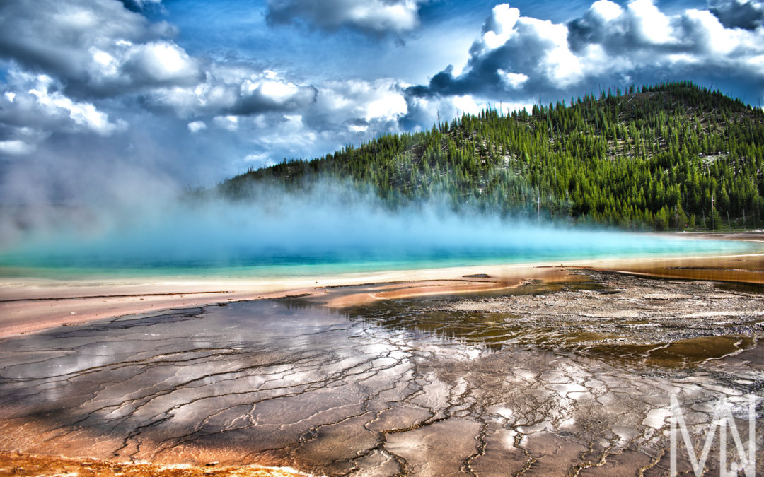
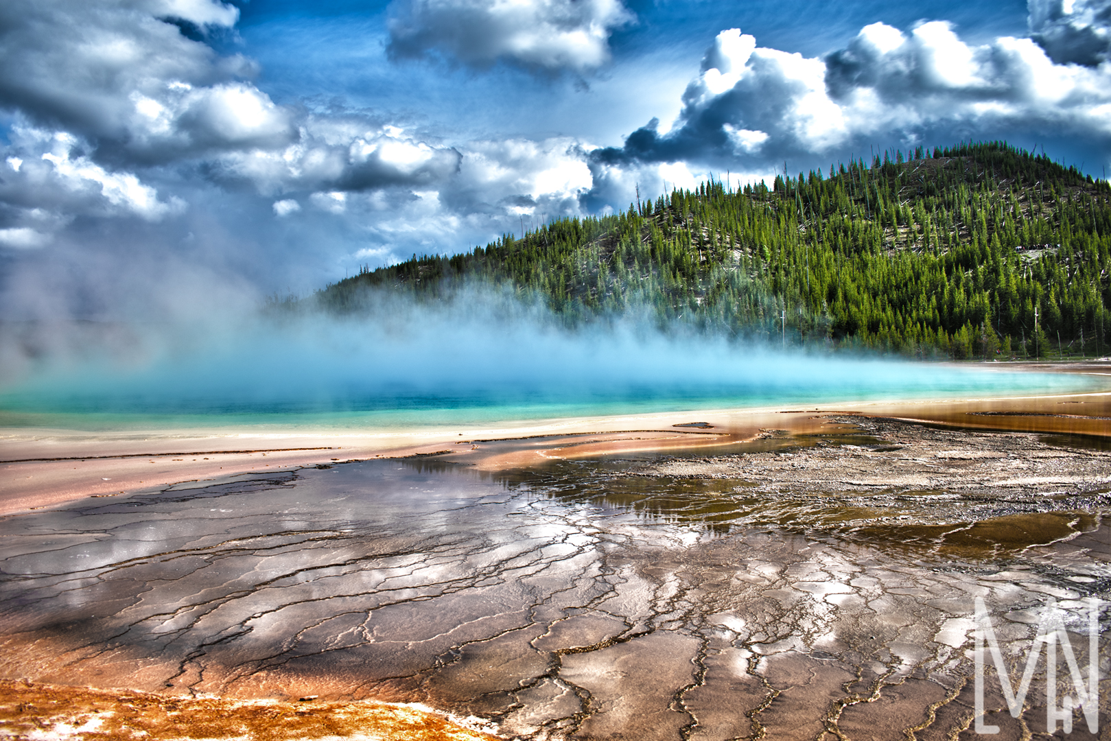
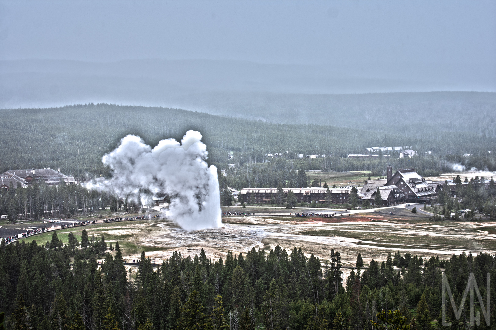
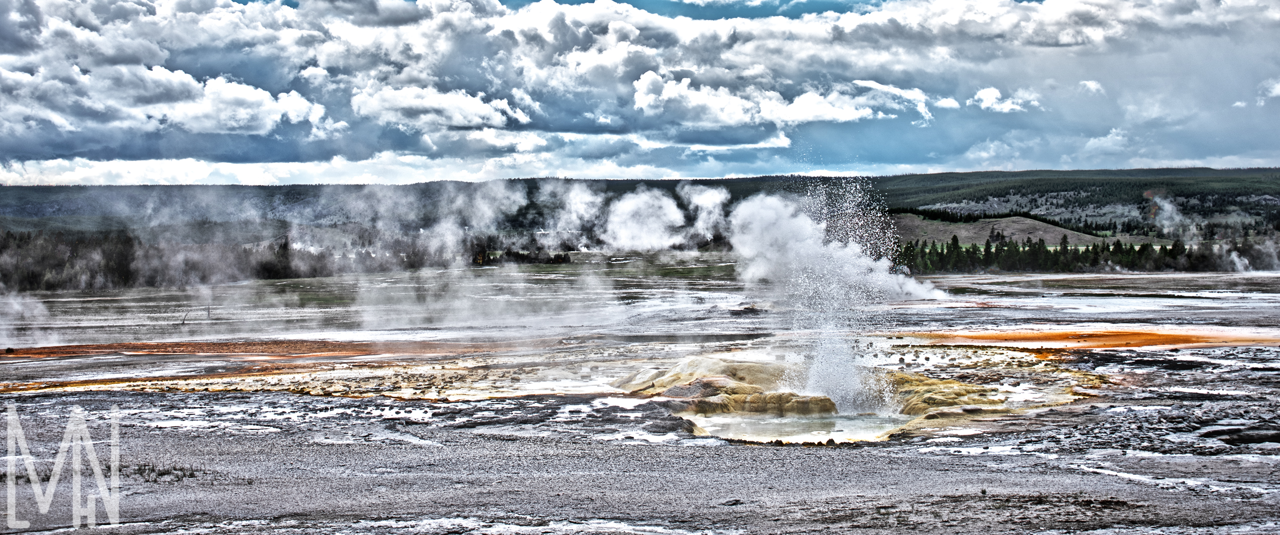
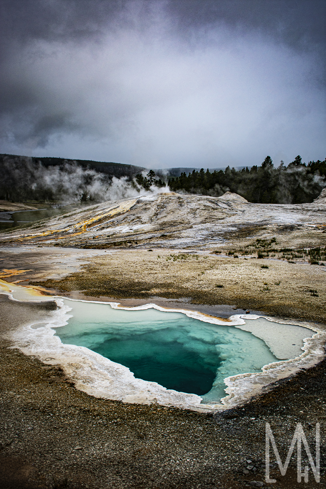
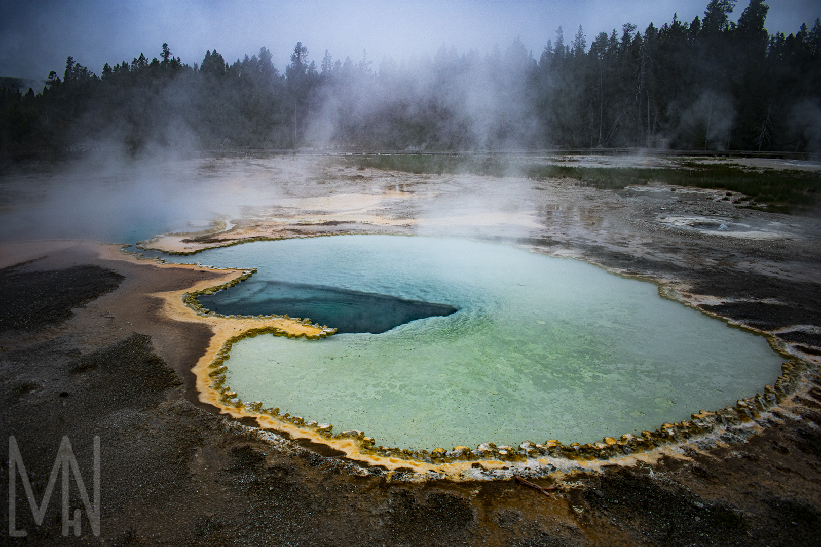
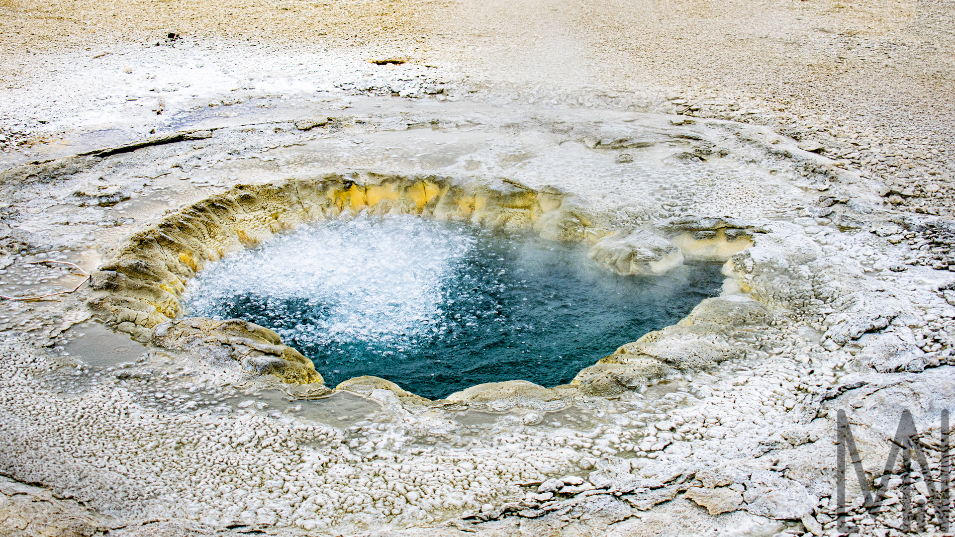
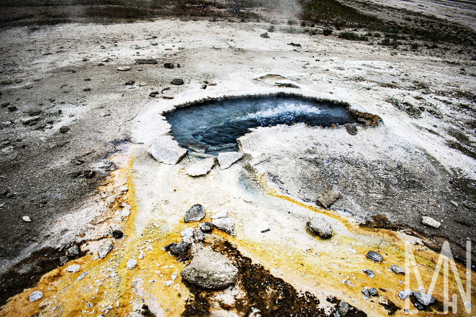
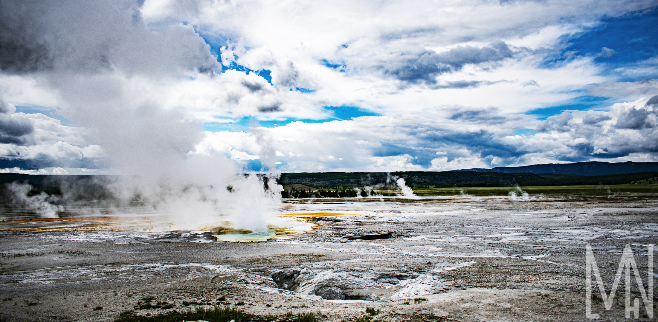
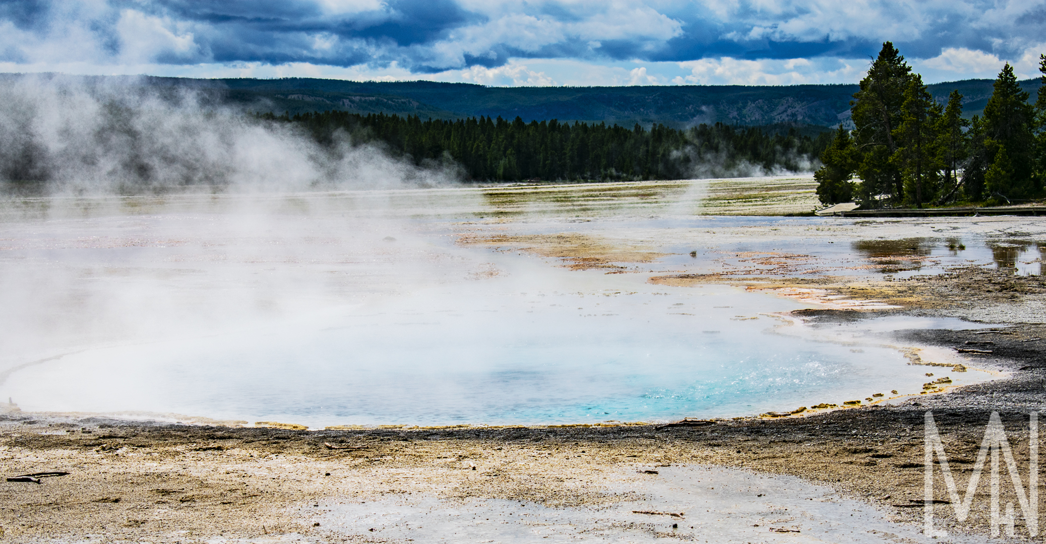
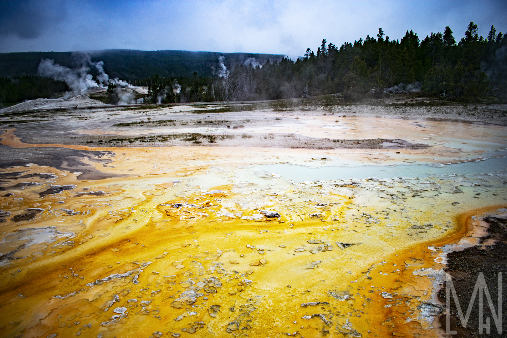
Yellowstone Hot Pools and Geysers
Hot Pools and Geysers in Yellowstone
Part of my Personal Style Project was to capture and edit fantastic images in Yellowstone National Park. I was unable to put all of my images in one blog post so I’m dividing them up into sections. Viewing the fantastic geysers and hot pools in Yellowstone National Park is simply amazing. I heard someone once say, “This is where you can feel the beating heart of the planet and gaze into it’s eye”. The variety and uniqueness of pools mere inches from each other were astounding to capture. It was really cloudy and a bit snowy when I visited the park so I really tried to bring out the colors in these images. The human eye can often see far more than a camera lens but by shooting in RAW and carefully editing in Photoshop, you’ll find you can get pretty close if not exactly accurate to what the subject looks like in real life. Please peruse and look through the images below! Comment your favorite image!
If you’d like to learn more about my personal style project, click here!
If you’d like to purchase a print of one of these images, click here!
Want to see more of Yellowstone’s hot pools and geysers? Check out My Yellowstone Park’s site here!
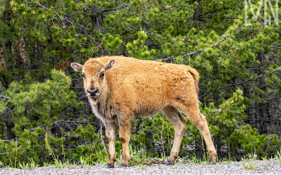
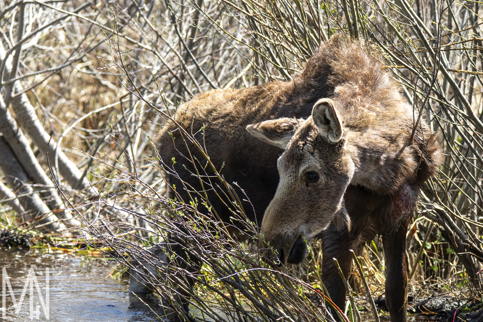
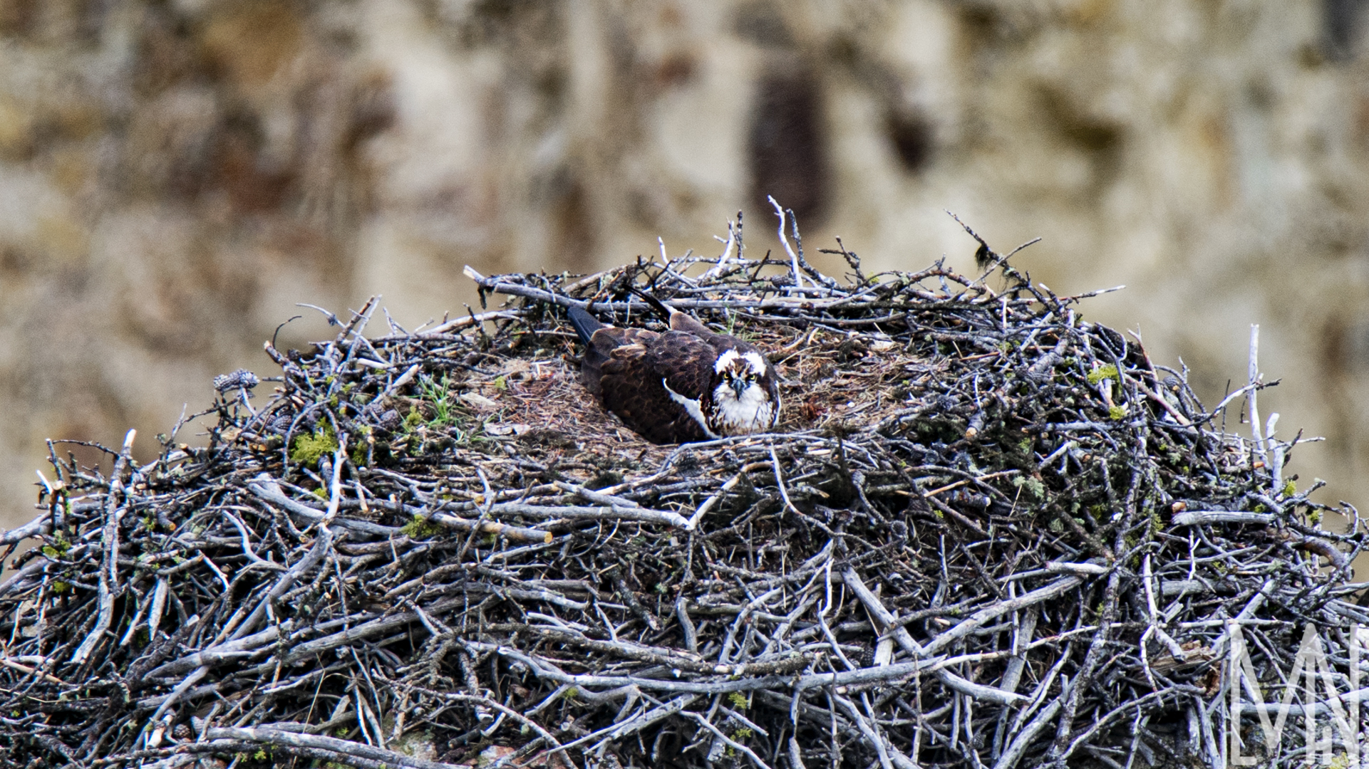
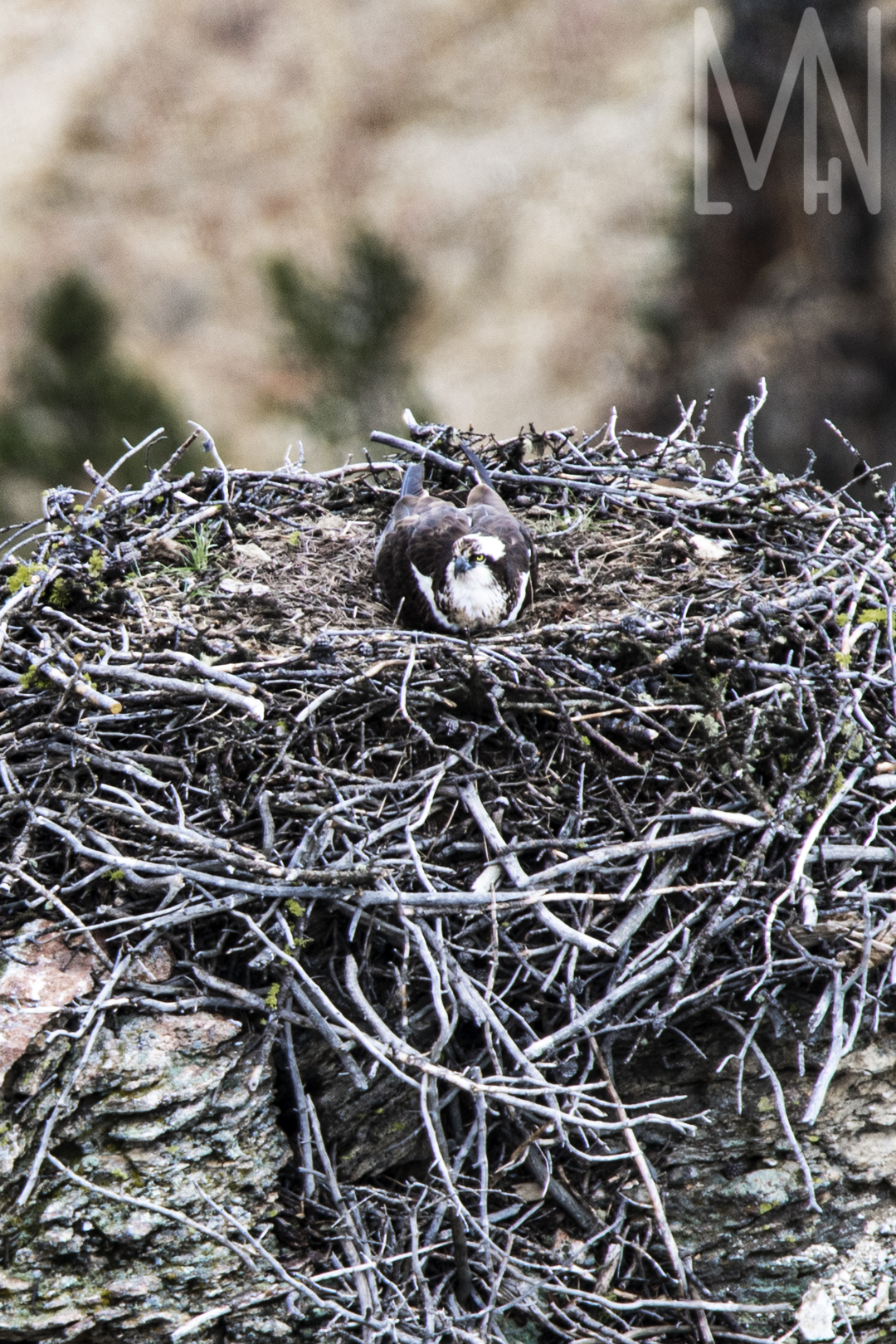
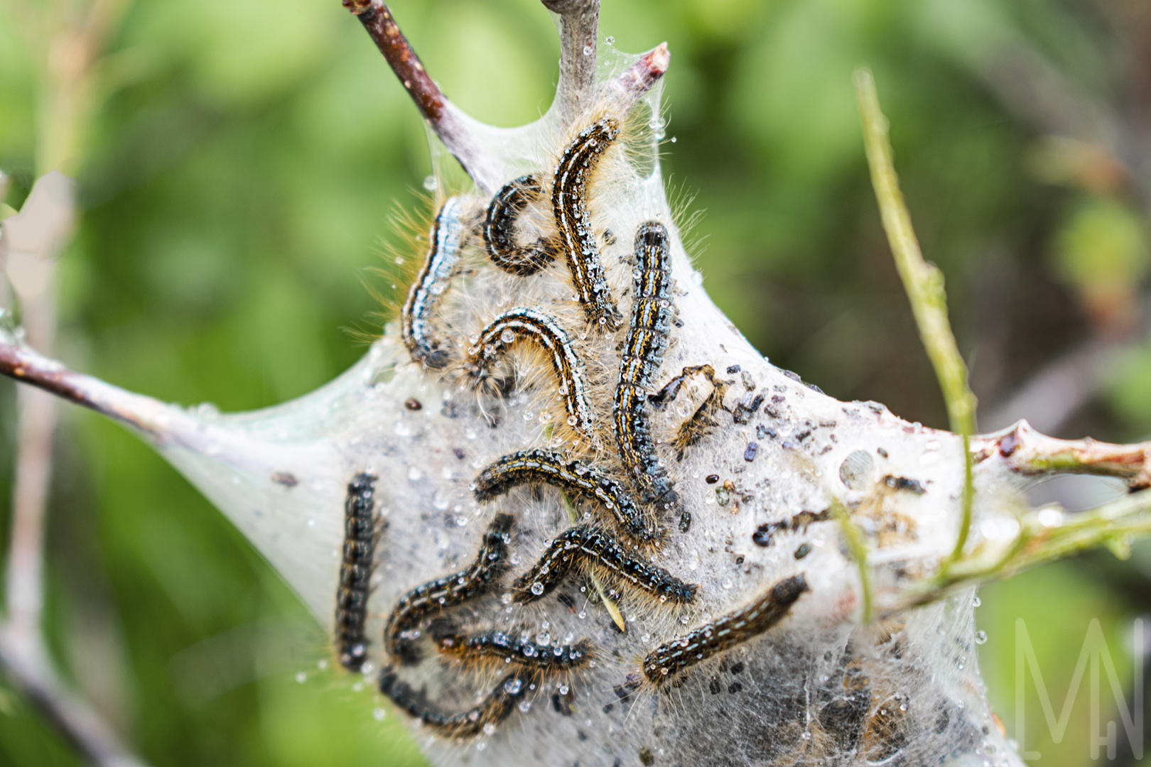
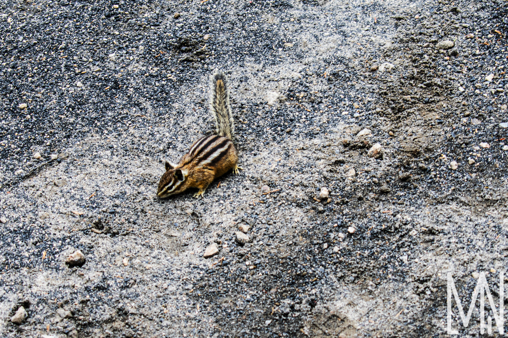
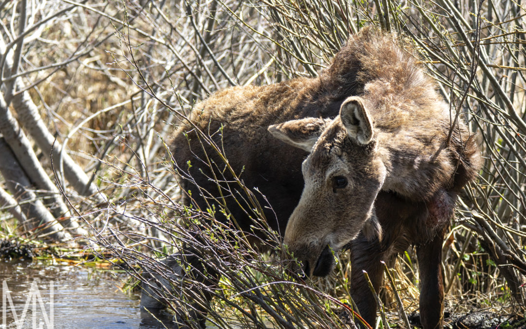
Yellowstone Wildlife
Photographing Wildlife in Yellowstone
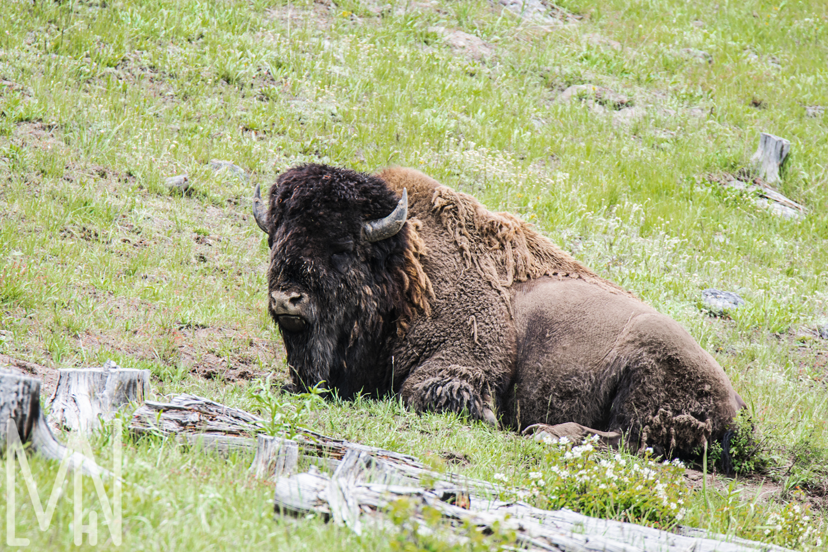
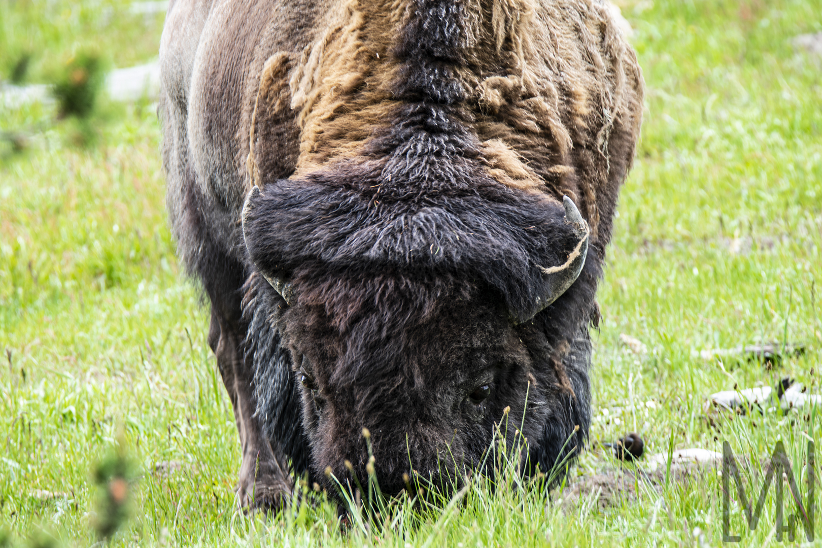
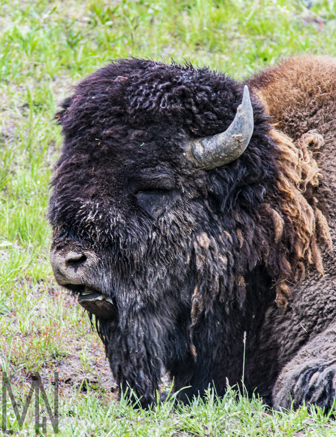
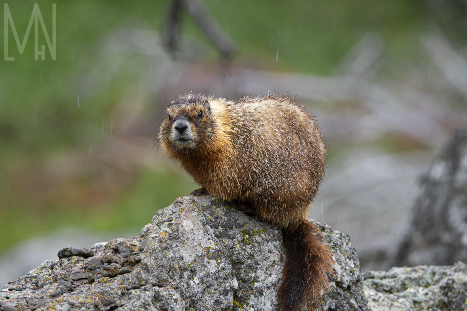
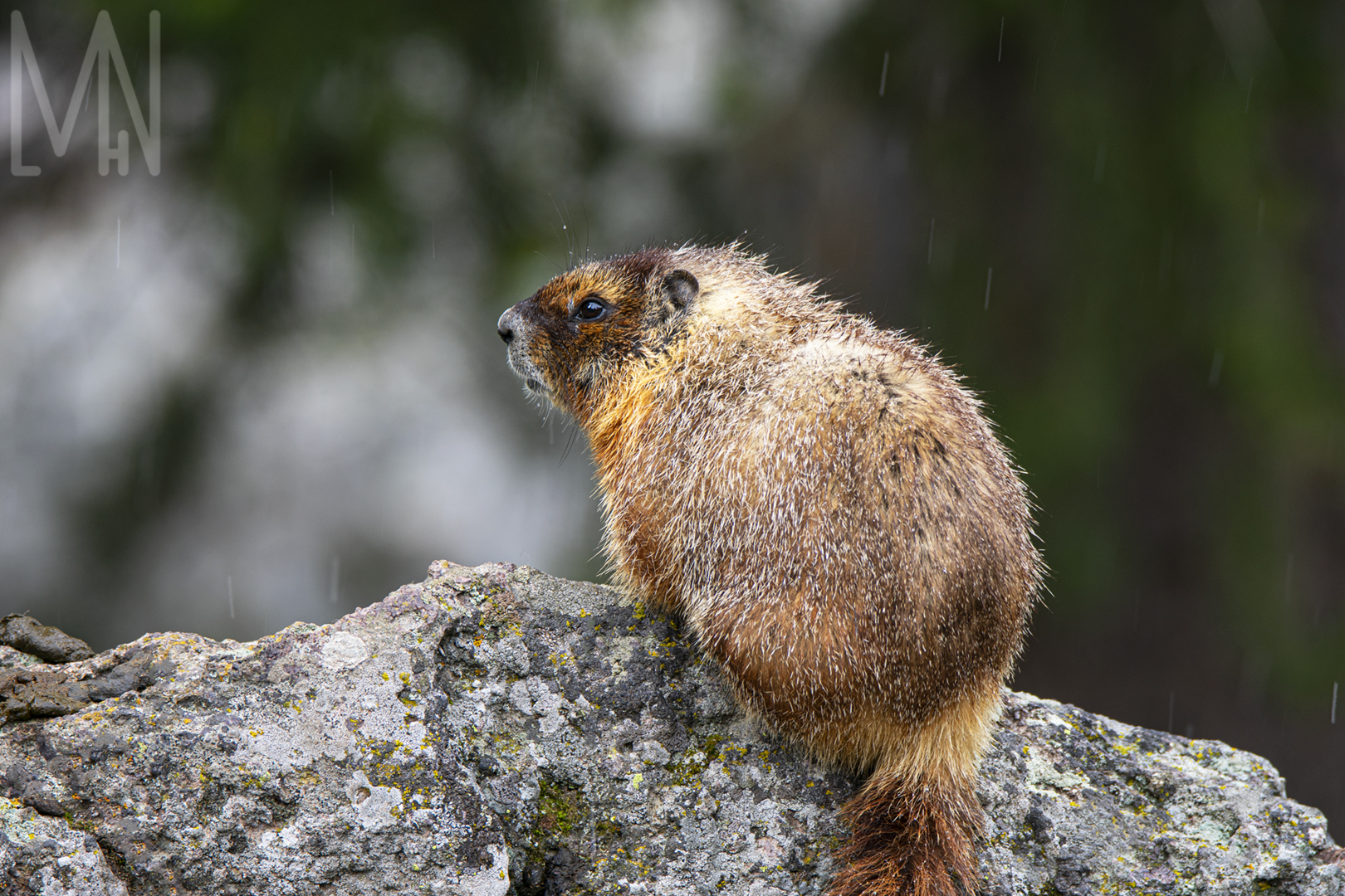
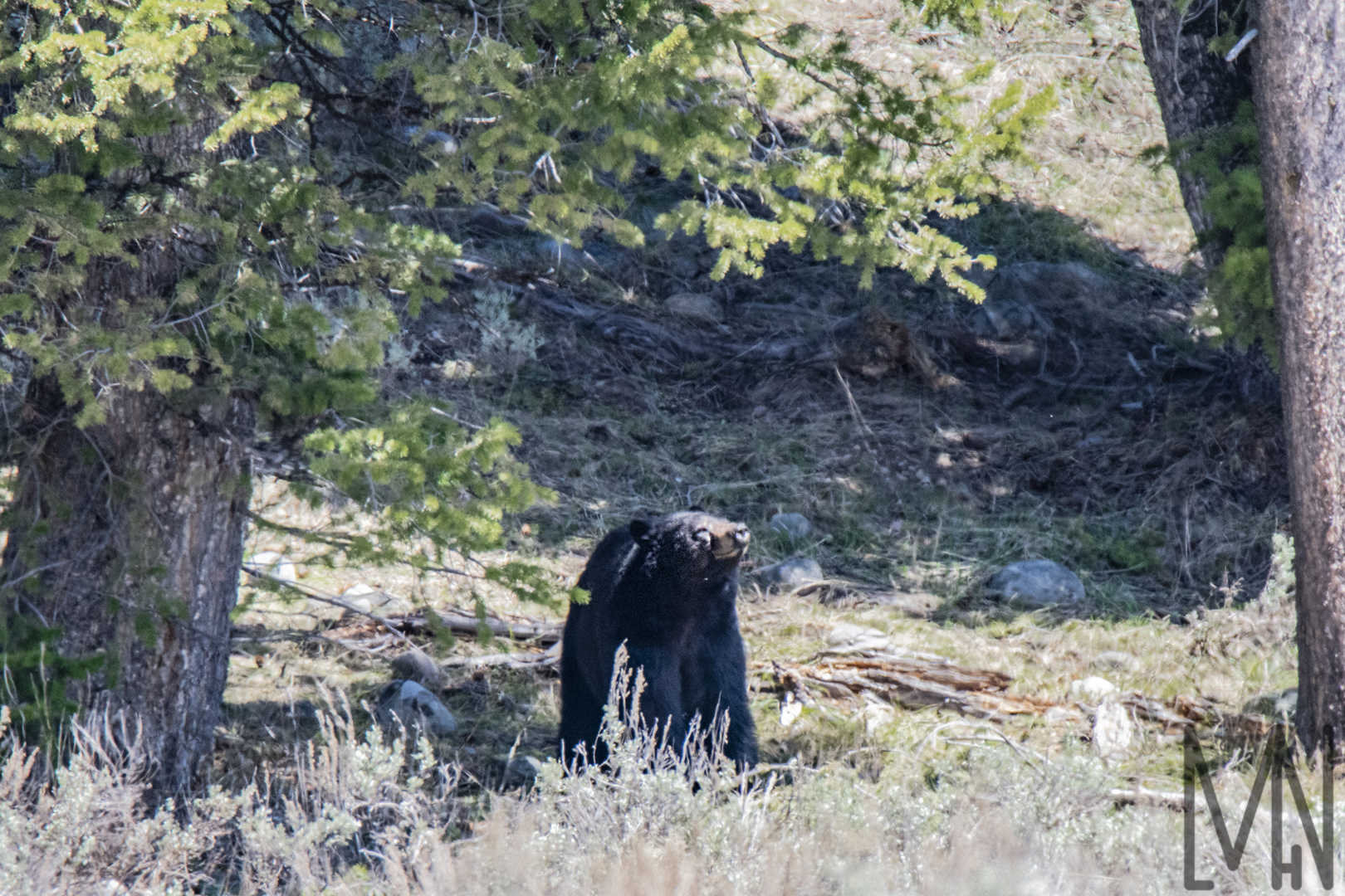
Part of my Personal Style Project was to capture and edit fantastic images in Yellowstone National Park. I was unable to put all of my images in one blog post so I’m dividing them up into sections. Most of these images were taken with a Telephoto lens which allowed me to get up close without actually getting up close. Photographing wildlife can be dangerous so be sure to stay a safe distance away while photographing them. Most of my pictures are of the highly photogenic Buffalo. However, I also managed to capture some unique images of a mama Osprey on her nest in Yellowstone Canyon and a nest of adorable caterpillars. A Marmot (also known as a Whistle Pig) also made a quick appearance during a light rain shower. You never know what you’re going to find when you visit Yellowstone. You’ll be amazed at the animals that can sometimes just pop up out of nowhere! Have a look below and comment your favorite wildlife picture!
If you’d like to learn more about my personal style project, click here!
If you’d like to purchase a print of one of these images, click here!
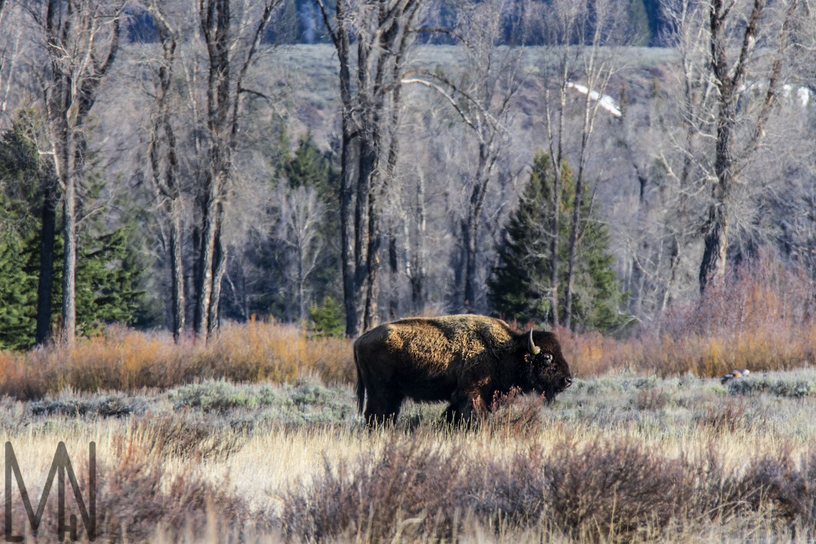
Bison/Buffalo
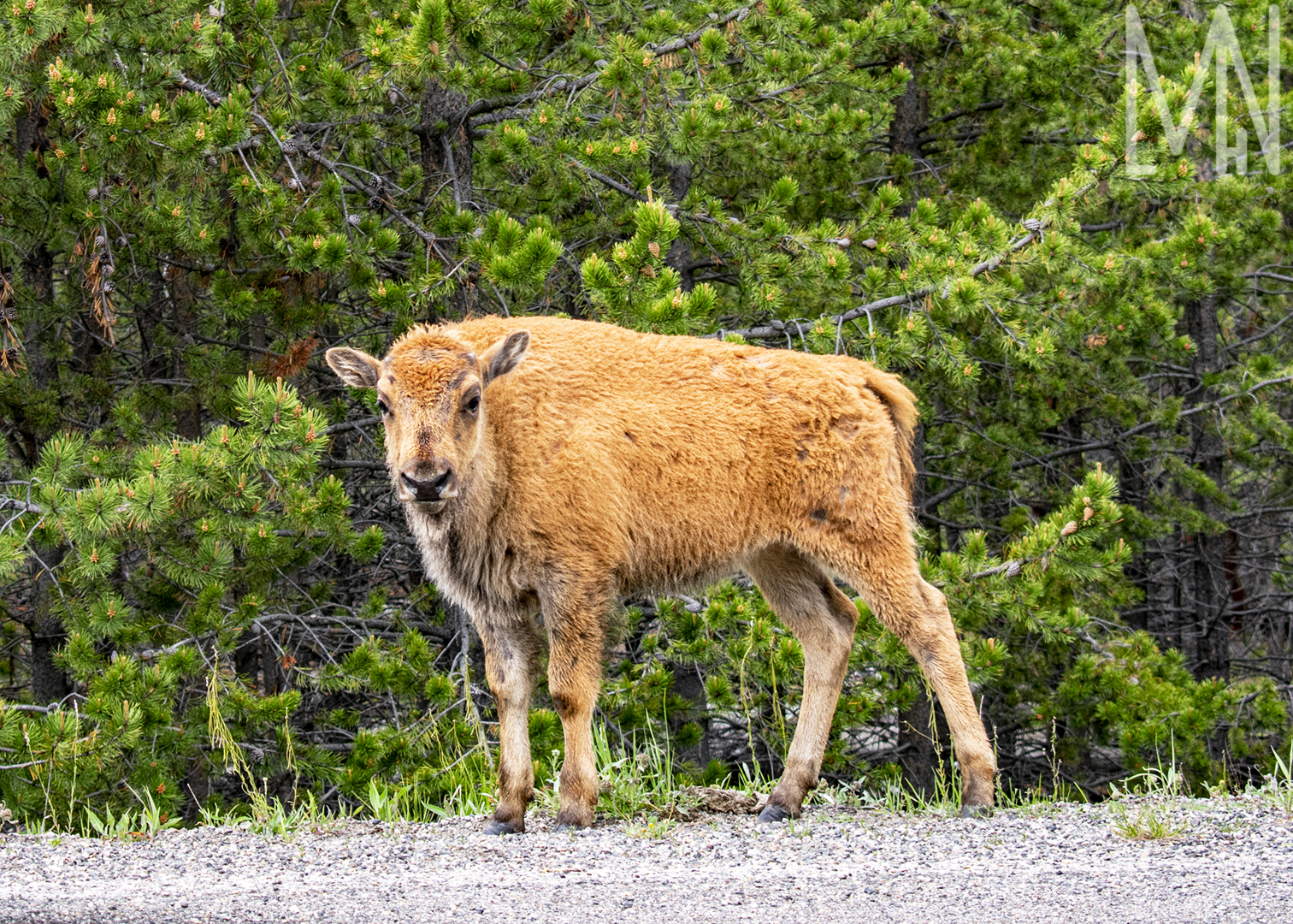
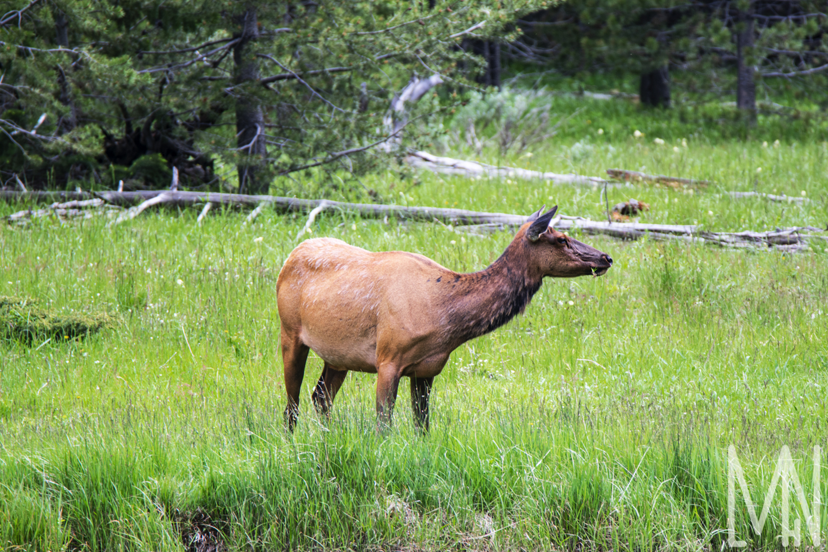
Cow Elk (Female Elk)
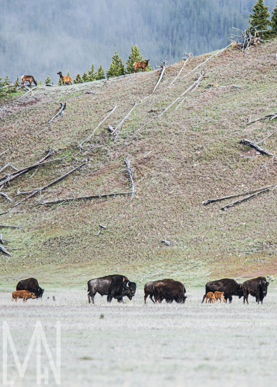
Elk and Buffalo!
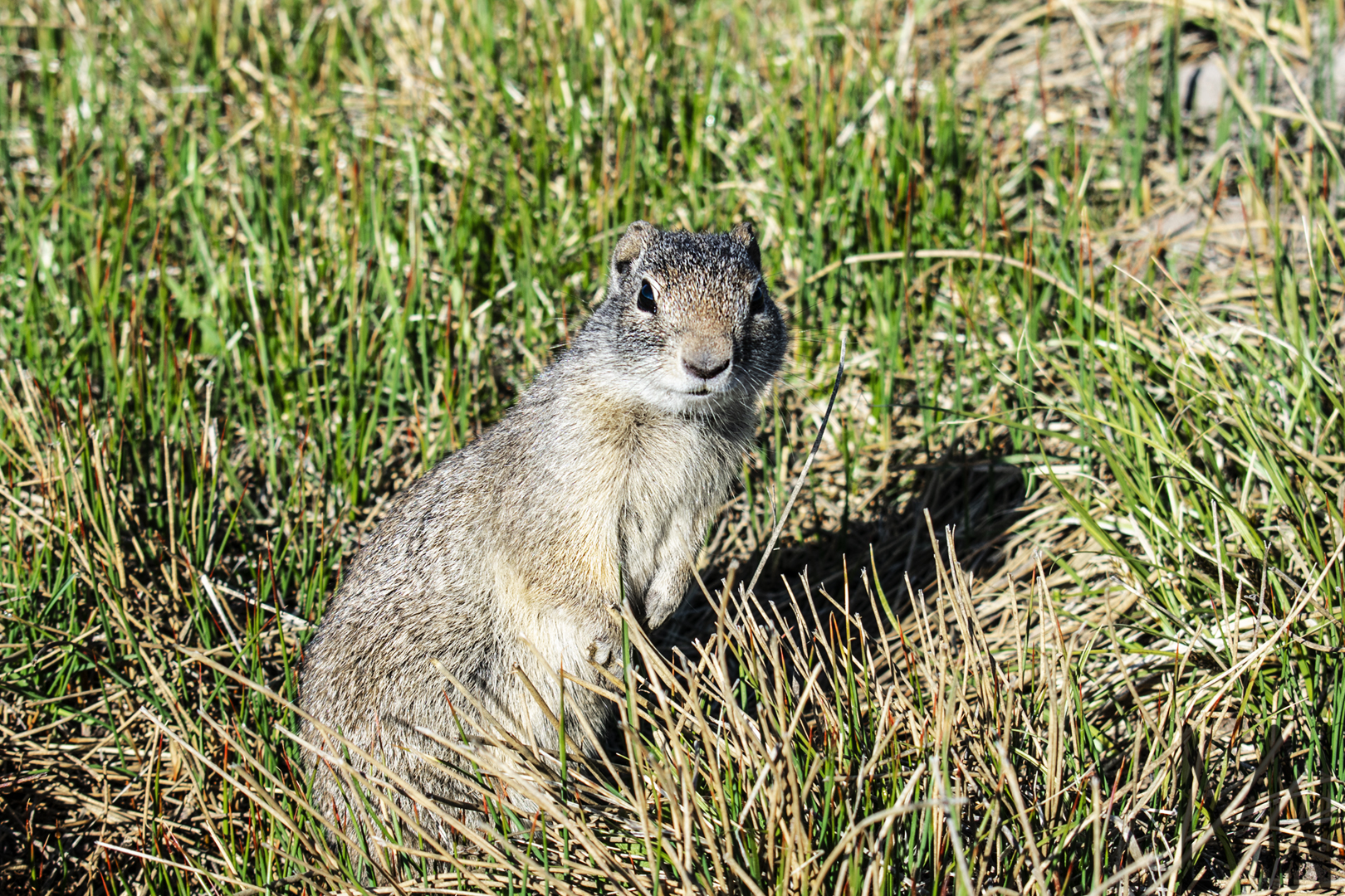
Marmot/Whistle Pig
Osprey
Caterpillars
Chipmunk
Want to see more wildlife pictures in Yellowstone? Check out Cool Green Science’s page here!
Personal Style Project: Yellowstone National Park
My Personal Style Project
John Muir once said, “Everybody needs beauty as well as bread, places to play in and pray in, where nature may heal and give strength to body and soul.” John Muir was a great activist for the National Parks and worked with the 26th President of the United States, Theodore Roosevelt, to establish these beautiful, nature filled parks.
If I could work anywhere for anyone, I would love to be an advocate for the National Parks and help them with photography, social media, promotions, advertisements, etc. This is why, for my personal style project, I chose to visit Yellowstone National Park, capture around 35 fantastic images, beautifully edit them, and place prints of them for sale on my website for all to purchase and enjoy.
Not everyone has the opportunity to explore these parks. This is a way I can bring these nature havens to all and show The National Park Service what I can do.
The most beneficial thing I learned from this project, and from the class that taught me a lot of these skills, is that you have to follow your passion. For a long time, I thought I would be stuck having to capture portraits of others in order to make money. While I do greatly enjoy portrait photography, it’s never been my true passion. I love being outside in the wilderness, capturing images of wildlife and unique landscapes. These last few months have given me the tools to better pursue that dream and I believe I can be successful one day because of it.
Theodore Roosevelt said, “Far better it is to dare mighty things, to win glorious triumphs, even though checkered by failure, than to take rank with those poor spirits who neither enjoy much nor suffer much, because they live in the gray twilight that knows neither victory nor defeat.” This path in nature and wildlife photography is one I want to pursue. It may be a career I try and fail at but if I never try, I will never know if I could have succeeded. Where ever this path takes me, I intend to walk it ’till the bitter end. Triumph or fail, I know it will make me better, stronger, and more than I could ever be standing still.
Personal Project Photos and Prints
Below are a few examples of the work I did on this personal project excursion to Yellowstone National Park. If you’d like to see more, please visit https://mlhnphotography.com/shop to view my prints and to support me as I pursue my dream!
Not all images I took are included in this blog post.
To view all Wildlife photos, click here!
To view all Hot Pool and Geyser photos, click here!
To view all Landscape and Plant Life photos, click here!
Website Shop Photos
A Few Yellowstone Photos From My Personal Style Project
Want to visit the park? Check out info on visiting from Travel Wyoming here!
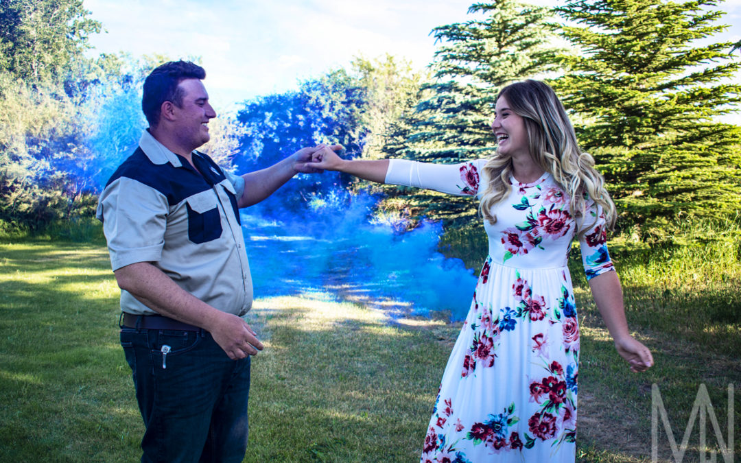
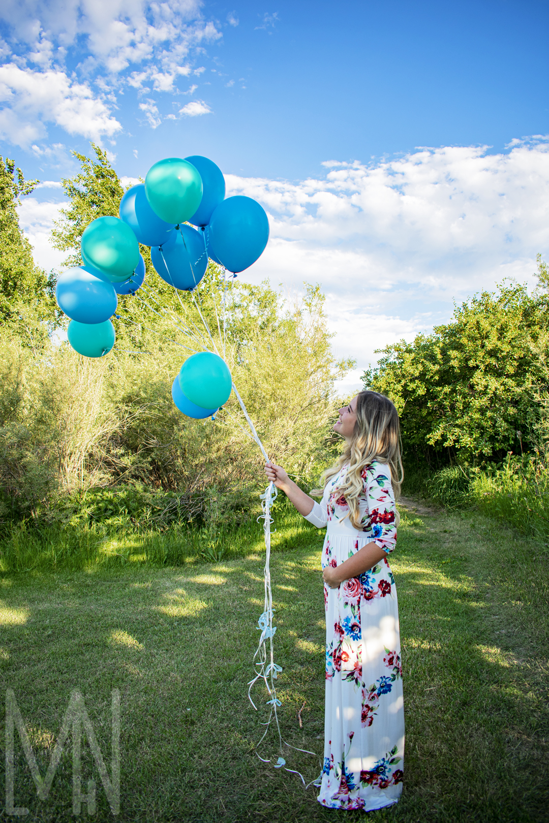
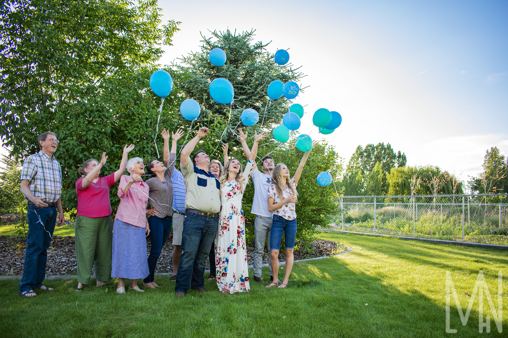
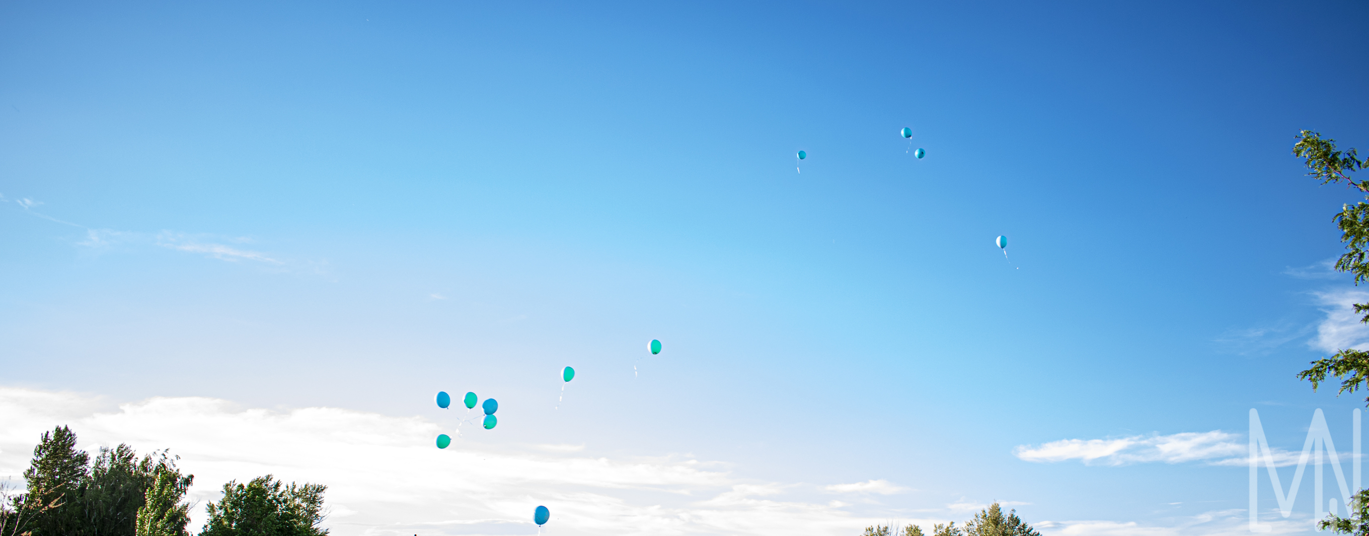
Gender Reveal
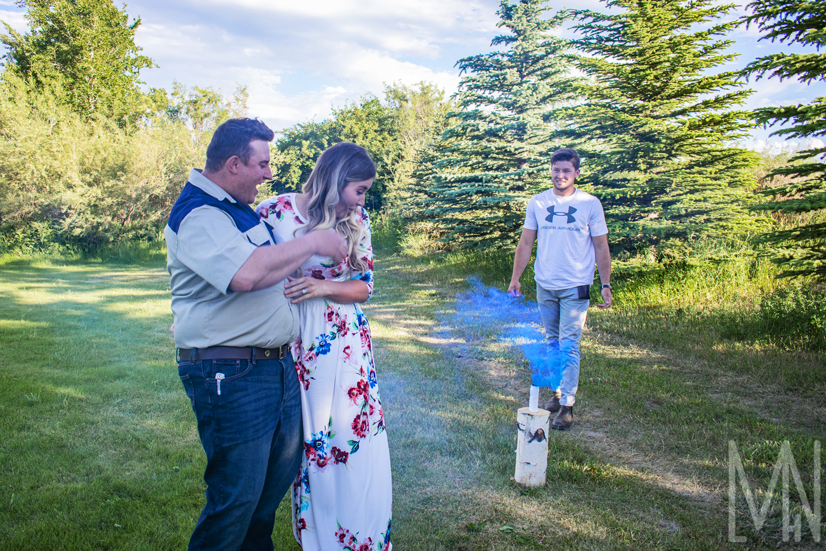
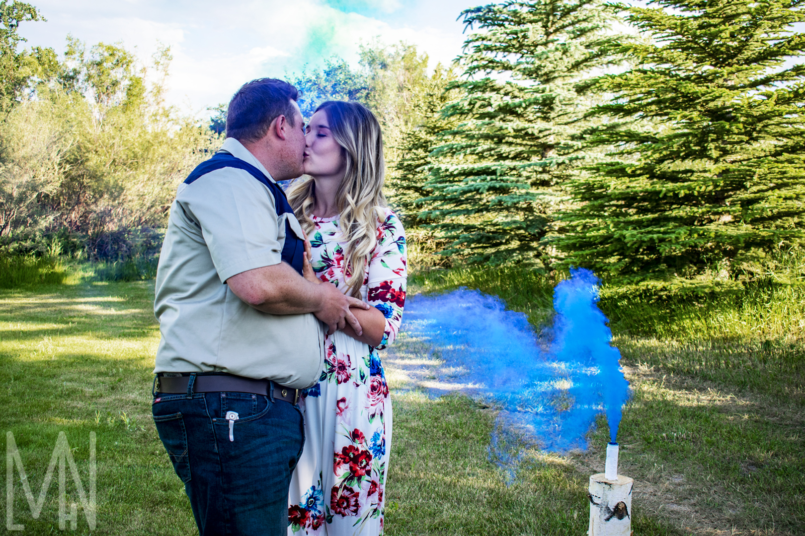
Finding out Baby Van Heerden’s Gender with a Smoke Bomb Reveal!
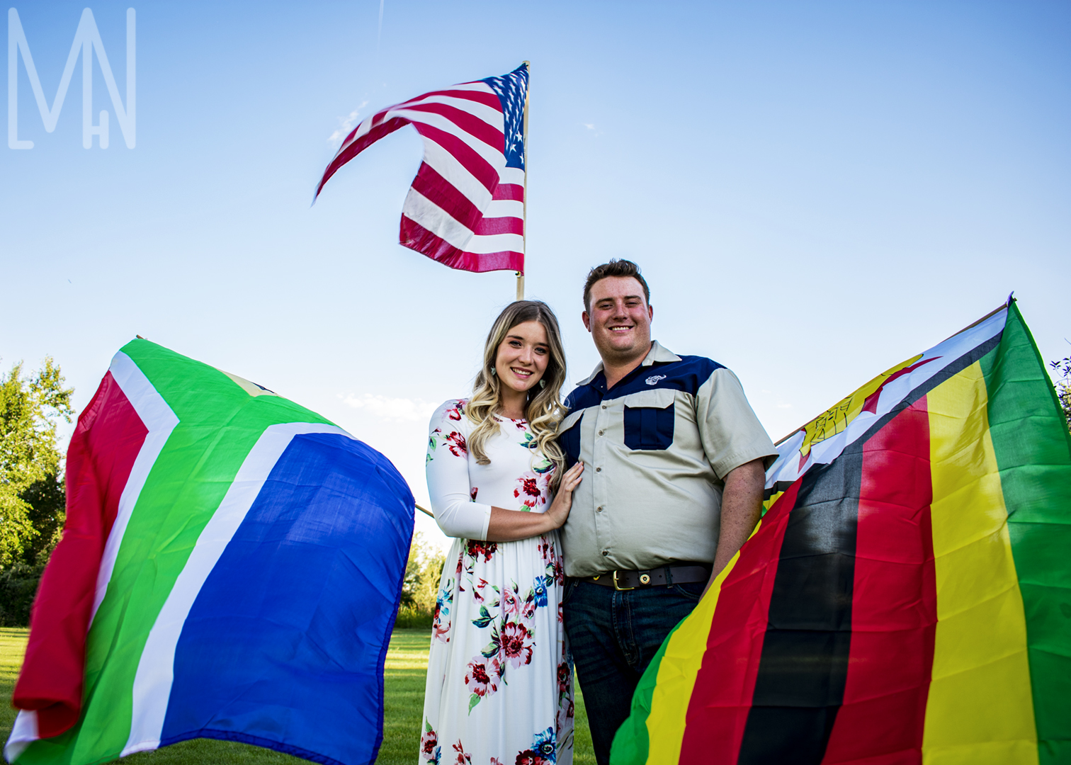
Monique and I became friends while volunteering in England for a year and a half. As luck would have it, we both ended up in Idaho with our spouses! She is from South Africa and her husband is from Zimbabwe. When they got in touch with me and asked if I could do a gender reveal for them, of course I said yes! They were so excited to finally be pregnant and wanted to do something big to learn the gender of their baby. I did my best to capture the emotion and excitement of this fantastic couple. They’re always one of my favorite couples to work with since they always know exactly what photos they want. Check out the images below! I’m available for hire if you’d like to do something similar. It’s these special moments that remind me why I decided to become a photographer in the first place. I’d love to help you create your own special moments.
The Big Reveal!
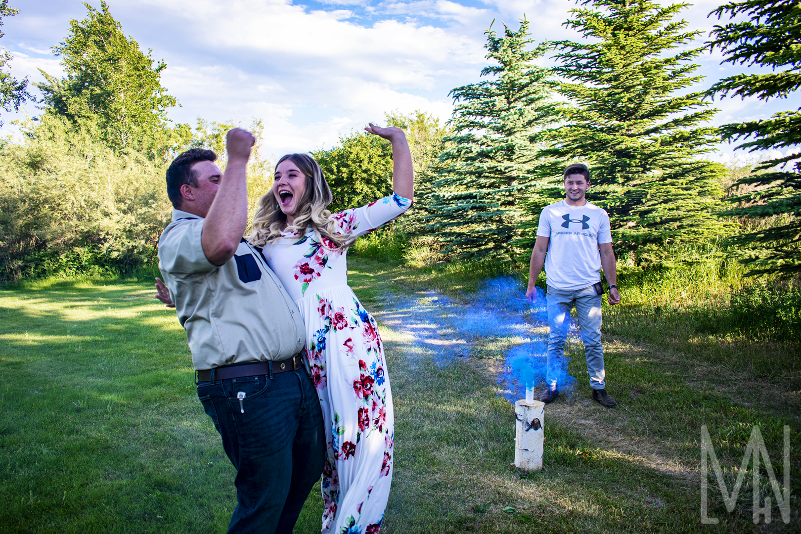
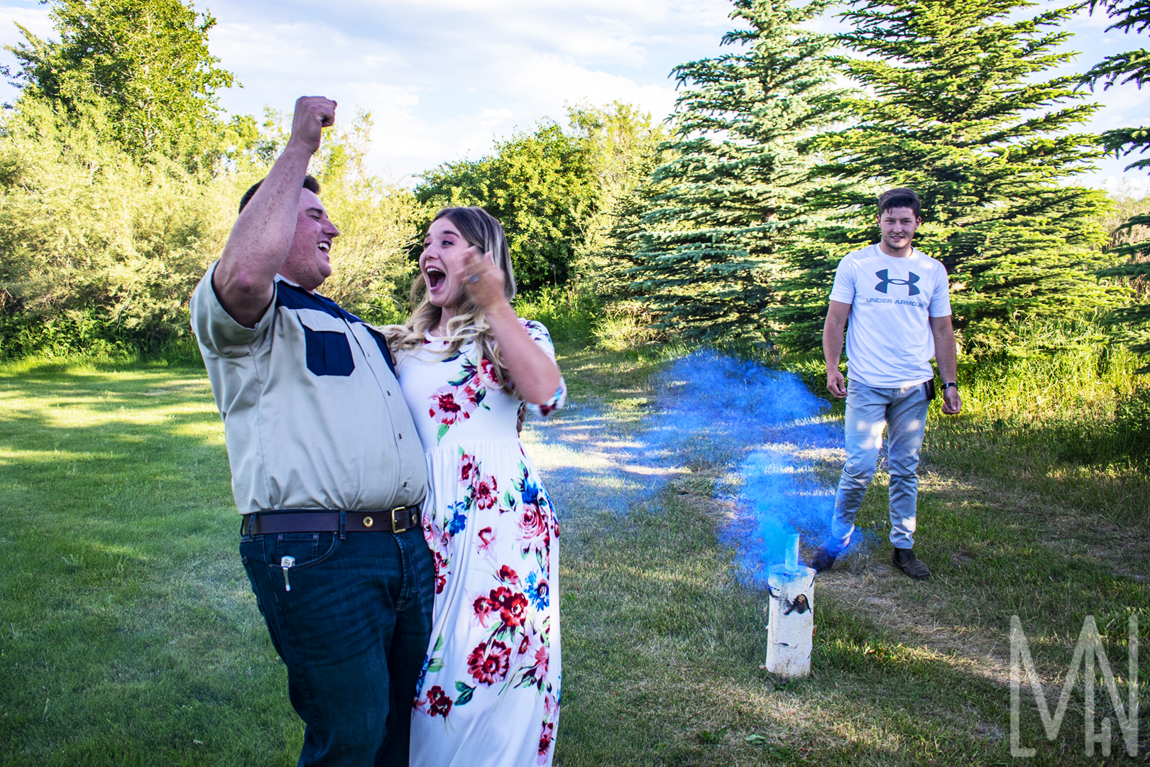
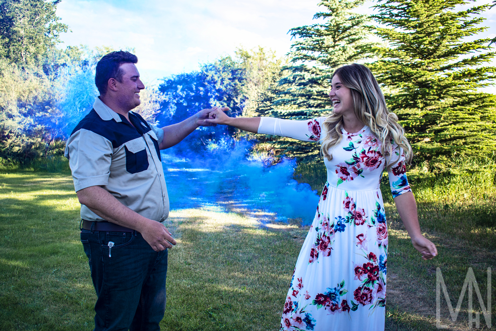
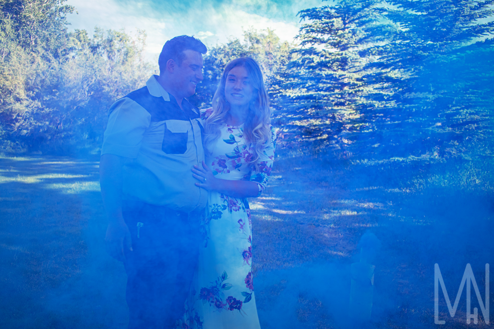
Sweet Photo Moments
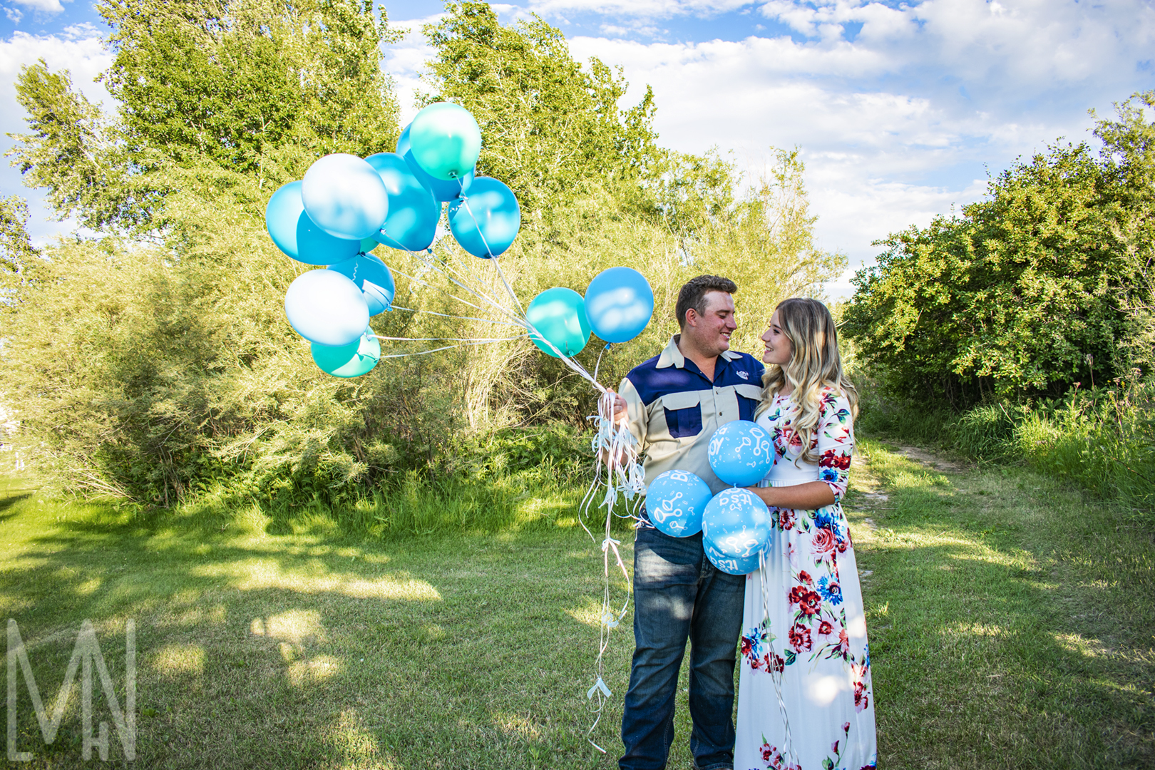
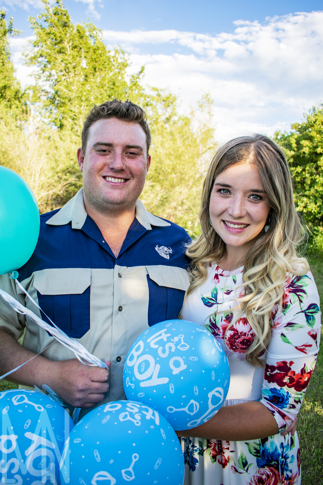
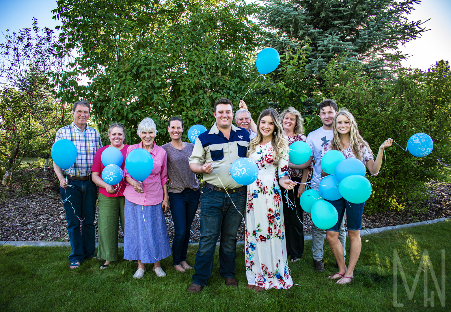
Monique is from South Africa, Andries is from Zimbabwe and now their little boy will be from America
Do you love Gender Reveals and need more ideas? Check out Party City’s package ideas here!
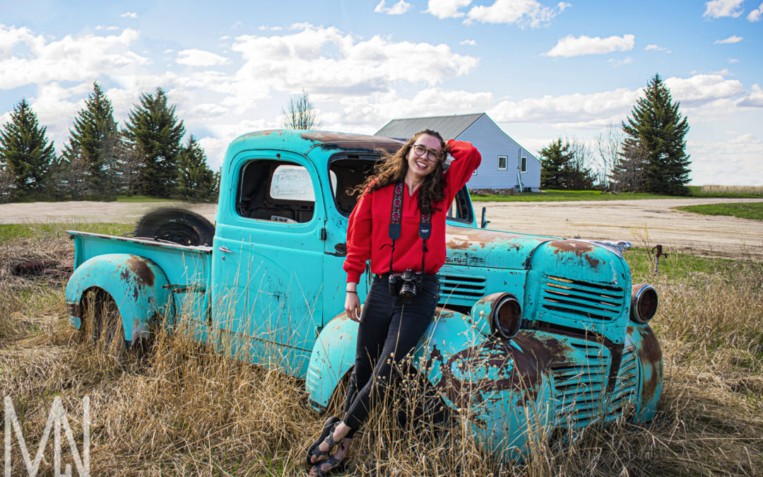
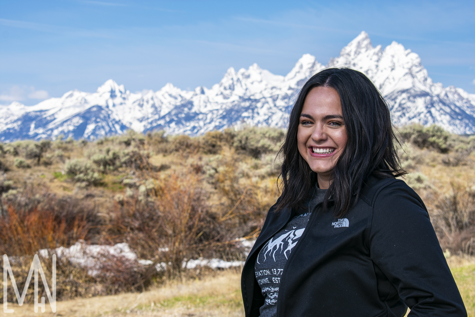
Themed Portraits: More Adventurers around Grand Teton
More Themed Portraits in the Grand Teton Area
While not all of these themed portraits below were taken right in Grand Teton, all of these images capture the natural moment of each individual. The thing I love most about these themed portraits is each person below is a photographer and is wearing what they’d normally wear when they work. The first themed portrait was taken to capture the essence of this photographer. She mostly does graphic design but when she does photography, she loves doing it out in nature. Grand Teton National Park is one of her favorite places to go for this so it suits her to have her photos taken in this area. The second themed portrait is of my professor. She always wears the brightest, happiest colors and is always kind enough to let her students take photos of her (whether she feels ready or not!). There are few professors who love and care about their students as much as she does. Having her students capture pictures of her at Grand Teton is the perfect images of her in her natural habitat. The final themed portrait is of a lovely friend of mine posing by an old car. Her photography style shows her love of the outdoors and I feel this portrait captured a unique “in the moment” image. Photography is something she loves to do and I loved capturing her between her own photo shoots. Each of these images are themed and capture the essence of the individual. Check out these awesome themed portraits below!
Want to see more themed images? Check out some of Kayla’s work here!
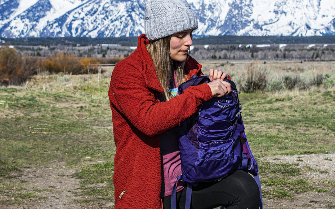
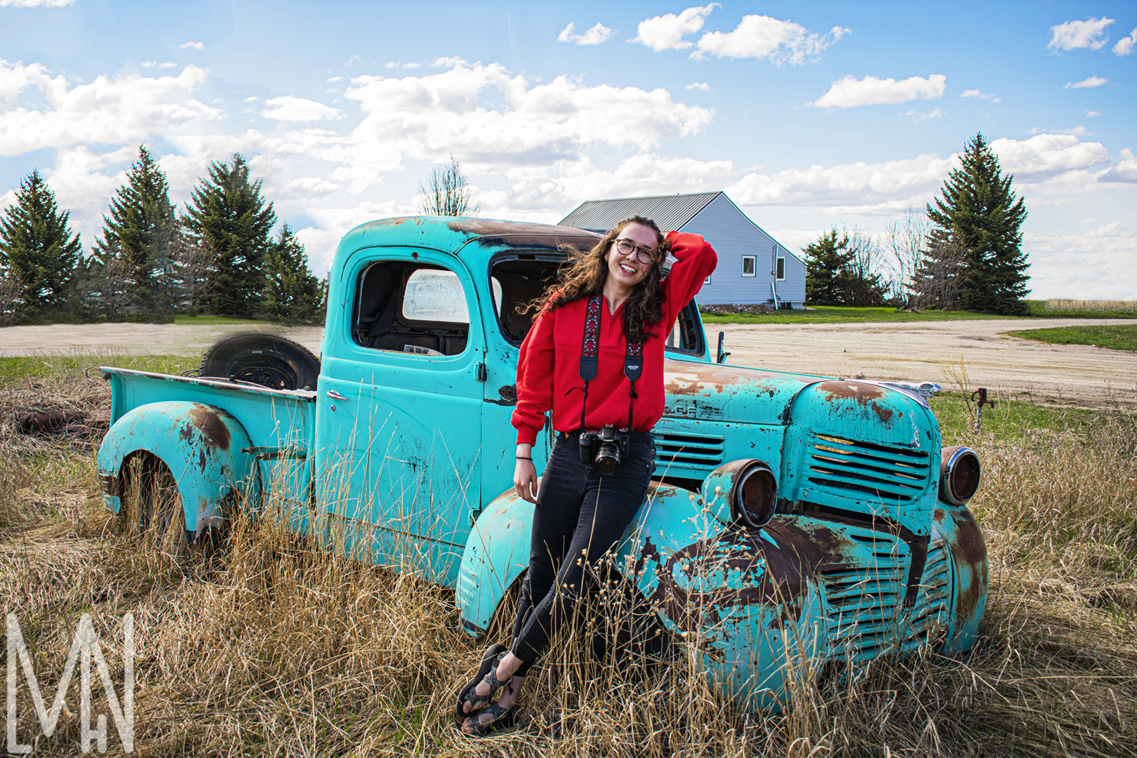
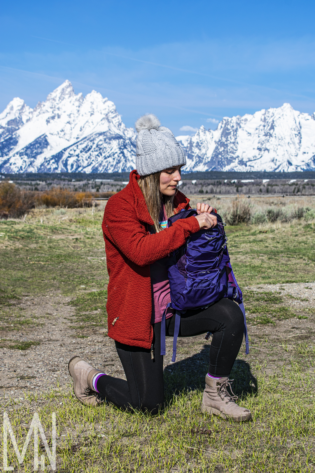
Themed Portraits: Grand Teton Adventurers
Capturing Themed Portraits in Grand Teton National Park
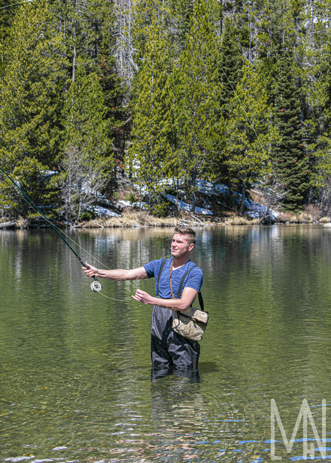
These three themed portraits from Grand Teton are more action based. Below you’ll find a climber, a fisher, and a hiker. In these images, I wanted to capture more of what they were there to accomplish than maybe who they are in full. Creating the themed portrait of the climber was fantastic! I used a gold reflector to really make her glow as she prepared her climbing rope by an old barn. Capturing the themed portrait of the fisher was far more difficult. There was no way to block out the sun at Grand Teton and it was the middle of the day. I had to use some highlight and shadow balances in Photoshop to make the light more balanced throughout the entire picture. I enjoyed capturing the themed portrait of the hiker. Her backpack was originally pink but I did not like the pink with her orange coat. I went into Photoshop and changed her backpack to a complimentary blue. Her themed portrait turned out lovely with her in front of the mountains. I tried to capture her preparing for the long journey ahead. Check out my themed portraits from Grand Teton below and let me know what you think!
The Climber
The Fisher
The Hiker
Want to see some more amazing themed portraits at Grand Teton? My friend Brenna took some amazing shots! Check them out here!
Epic Portrait
Making a Portrait into Something Epic
You might be asking yourself, “What is an Epic Portrait?”. An Epic Portrait is when you use a flash to help your foreground and your background have the same level of exposure. Below are some examples of this. Please excuse her posing in the first two images. She was talking while I was taking these sample images, haha! In the first portrait, we can see the woman perfectly. The lighting exposure looks great on her but her background is over exposed. Look at the next portrait. The background is well exposed and looks lovely. Unfortunately, we cannot see her very well because she is underexposed. How do we fix this? Keep your camera on the settings where the woman is underexposed, set up a speed light to face her, and snap the portrait. The third portrait shows the result. Suddenly, we can see that the entire image is well exposed and we have created an Epic Portrait! It’s that easy!
Over Exposed
Under Exposed
Balancing the Epic Portrait with Flash
To check out a different kind of epic portrait, have a look at the f/stoppers page here!
Environment and Architecture
Creating Architecture and Environment Photography
Whether it’s photographing a few buildings or some individuals interacting with objects or other people in their environment, architecture and environment photography can be a useful skills to learn.
First of all, what is environment photography? Environment photography can be a hand picking up a piece of food. It can be an individual placing a saddle on a horse. Any time an individual is acting naturally in their environment (or at least appearing to) that can be turned into environment photography.
What is architecture photography? Have you ever wanted to work for a realtor and take pictures of homes from the inside out? How about taking images of a historic castle or business location? These can all fall under the description of architecture photography.
The key to taking great photos of any of these topics is looking for the unique angles or aspects of any situation or place. What’s special about these people? What they’re doing or the place that you’re in? What feeling do you want to capture? What emotions do you want to show and help your viewers to feel?
To view some examples of what I’m talking about, check out my images below!
Architecture Photography
Environment Photography
Want to learn more about architecture photography? Check out Expert Photography here!
Food Photography
Creating Fantastic Food Photography
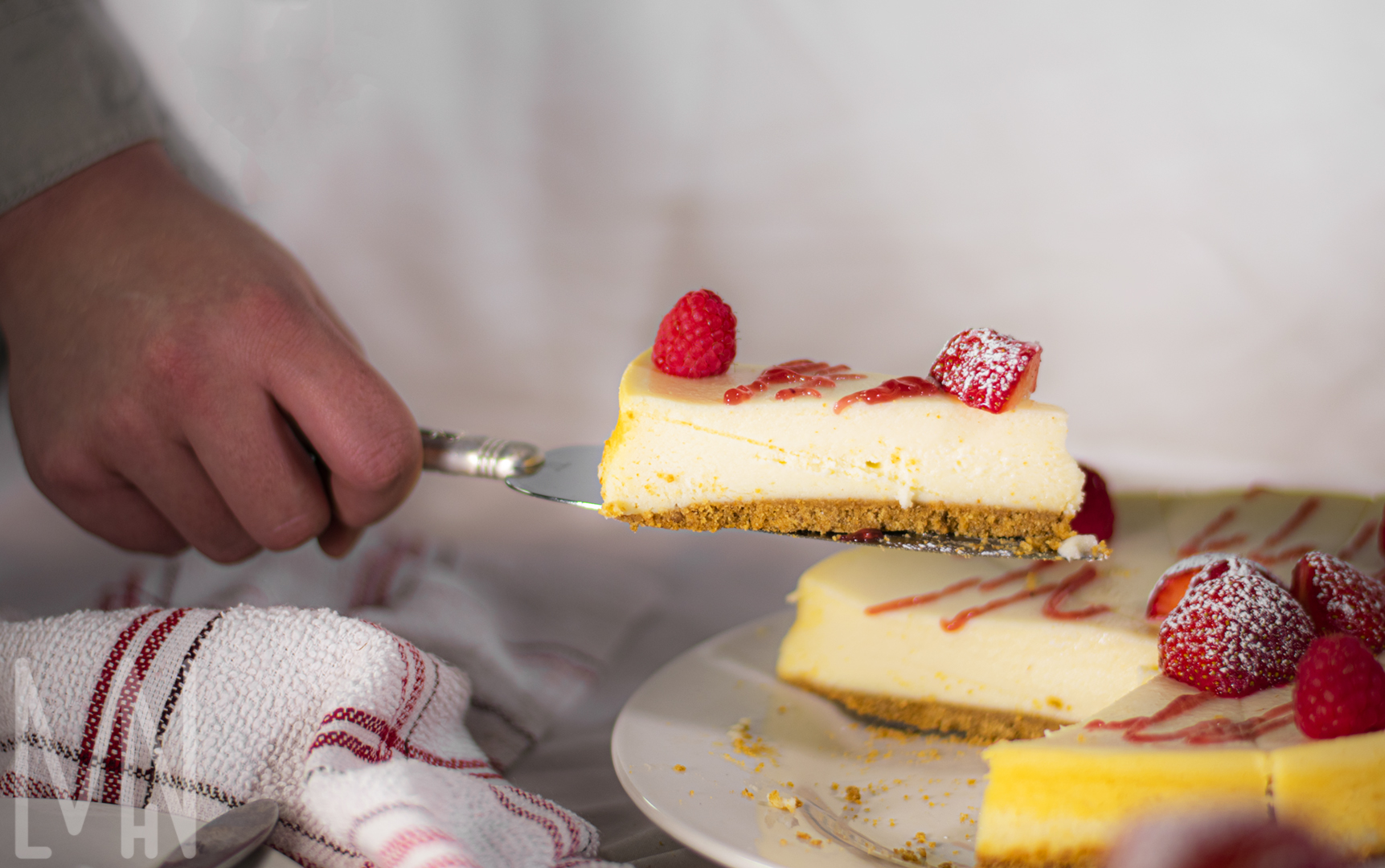
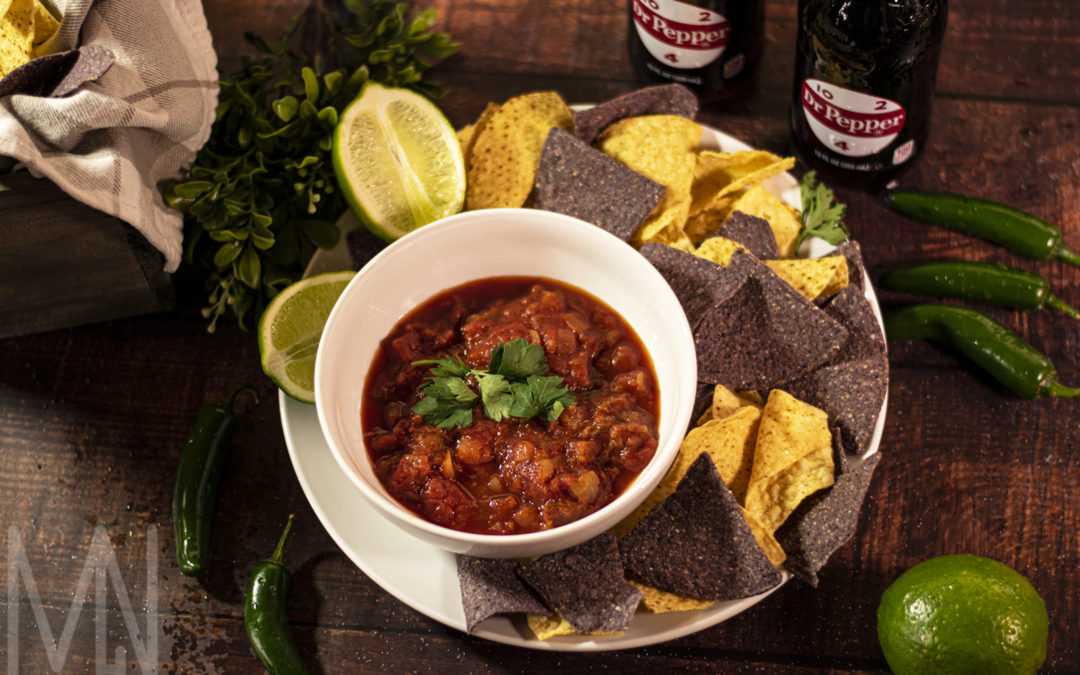
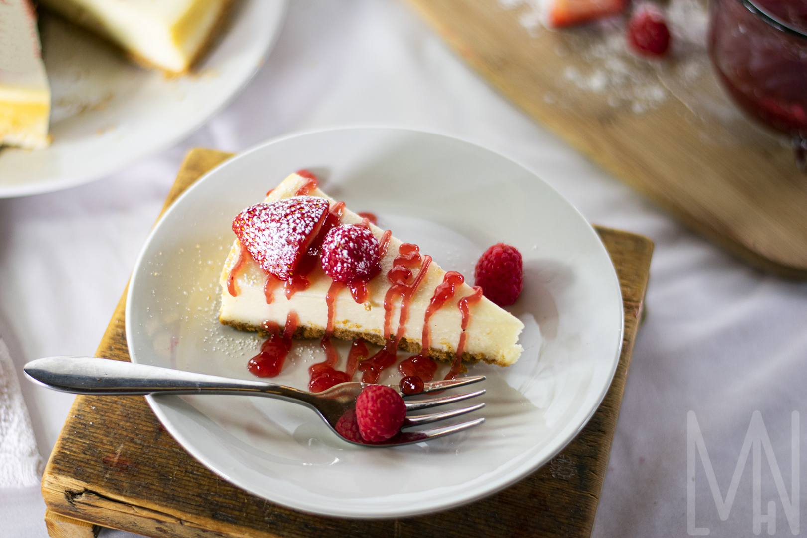
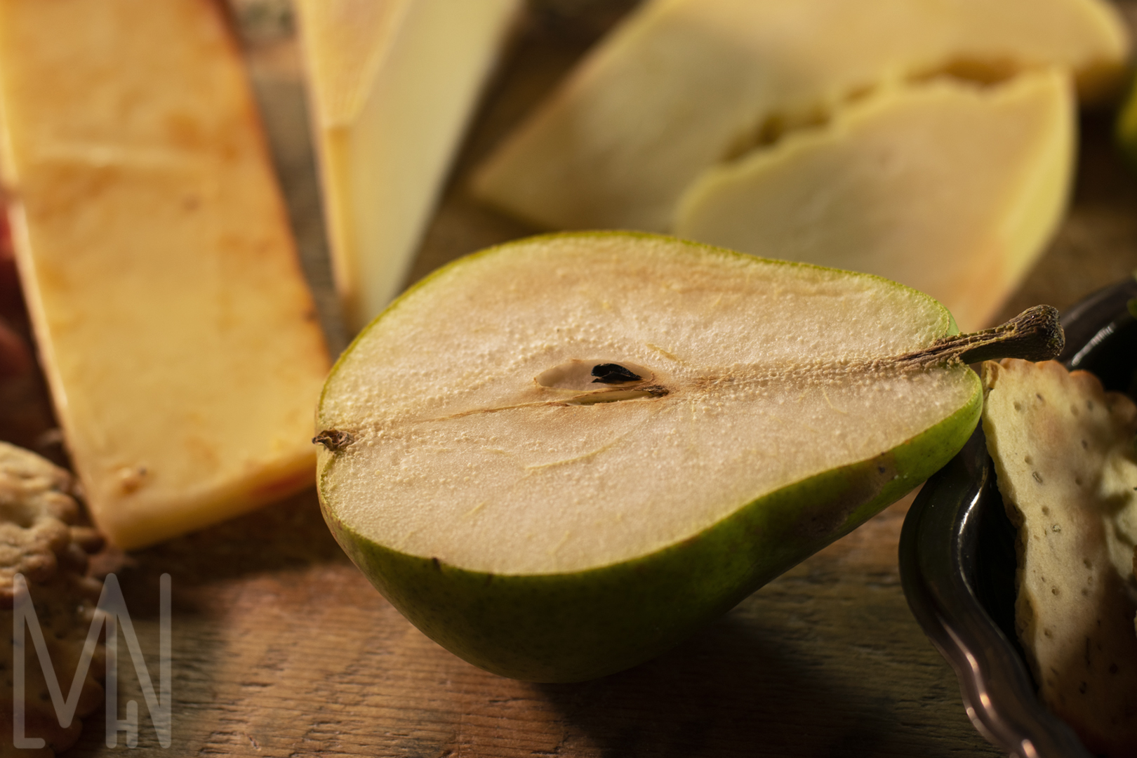
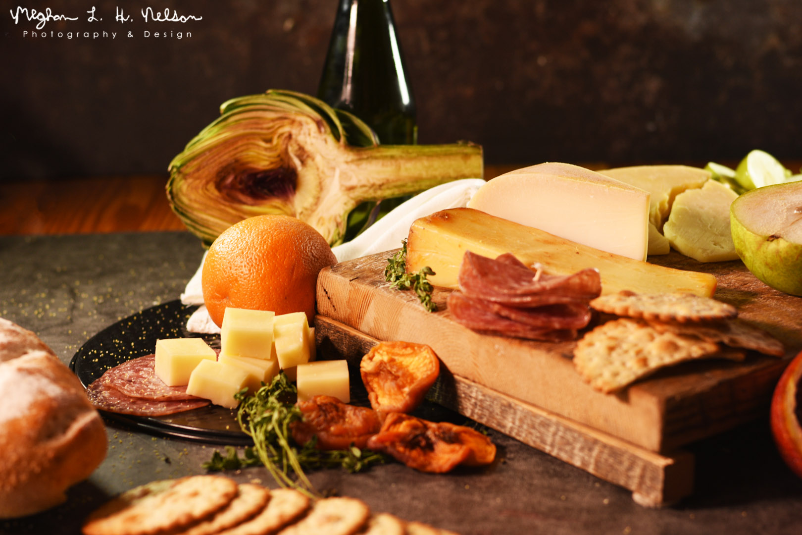
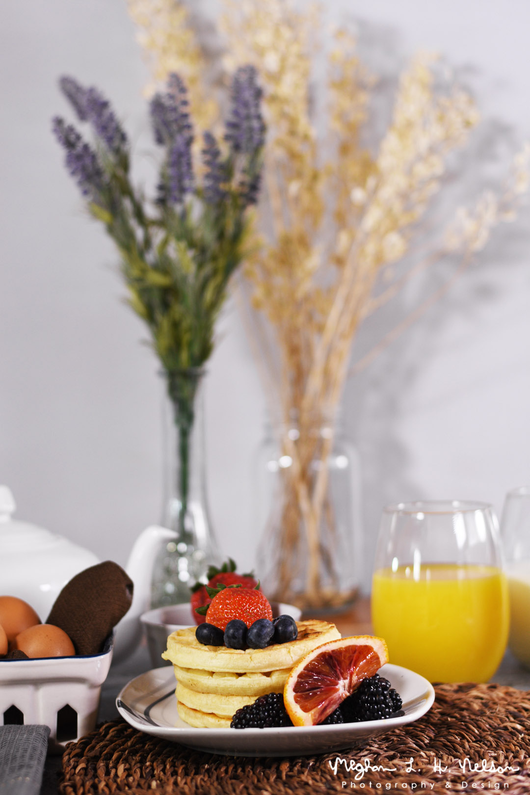
Everyone loves food. Many people even love taking photos of their food before they eat it. The unfortunate thing is, advertisements often make food look better on the screen than in real life. In order to create food photography that looks as great as it tastes, it’s important to understand how to stage the food in an appealing way. Whether that’s drizzling strawberry sauce and raspberries on a cheesecake or adding some colorful chips and limes to a bowl of salsa, there are many ways to stage food to look realistic and delicious.
If you’re going for a lifestyle image, you might consider adding a cutting board or some decorative plants. This can give the feel that the food is being prepared in a home or a fancy restaurant. One of my favorite ways to display food realistically is to add other food you would eat with it (as I briefly touched on above). Not many people just sit down with an entire cheesecake and eat it without cutting it or adding any extras with it. Even if someone does do that, it’s not exactly an appealing image to portray. Most people want to be enticed by food, whether they realize it or not. Check out these images below to see some unique ways to place food. There are many great “food accessories” to make your product look delicious!
Want to learn more about how to create great food photography? Check out Adorama Learning Center’s post here!
Balance The Light
How to Balance your Light in your Photos
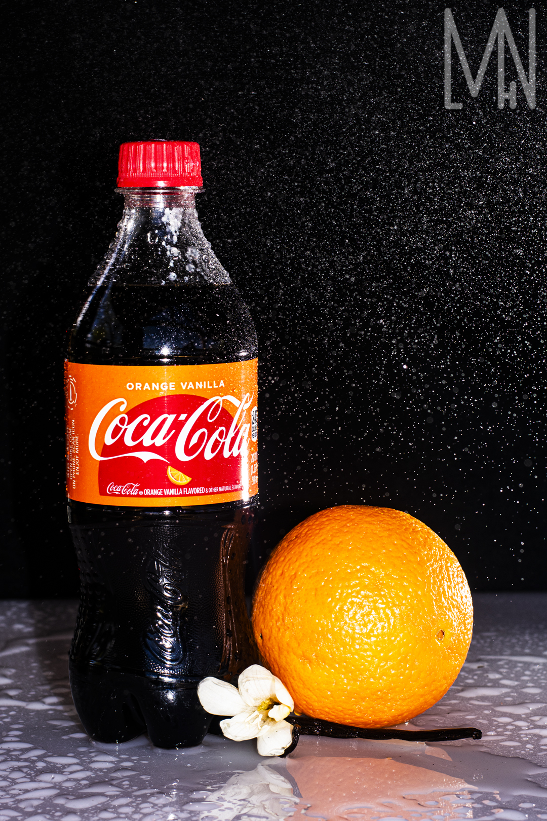
There are many different kinds of light balance and different ways to portray it in an image. The first image below was created by using a spray bottle and an external flash. When the mist hits the orange vanilla coke, the flash freezes it in it’s place. This creates a unique image and is often used when the creator wants to portray a fresh image. Orange vanilla coke isn’t exactly fresh from nature but it feels refreshing when placed with an orange, a vanilla bean and a natural appearing mist.
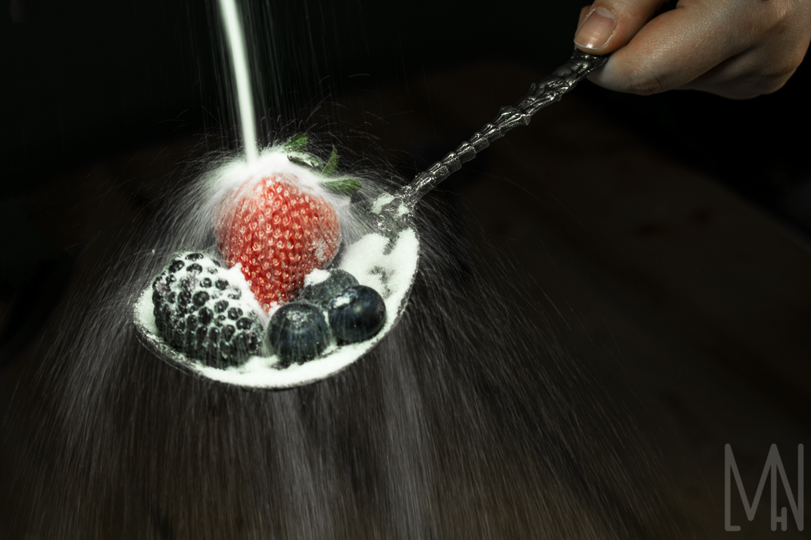
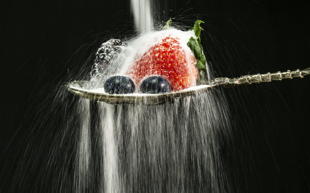
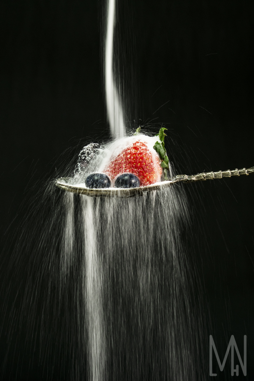
Another fun way to balance light is through blur motion. By maintaining a constant light on your subject and creating movement (for example, with water or sugar), it can create a gentle blur that seems to wash over the object in focus. To capture this sugar cascading over the berries, the person holding the spoon had to remain very still while simultaneously pouring the sugar. I then simply kept my shutter speed low and was able to capture a unique, motion blurred image.
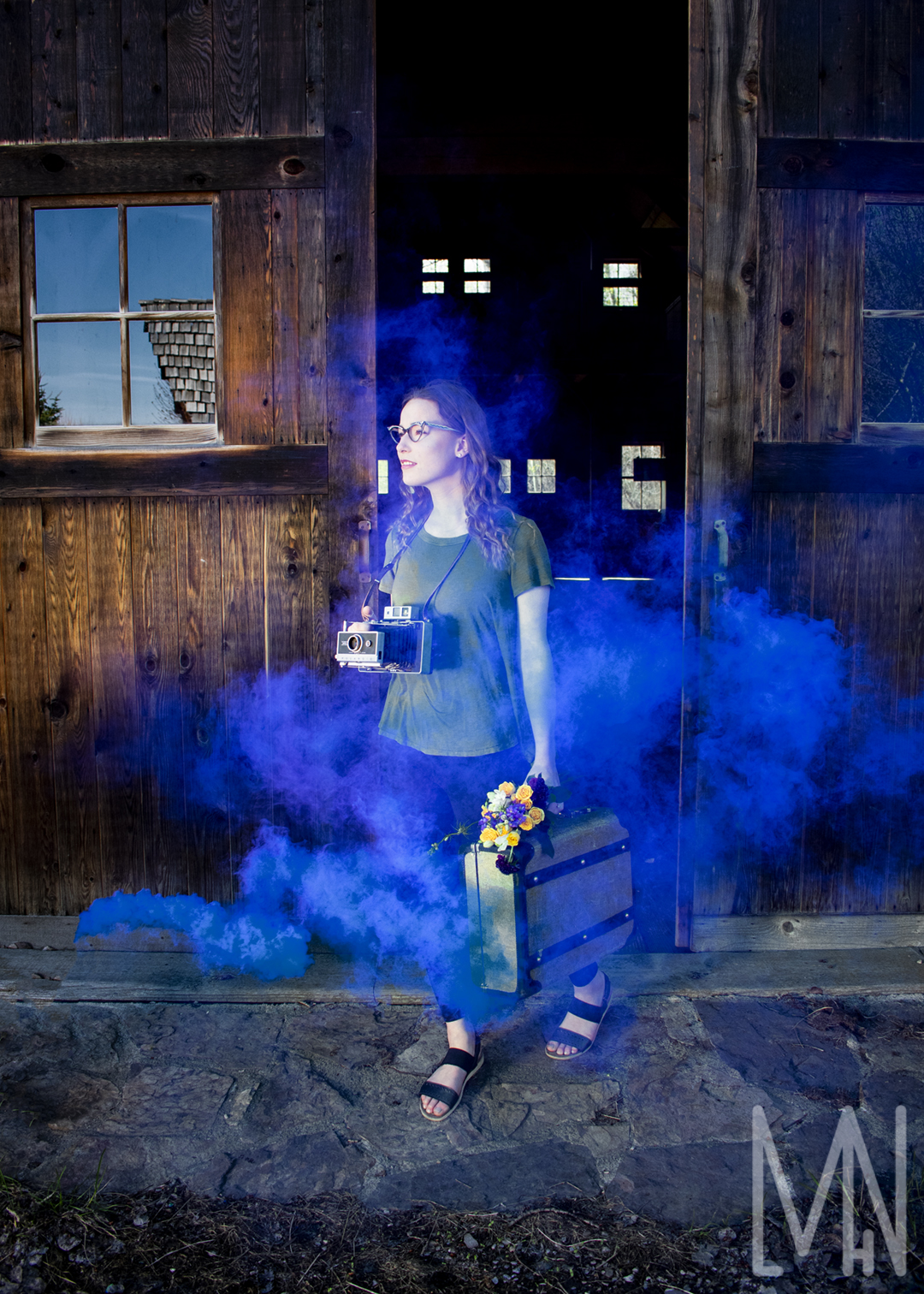
The final image was created with a blue smoke bomb outside a barn. The balance of the light was truly crucial. We used natural light for this but often risked over exposing our shots. A smoke bomb image must be taken quick enough to gain a well exposed image without moving so quickly that the smoke streams are missed entirely. Smoke bombs can give an air of mystery and enchantment. They’re definitely great to use when capturing light balanced images but be sure to get it right the first time! Smoke bombs are expensive and don’t last long.
Check out the final images below!
Using Light Balance to Freeze Water Spray
A Sugar Stream with Light Balance
Using Light Balance with a Smoke Bomb
Want to learn more about how to balance the light in your photos? Check out dpmag’s page here!
Fine Art Print: Mountain Reflections
Creating a Print of My Fine Art Image “Mountain Reflections”
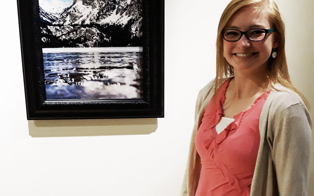
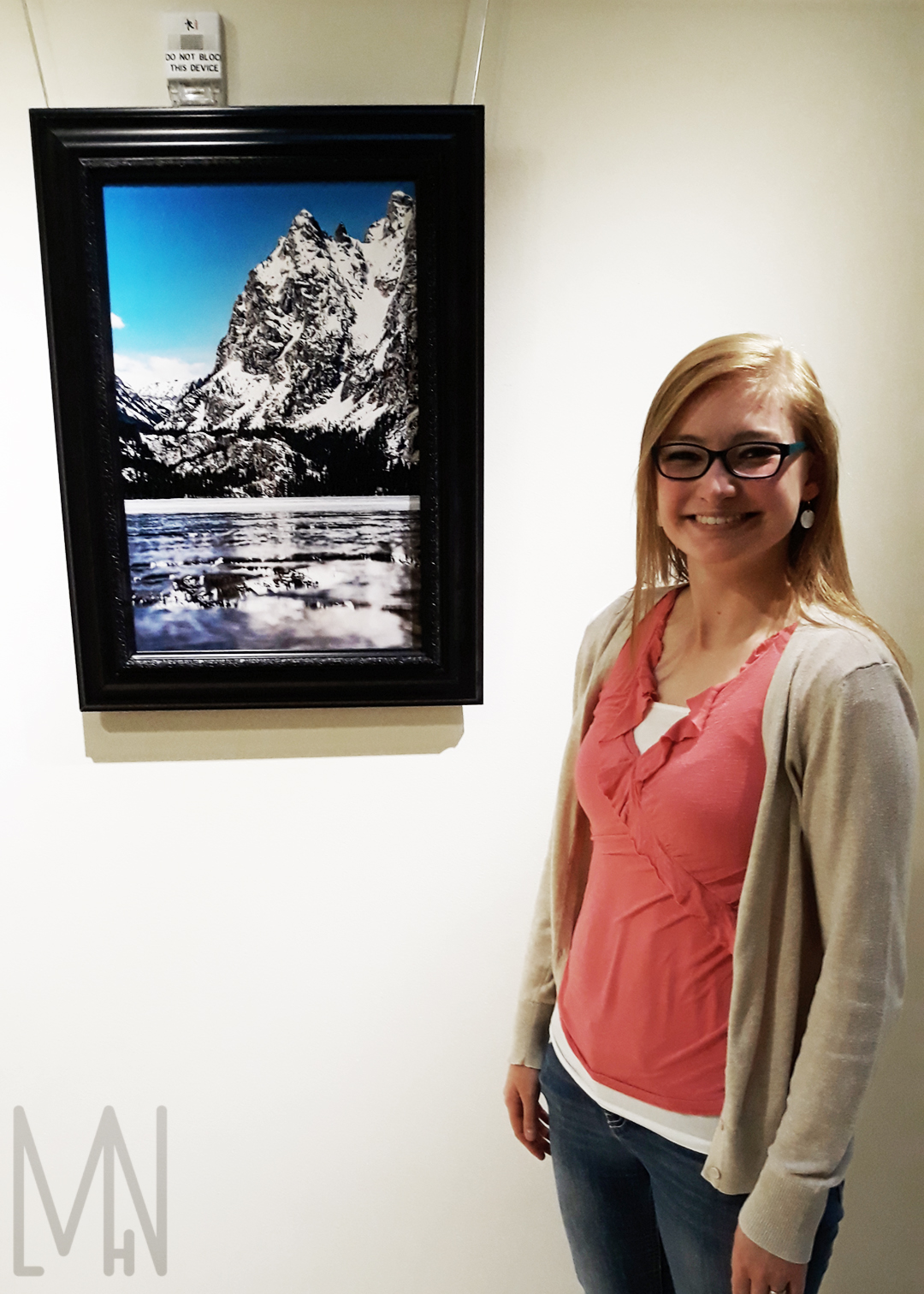
I had the unique opportunity to have one of my fine art images displayed in the Jacob Spori Building at Brigham Young University-Idaho (BYUI). It is currently hanging on the main floor of the building and will remain there for the next few weeks if you’d like to venture out and see it.
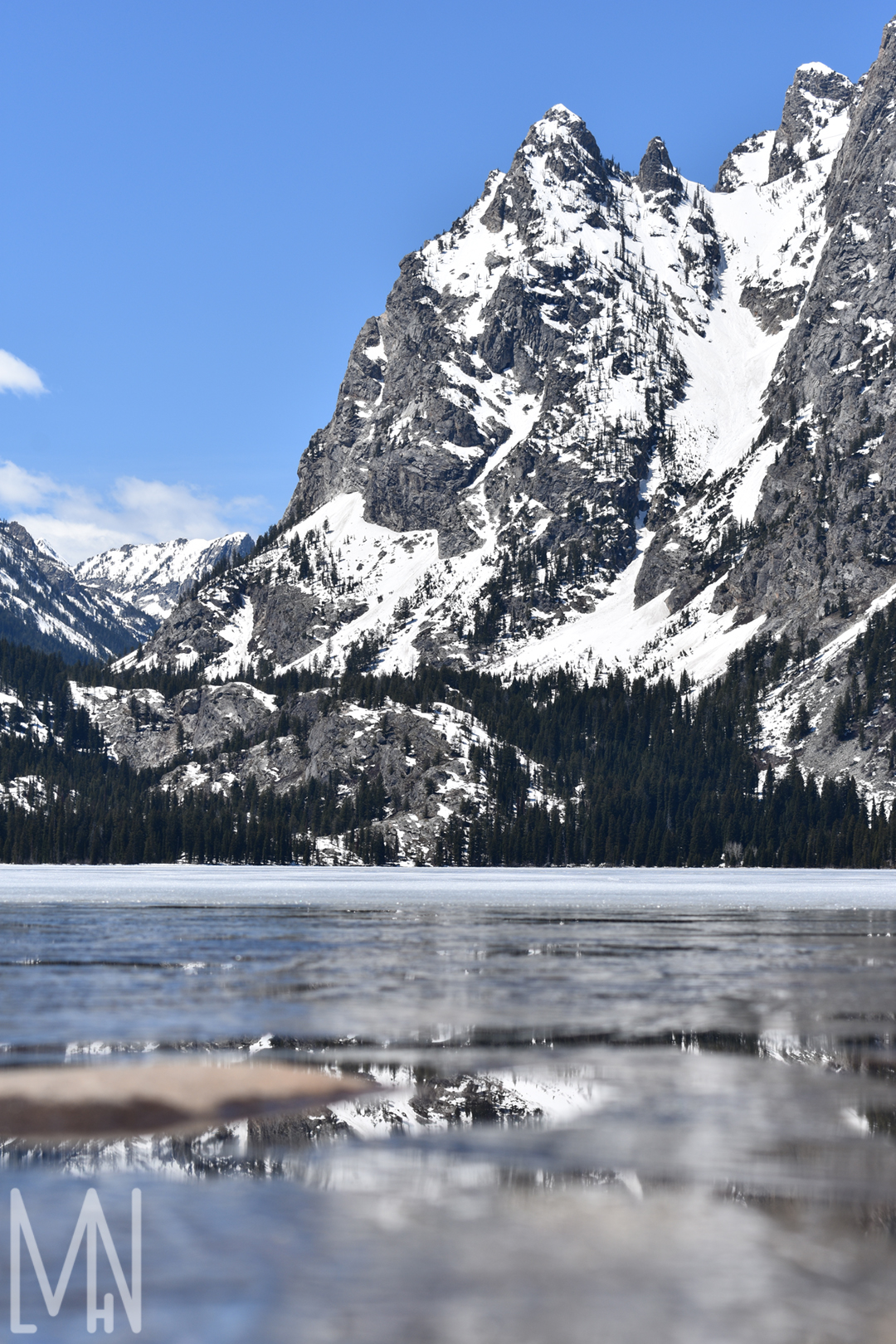
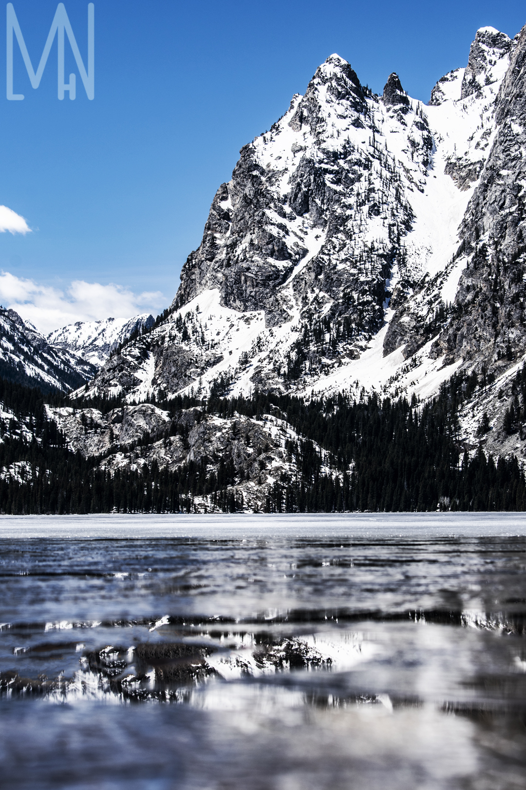
I captured this image on a trip to Grand Teton National Park. Jenny Lake was frozen over and I wanted to get as close as I could to the water. I scaled down the side of the hill a bit and got to the waters edge. There I was able to lay down by the water and capture the majesty of the mountains from a new angle. Little did I realize that a bit of the ice on the lake had begun to melt. This formed a small pool in the water and created a small but gorgeous reflection. After capturing this image, I took it into Photoshop and cleaned up the edges, shadows, highlights, colors, and removed a rock that seemed to be in the way of the reflection. After all of that, I ordered a my fine art piece on metallic print through McKenna Pro. They were fantastic and got my print to me right away! I then took some time in the Spori Gallery picking out a frame to use. My image was hung up in one of the main hallways of the building and will soon bear a name plate. Now my piece, “Mountain Reflections” is available for all to see and enjoy! Come on down and take a look while it’s still there!
This image is available for purchase through my online store. Click here to get your own Mountain Reflections today!
Unedited Mountain Reflections Fine Art Print
Edited Fine Art Gallery Print: Mountain Reflections
My Fine Art Mountain Reflections Print Hanging in the Gallery
Want to check out more info on Fine Art Prints? The Lightpower Collection shows what it takes to display your work! View their information here!
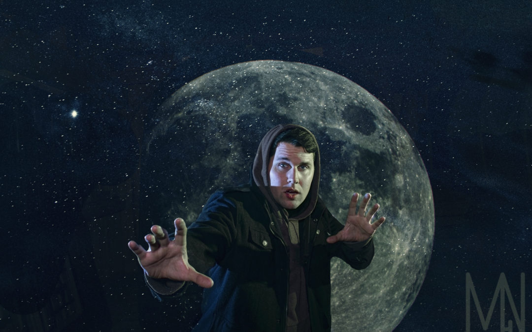
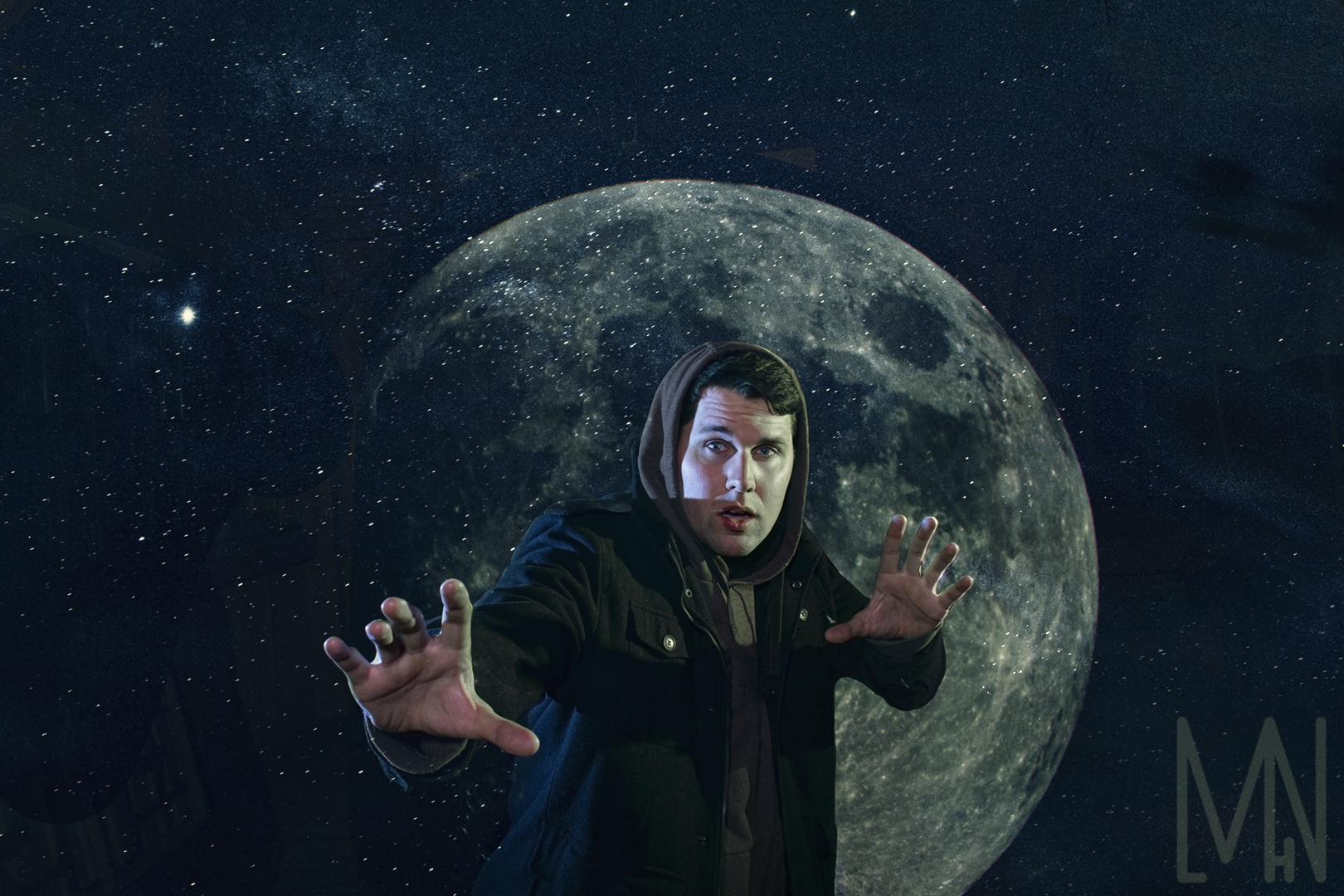
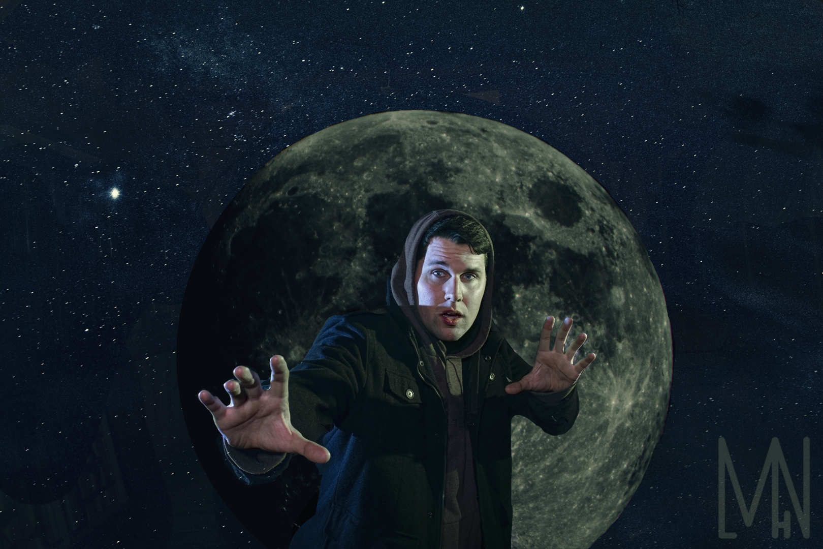
Post Production: “Star Dust: Man in the Moon”
Using Post Production to Create A Man in the Moon image surrounded by Star Dust
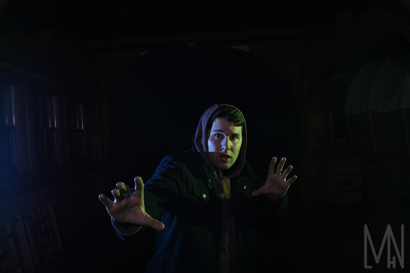
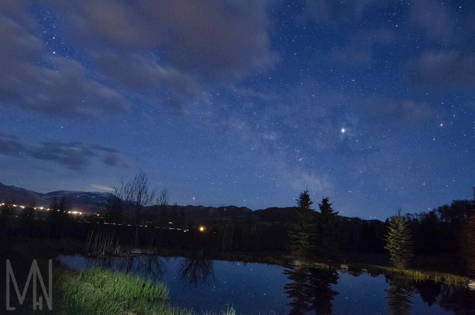
In order to create this post production image, I took three different photos and merged them together. The one of the man (Matt Pond), I took using two speed lights. One had a blue gel and the other had a green gel. This was taken in a barn at night. The second image of the “star dust” I took one evening over a pond outside. I just had to crop the star image and edit it to make it a little fuzzy to create the appearance of the stars being dusty. Hence the term, “Star Dust”. I took the moon image a while back using a telephoto lens. I simply screened it into the post production image and used a mask/brush to bring the man out of Moon. I wanted the moon to be a little transparent as if the man in the moon was leaving the moon. It gave it a more mystical feel and I think it helped keep the main focus on the man.
The detailed process took a while. I started with the image of the man and the image of the star dust. I placed the star dust over the man and used “lighten” in Photoshop to blend it in. I then masked the star dusk in my post production image and used the brush to paint the man out of the stars. After that, I combined the images together and created a copy.
My next step was to change the man’s eyes. I pressed Q in Photoshop to make the layer red. I then proceeded to paint over our man’s iris’s until they were all covered. I then was able to use control J to duplicate the layer. I then changed the post production image from normal to Linear Dodge. This allowed me to add a selective color. I then changed the man’s eyes to a more moon white/star blue color to really make them pop. It also created an idea that there was something deeper inside of him. Like a secret trying to burst out.
After all of this, I added color lookout tables to my image to make the image feel more cohesive. I used Tension Green, Edgy Amber and Foggy Night. When I had finished adding in all the color and masking some of his skin, I realized this post production image felt very empty. I decided to go back a bit and mask in the moon behind our man making him, the man in the moon. Rather, he became the man who escaped the moon.
I love how this picture turned out because the man in the moon looked almost lost among the star dust. The image could show where he came from but he doesn’t seem to know where he’s going. I like that overall message and feel. Space is so mysterious to us, even the man in the moon could feel lost outside his home in the moon. Still, I couldn’t decide which post production final image I liked best. One where the moon is solid or among the stars. I’ll let you decide.
Take a closer look below to see the final post production images and what images I put together to make it a post production image. Be sure to comment your favorite!
Originals

Interested in learning more about post production images? Check out Fstoppers page here!
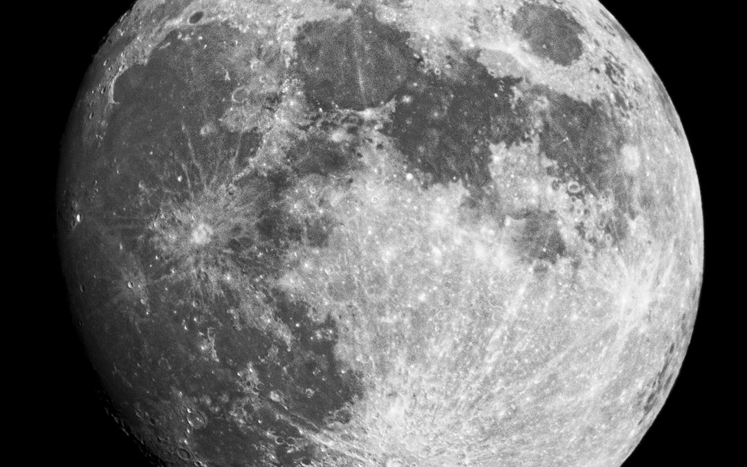
The Moon
Photographing the Moon
This was a spur of the moment Moon capturing adventure. I had just borrowed the Tamron SP 150-600mm f5-6.3 Di VC USD Lens for Nikon for another project I’m working on. When night came, it was absolutely clear outside. My husband noticed how bright the moon was and I wanted to show off the Tamron lens. We had no idea how powerful it would be. We captured these amazing images of the Moon! We couldn’t believe how clear the image was and how close we seemed to feel to the moon itself. My husband joked that we were going to see the american flag on the moon that night. Even though we didn’t, we were both star struck when we realized how powerful this lens really was. I highly recommend it to anyone who wants to get a closer look at the world or universe around them. Below are a few different edited images of the moon. At the bottom, you’ll find one of the original/unedited pictures of the moon, raw from my camera. Let me know what you think!
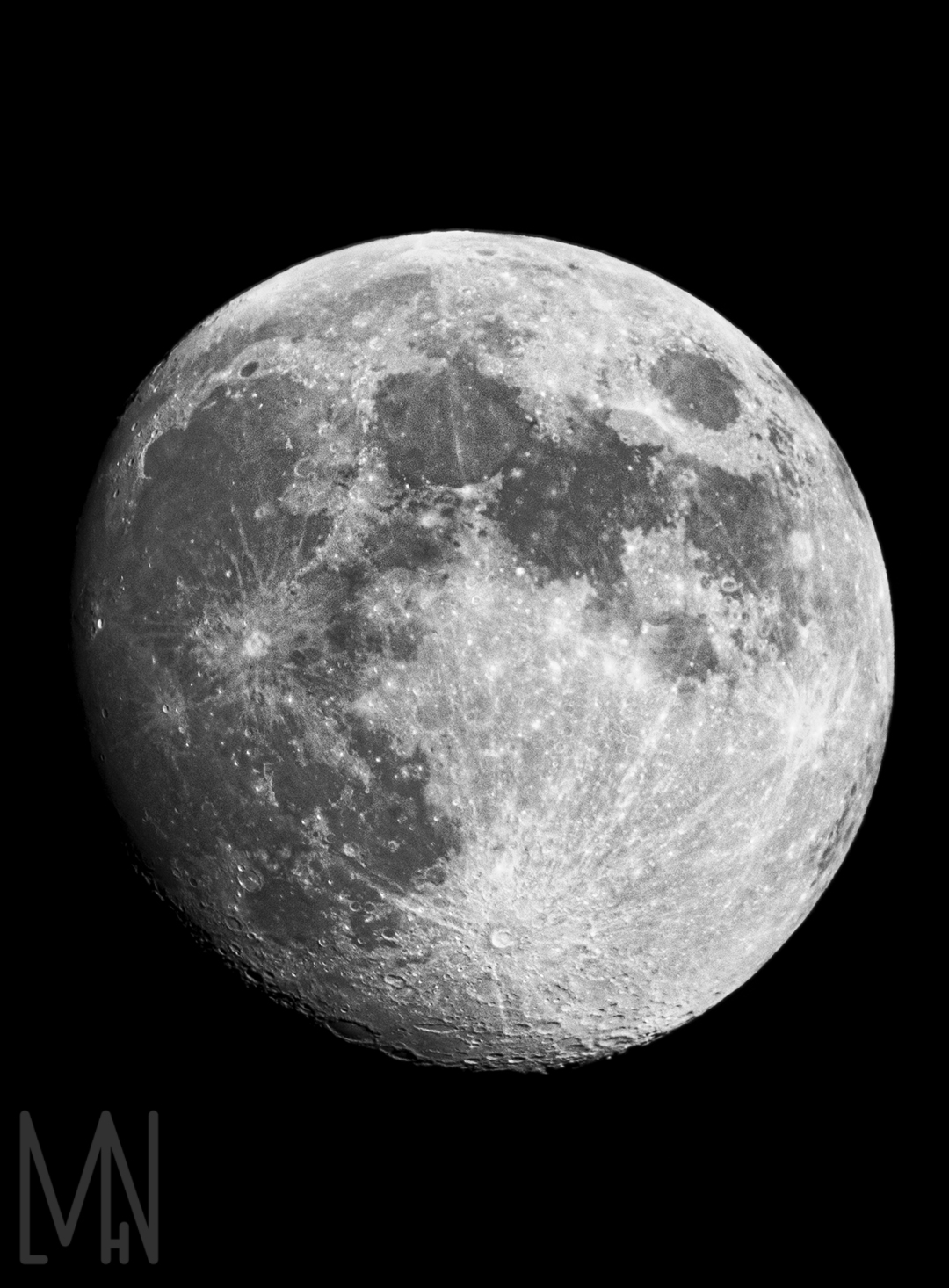
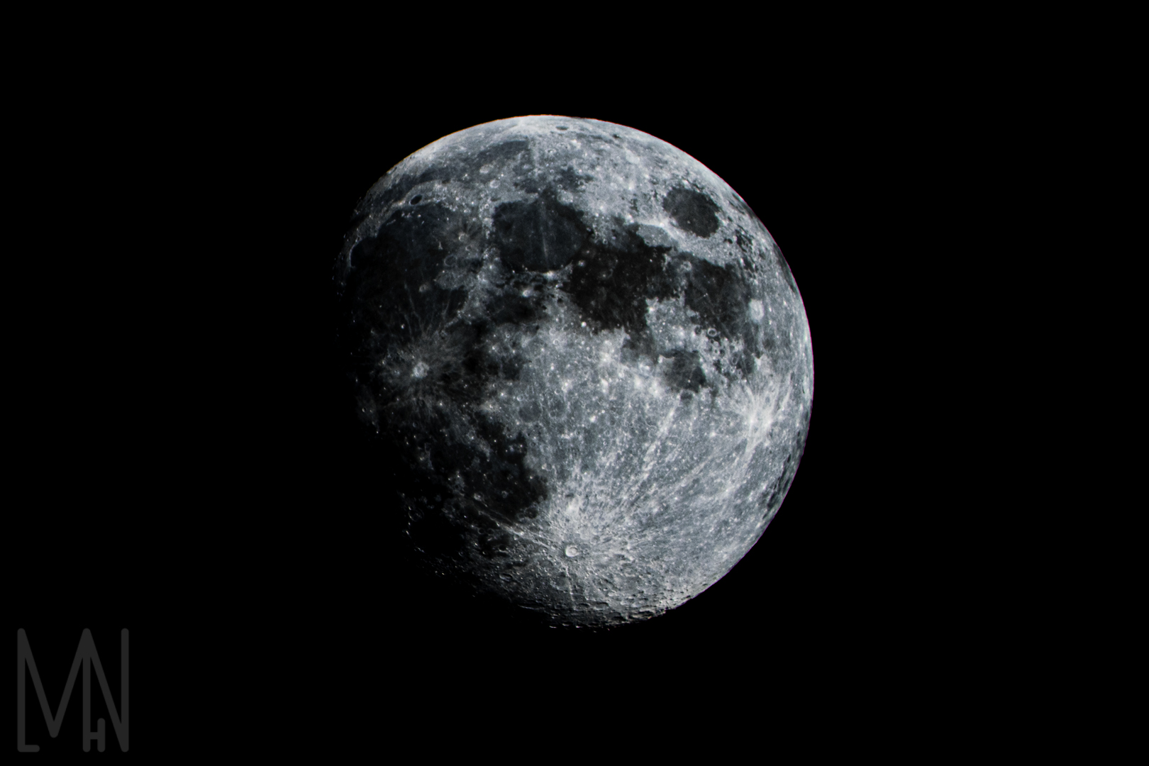
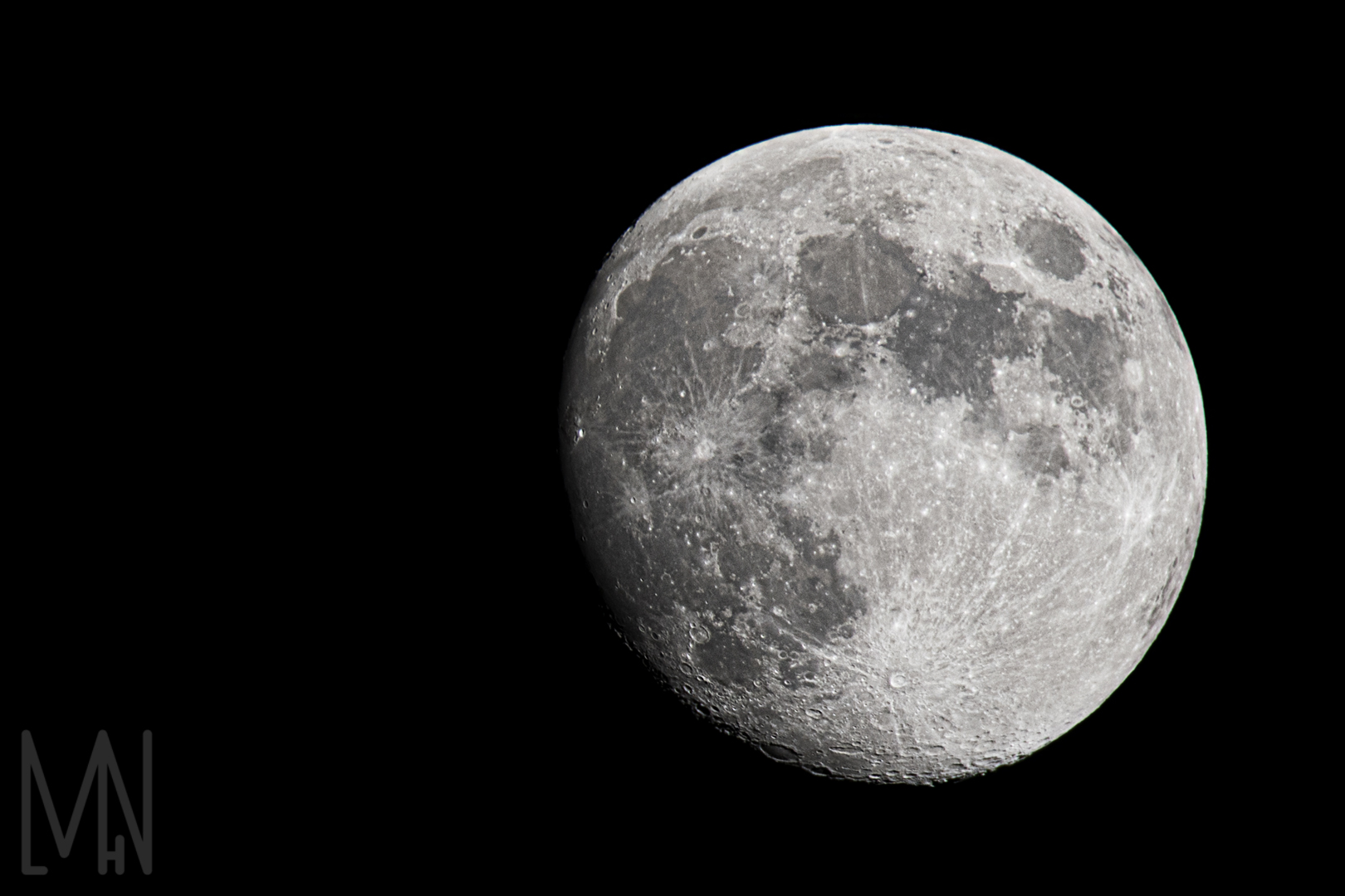
The Original Moon Image
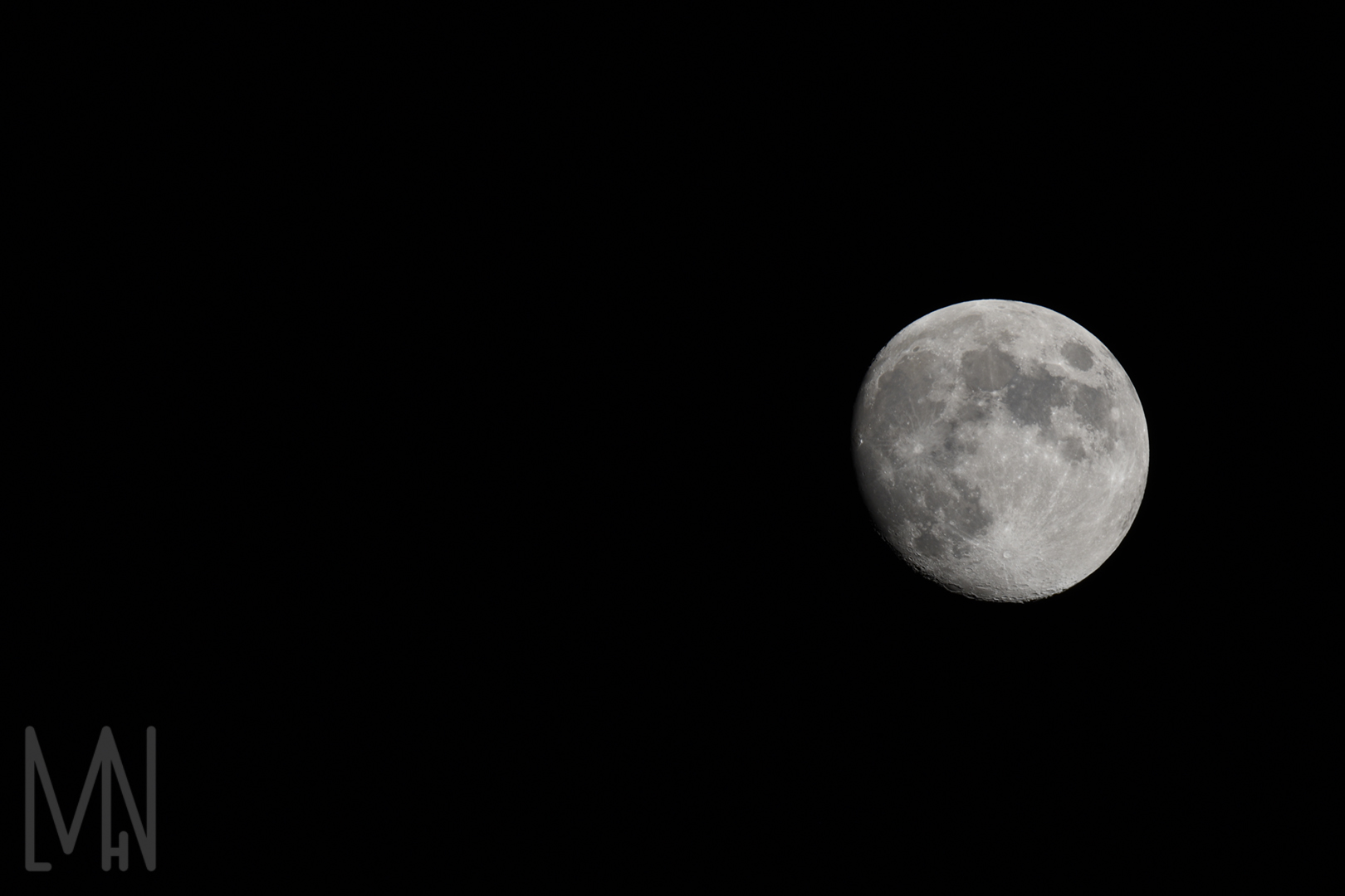
Wants some tips on how to photograph the moon? Check out Photography Life’s article here!
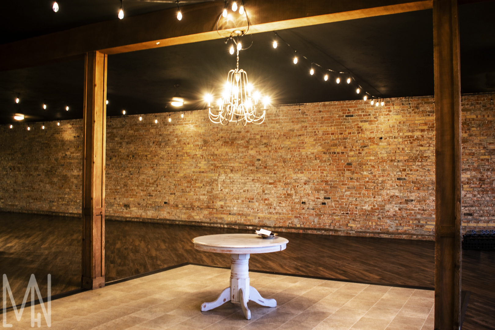
Fashion: Accessories and Buildings
Fashion in Buildings and Accessories
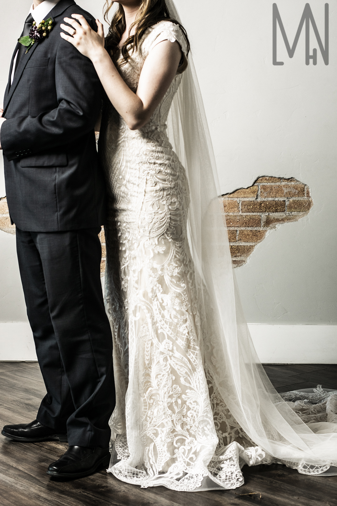
These are the images of accessories from the fashion shoot and of The Venue in Rigby, Idaho. Most of the images were taken with either some basic speed lights, LED lights or lights diffused by the “umbrella” covers. The images of the Venue itself were lit by natural light or the lighting in the Venue itself. We were very grateful to The Circle of Love in Rexburg Idaho for lending us a wedding dress and veil for our model, Alexis. Unfortunately, I was unable to locate a large logo of theirs to put on the wedding images below. However, I loved creating the other logo images. It was fun trying to image what companies would want images of their particular accessories. You can check out all my work below! Comment your favorite image! Do you like the images with text or without better?
Accessories with a Logo
Other Building and Accessory Images
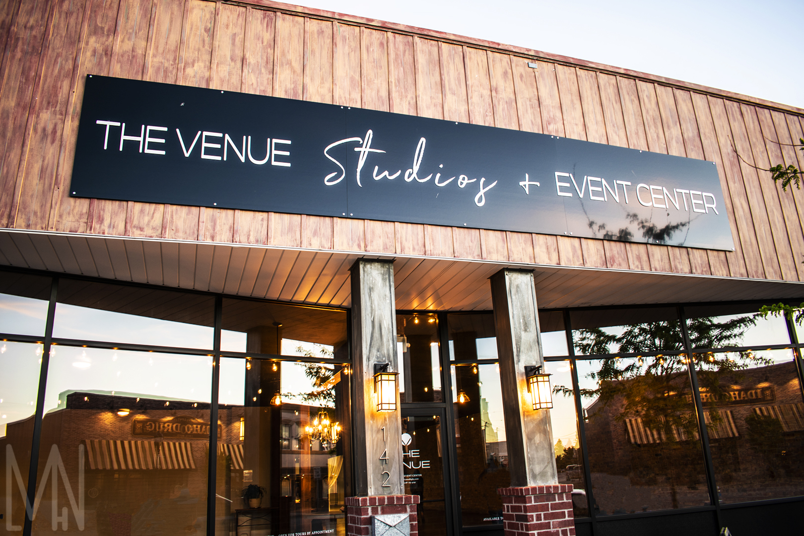
Interested in seeing more building photography? Adorama Learning Center has all the tips and tricks here!
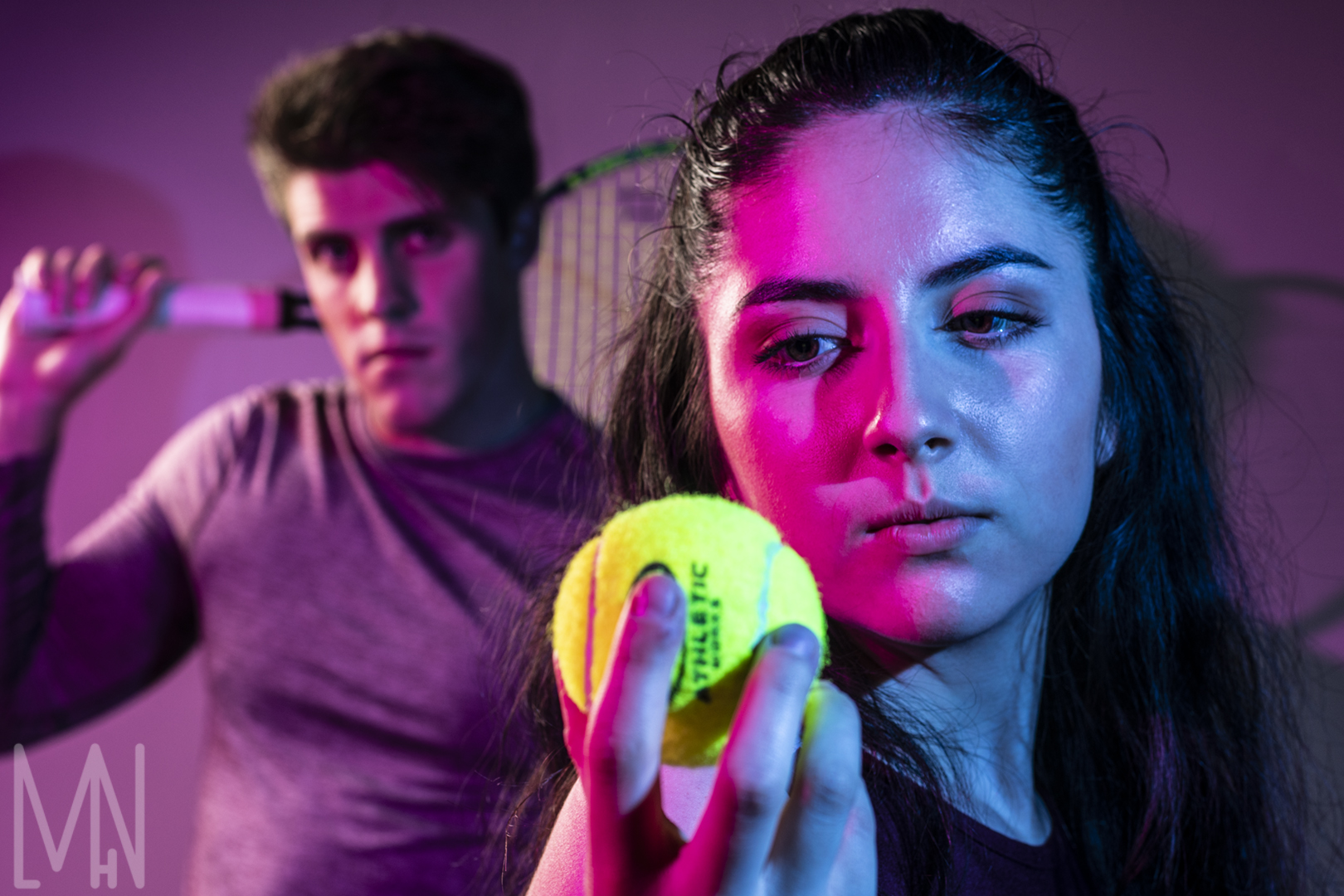
Fashion: Groups
Groups of Fashion
These are the images of the groups from the fashion shoot at The Venue in Rigby, Idaho. All of these images were shot with a prime lens. I loved this part of the photoshoot because I felt it gave me the opportunity to get creative. I love the depth of field on the tennis image! It fills the space while keeping focus on the woman tennis player. I also loved the angle of the couple in sunglasses. It gives them a sense of power and purpose. The wedding image was just sweet and I loved this tender moment. I loved having the chance to use the dress from The Circle of Love in Rexburg too. For the colorful images, we used two speed lights. One was covered with a blue gel and the other was covered with a pink gel. Most of the other images were taken with either some basic speed lights, LED lights or lights diffused by the “umbrella” covers. Keep scrolling to see how these group images turned out!
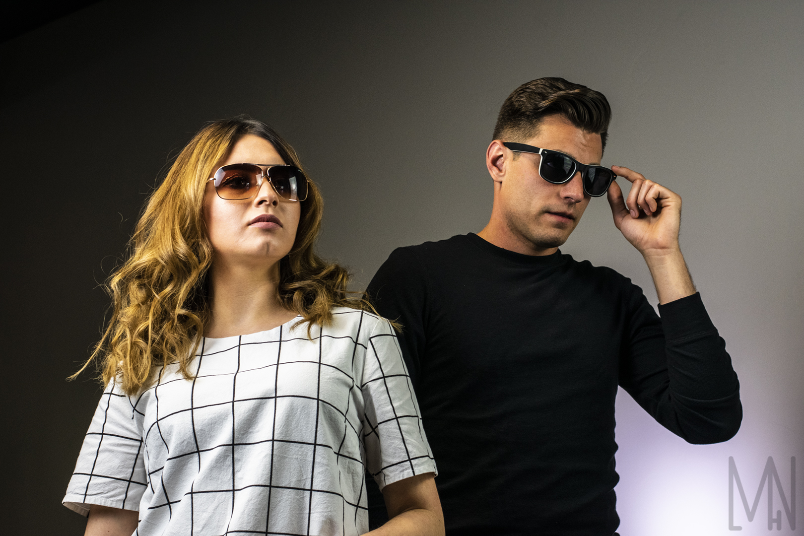
Want to see more group fashion pictures? Check out Omni Brand here!
Fashion: Women
Women of Fashion
These are the images of the female models from the fashion shoot at The Venue in Rigby, Idaho. All of these images were shot with a prime lens. Most of our models were not professional models but they knew exactly what to do! We used all different kinds of lighting for each of the models. For the colorful images, we used two speed lights. One was covered with a blue gel and the other was covered with a pink gel. Most of the other images were taken with either some basic speed lights, LED lights or lights diffused by the “umbrella” covers. You can check out the women models below. Let me know which one is your favorite! Each woman is uniquely beautiful just like the settings they were placed in to model.
Want to see more women’s fashion? Check out Pendleton USA here!
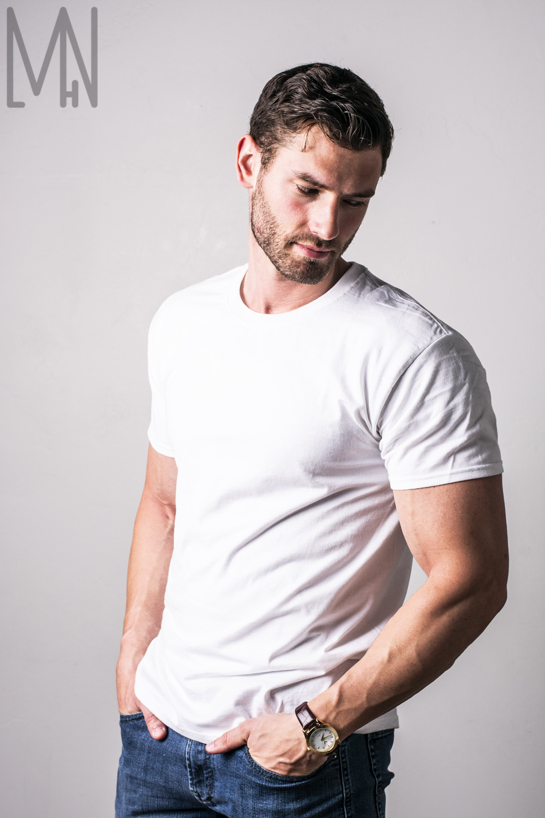
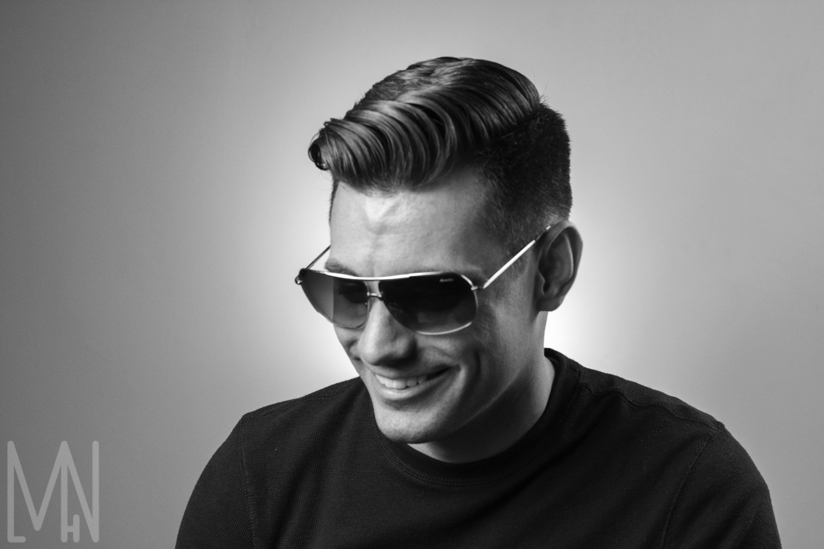
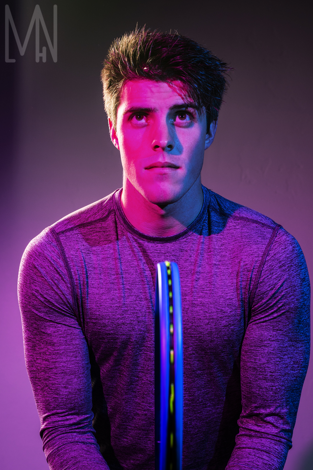
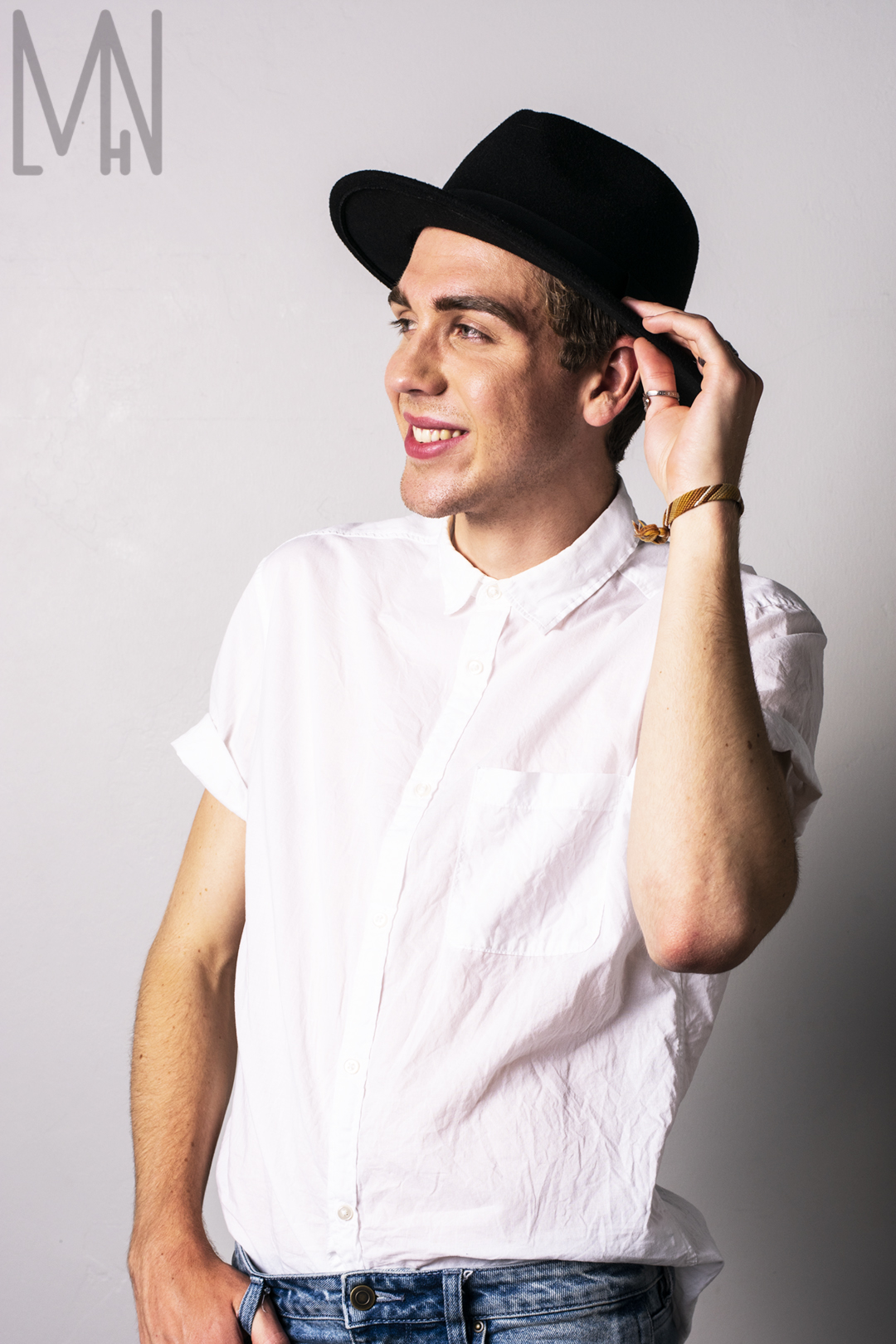
Fashion: Men
Men of Fashion
These are the images of the male models from the fashion shoot at The Venue in Rigby, Idaho. All of these images were shot with a prime lens. Some of these men had modeled before while others were modeling for the first time. I love how unique each image is and the amazing emotions each light setting brings out. For the colorful images, we used two speed lights. One was covered with a blue gel and the other was covered with a pink gel. Most of the other images were taken with either some basic speed lights, LED lights or lights diffused by the “umbrella” covers. Check out each image below and tell me which is your favorite! It’s hard to pick because they’re all special in different ways.
Want to see some real male models and learn more about the latest fashion? Check out Style Caster’s site here!
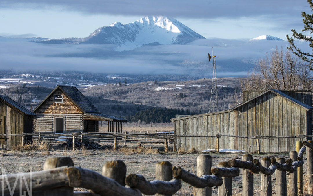
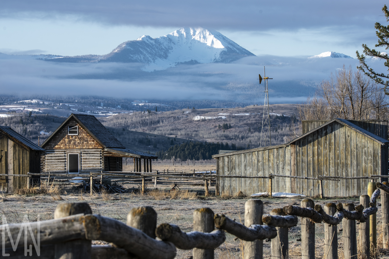
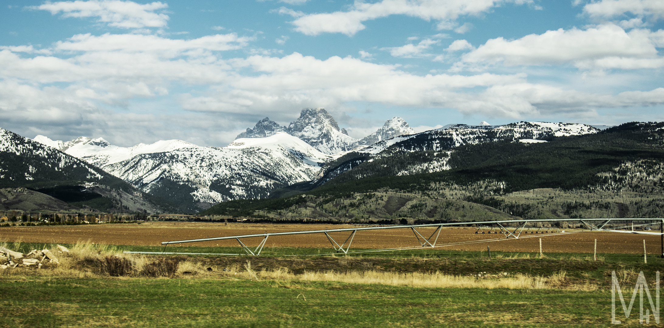
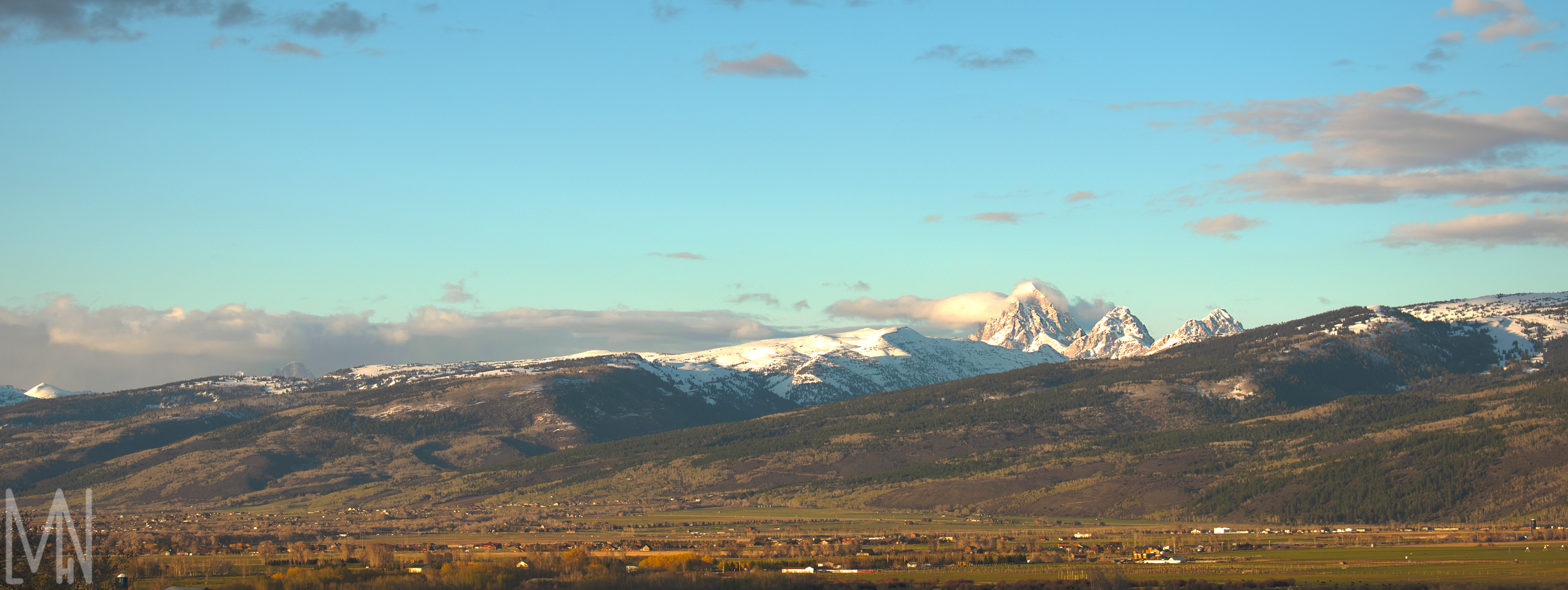
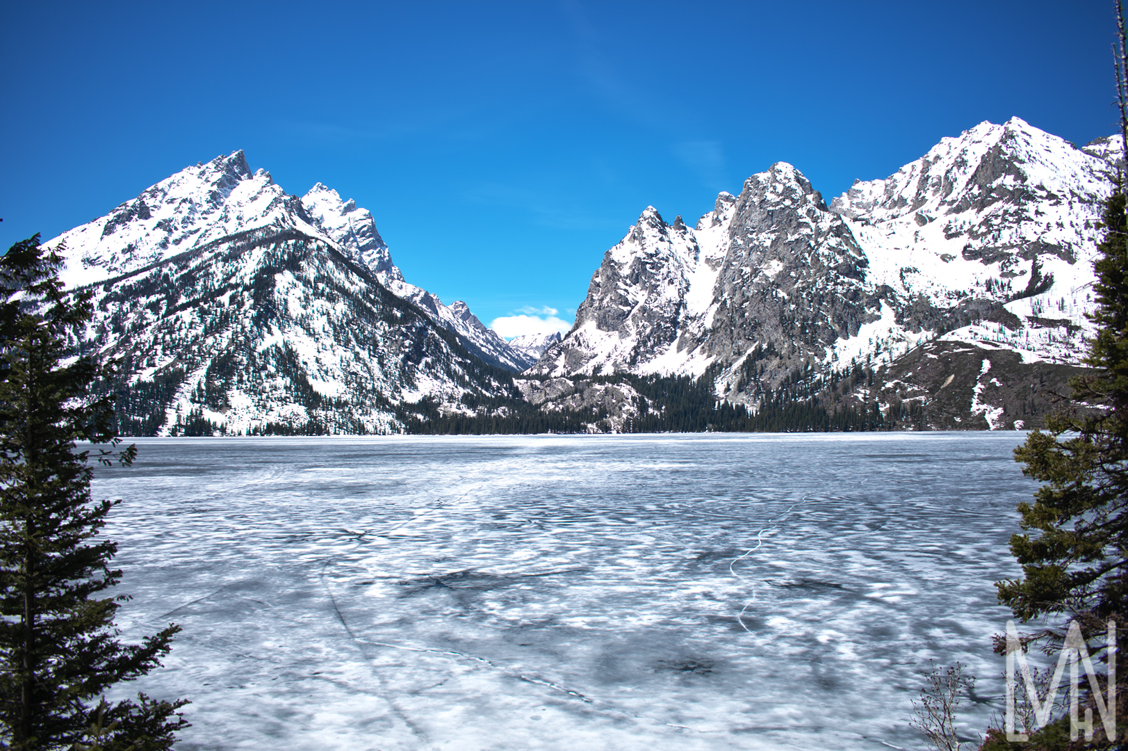
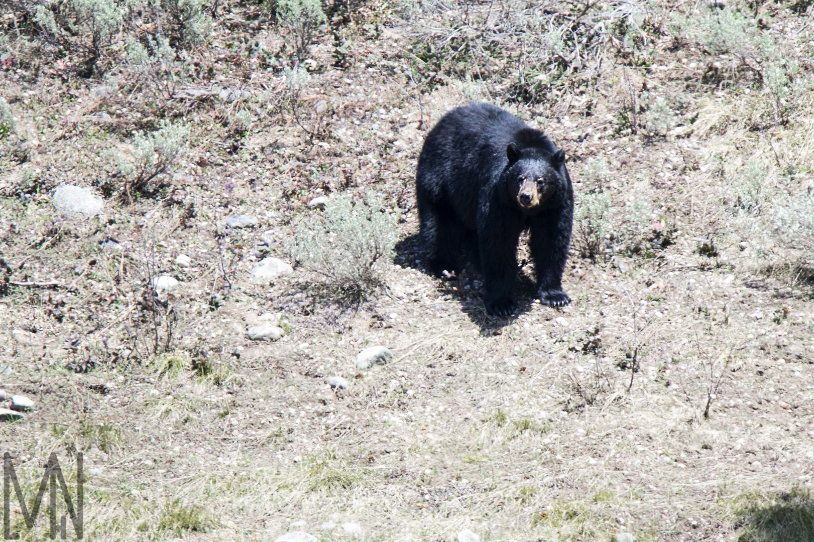
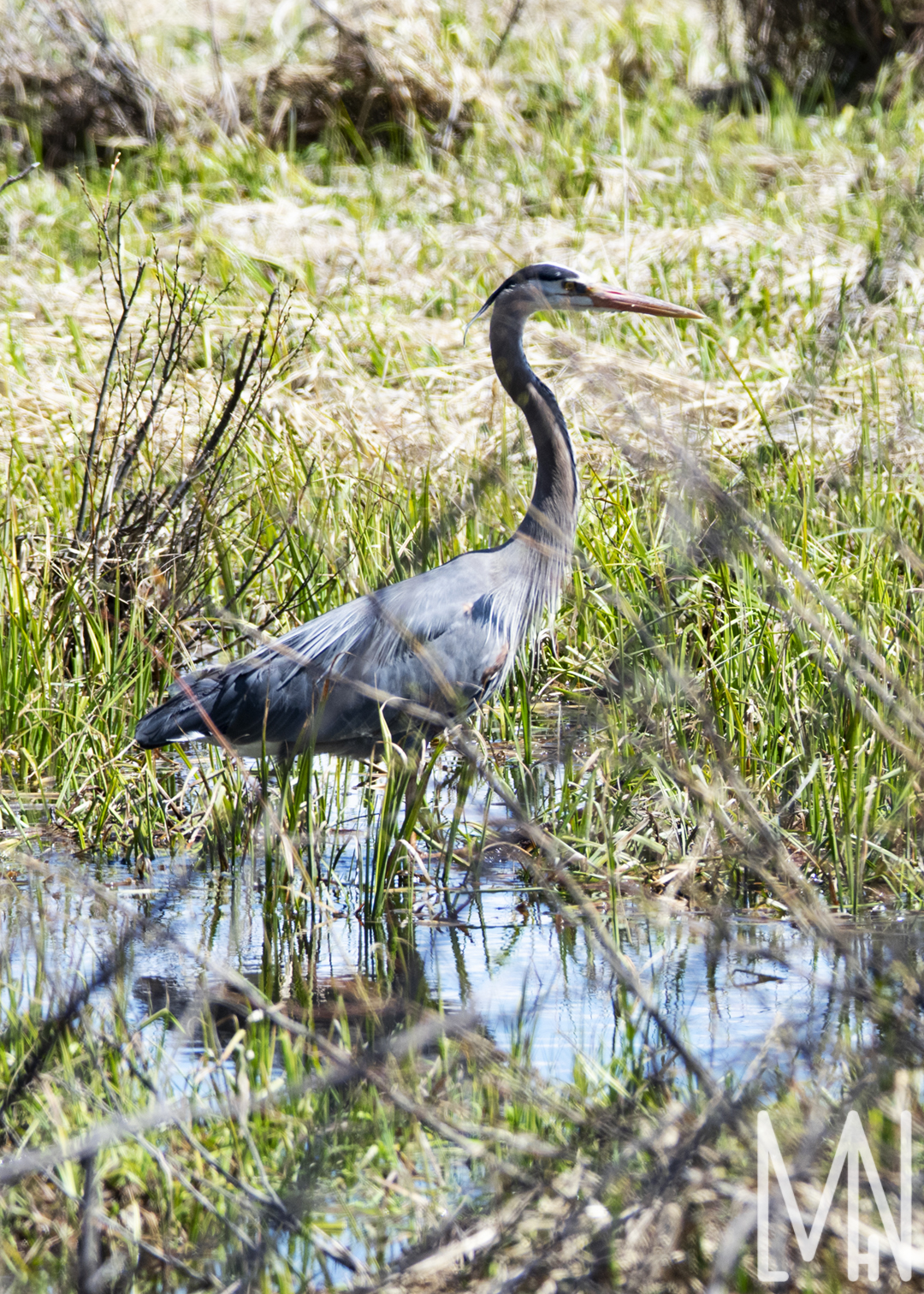
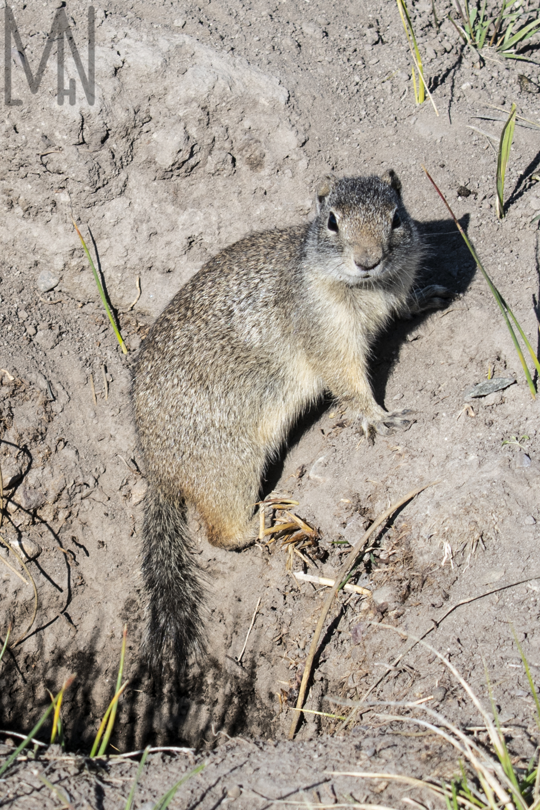
More Grand Teton National Park: Landscape and Nature
Capturing More Landscape and Nature Photos at Grand Teton National Park
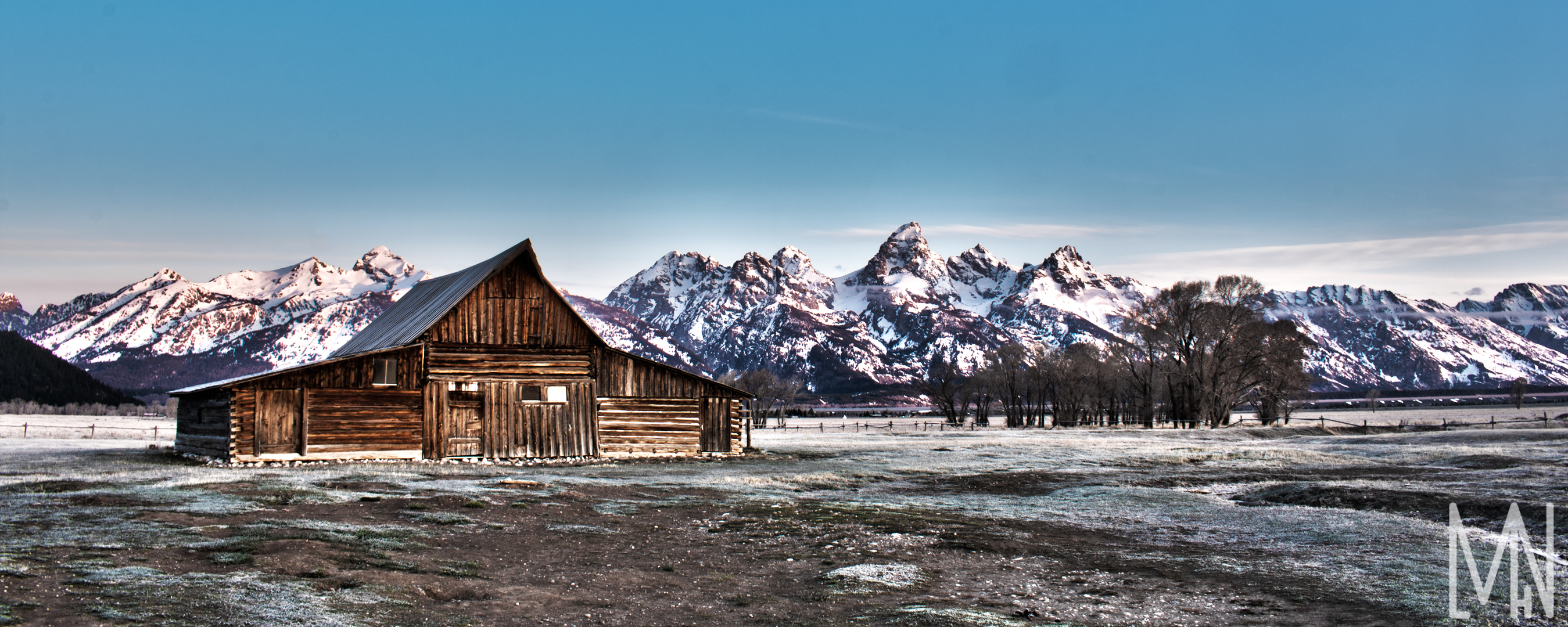
Want to see some more landscape and nature photos from Grand Teton National Park? You’ve come to the right place! These are a few more unique shots I was able to capture while visiting the park. A lot of my landscape images are from Mormon Row. It’s definitely a place you have to visit while at the park. If you arrive at sunrise, you can see the barns painted beautifully among the Grand Teton mountains. If you’re willing to walk down the trail a ways as well, you’ll find more unique shots of the old structures along with a lonely peak in the background. If the clouds are just right, you can get an amazing landscape shot there. Of course, I also loved taking nature pictures of the wildlife. The park is booming with life if you get there in the morning! The buffalo and the prairie dogs will sometimes pose for you. I loved having the chance to see that black bear as well. It was so cute when he lifted his head to take in the sunshine for a moment. Want to see what I’m talking about? Check out these landscape and nature shots below!
Do you want to see more pictures and learn more about visiting Grand Teton National Park? National Geographic has some great images and tips! You can learn more about it all here!
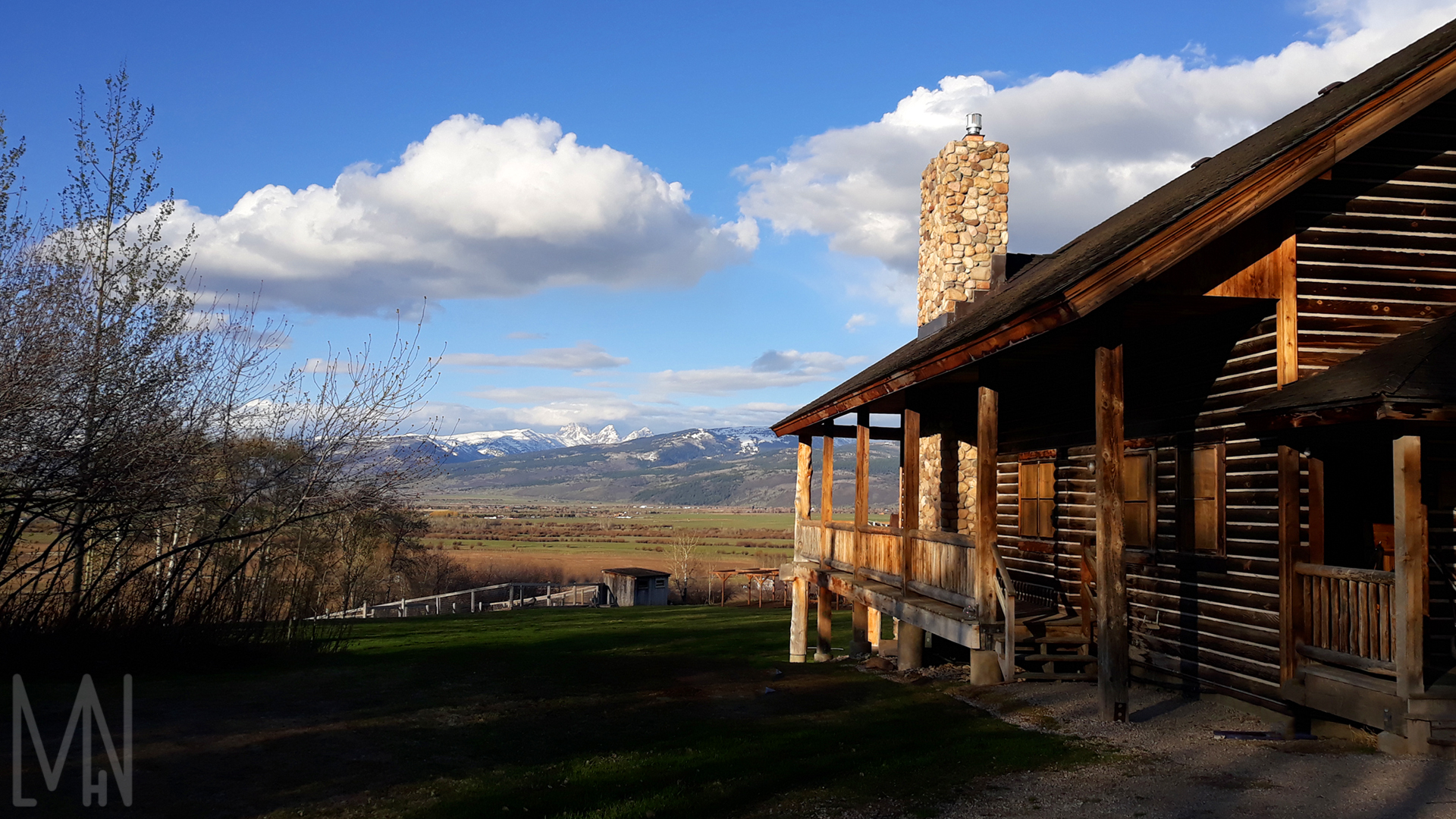
Sky Mountain Lodge
Pictures at a Lodge Named Sky Mountain
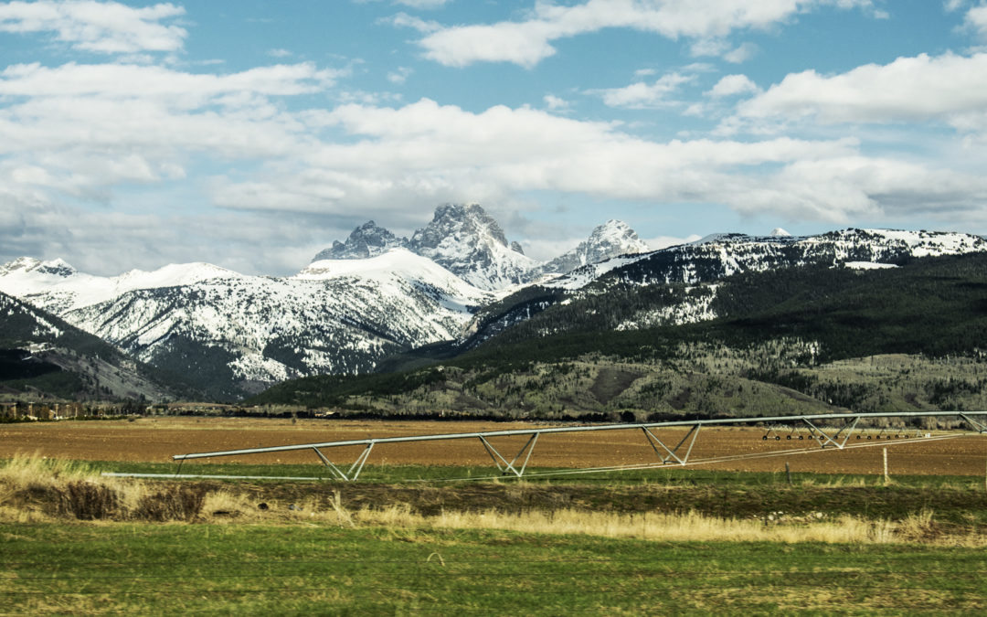
I didn’t have as many opportunities to take nature shots at the lodge as I would have liked but I still managed to capture a few unique images. Sky Mountain Lodge is where we stayed for a few days and learned some fantastic tips and tricks about photography. We used this lodge as a base when we went to Grand Teton National Park. The images below are from driving around the lodge, from the porch of the lodge and one from the front of the lodge with a bit of the lodge in it. The second image below is actually a combination of three images put together. I did this so that I could capture the valley, sky and mountains in the same light when I edited them together. This made for a perfectly light balanced image. I had to use a tripod on the lodge’s porch in order to keep my camera still enough to take three pictures in different lighting of the exact same image. The other two images were captured with only my camera and a basic lens. Check them out below!
Want to see some cool pictures of the Lodge in the winter? Check out some of Kiley Lee’s photos here!
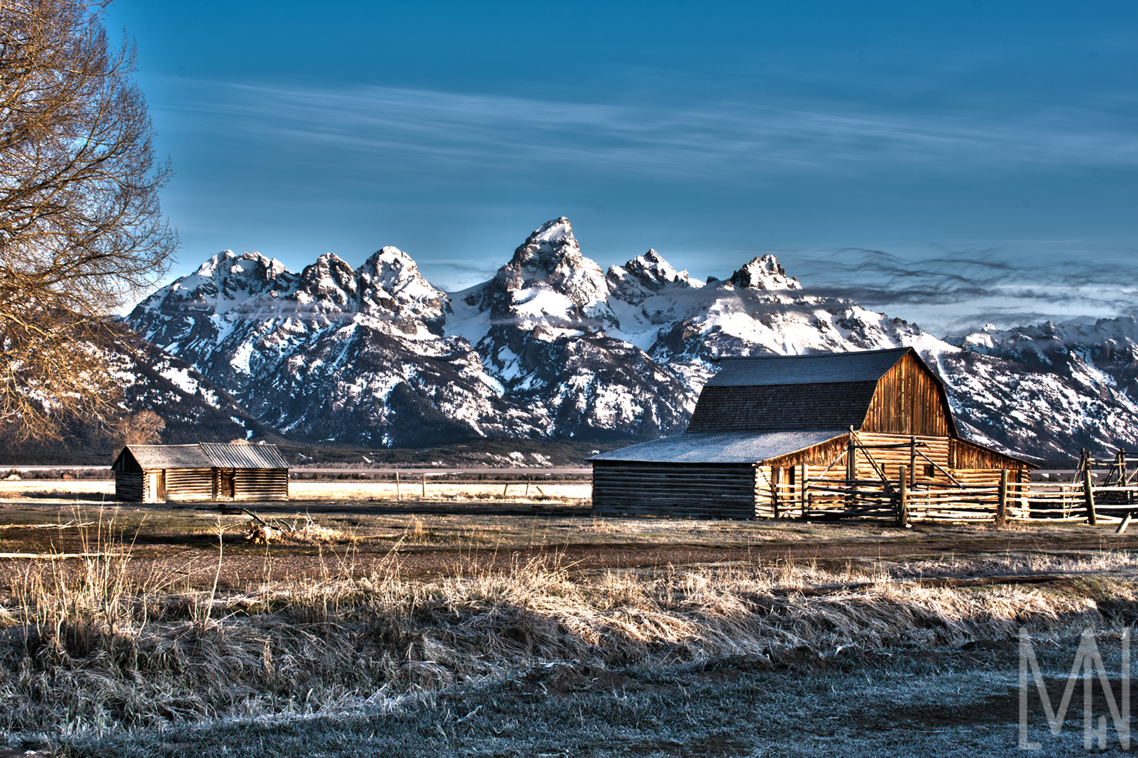
Grand Teton National Park – FAPOS
Creating FAPOS at a National Park (Grand Teton)
Landscape and nature photography have always been my two favorite kinds of photography. On this trip to Grand Teton National Park, I was able to capture some amazing images of the scenery and some amazing moments with some animals. All of these animal nature shots came to be because of the Tamron SP 150-600mm f/5-6.3 Di VC USD Lens for Nikon. It was a heavy lens to carry to capture the perfect FAPOS (Fine Art Photo Op Stops 2: “The process of searching for the best possible places and things to photograph…”) image. In the end, I always managed to hold still enough to get some fantastic nature shots of the animals. My landscape shots were a bit easier. All I really needed to capture the barn shot and the image at Jenny’s Lake was my camera and a tripod. Both photos seen below are a combination of at least three different images. This is what we call an HDR image or “Bracketing”. I took three pictures of the scene, each with different levels of light. This allowed the sky and the main scene to be perfectly balanced in lighting and texture when I combined them all together. This made for some fantastic landscape shots and really helped capture what the human eye sees when we look at beautiful scenes like this in person. Feel free to check out all my FAPOS landscape and nature photography below. Leave a comment too if you’d like!
Want to learn more about Grand Teton National Park and see some more amazing photos? Check out the National Parks Service’s main website for the park here!
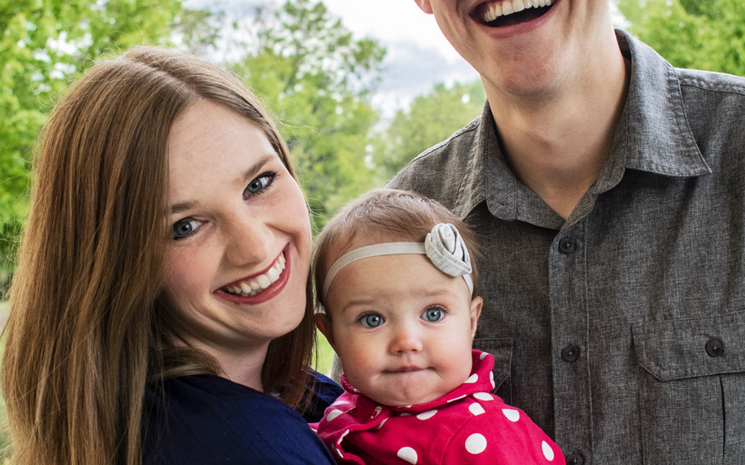
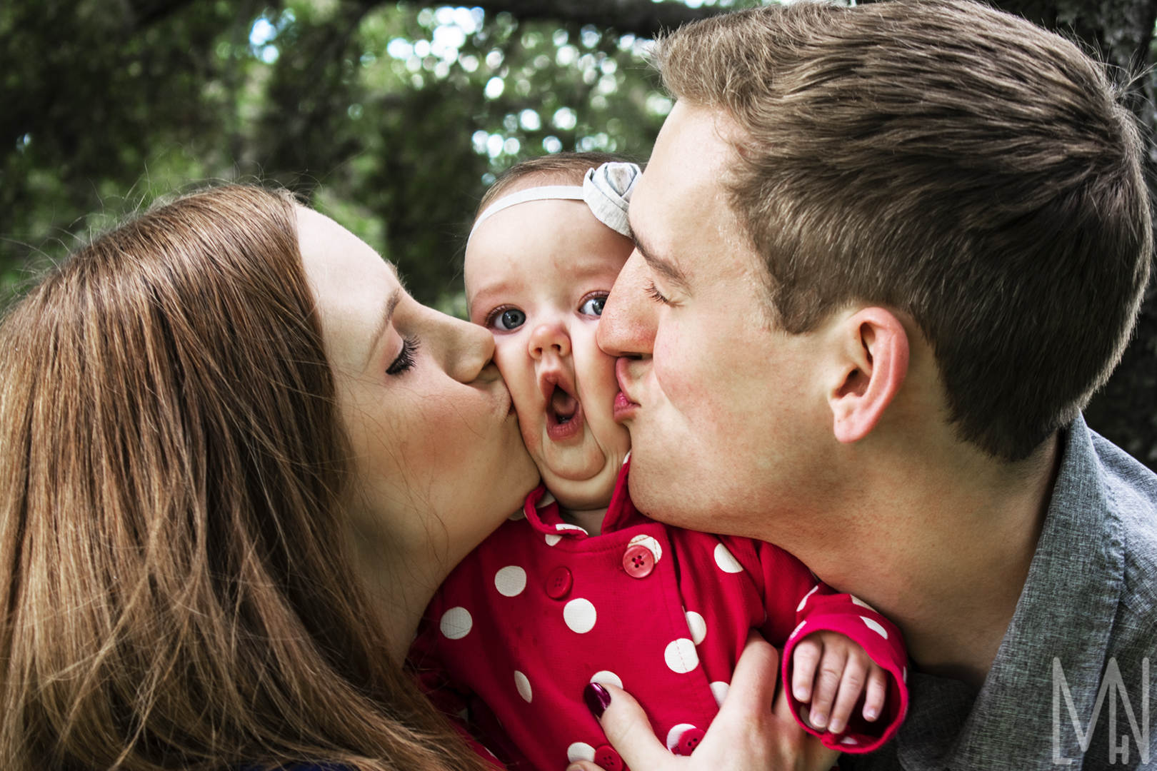
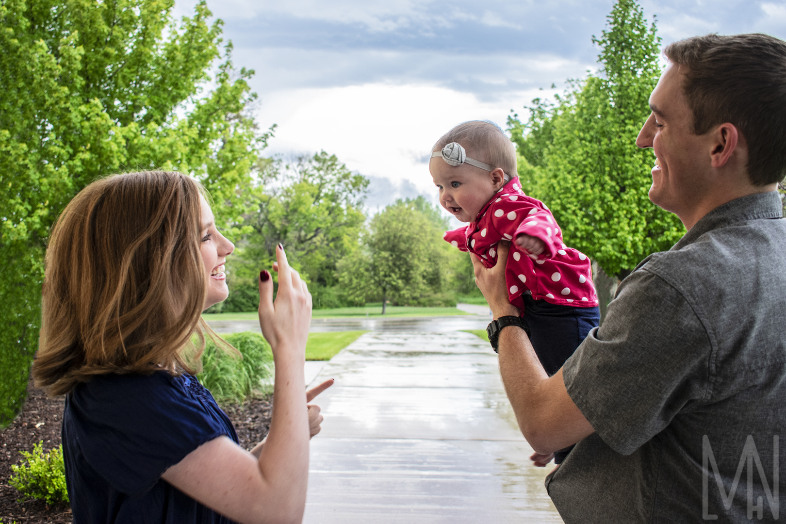
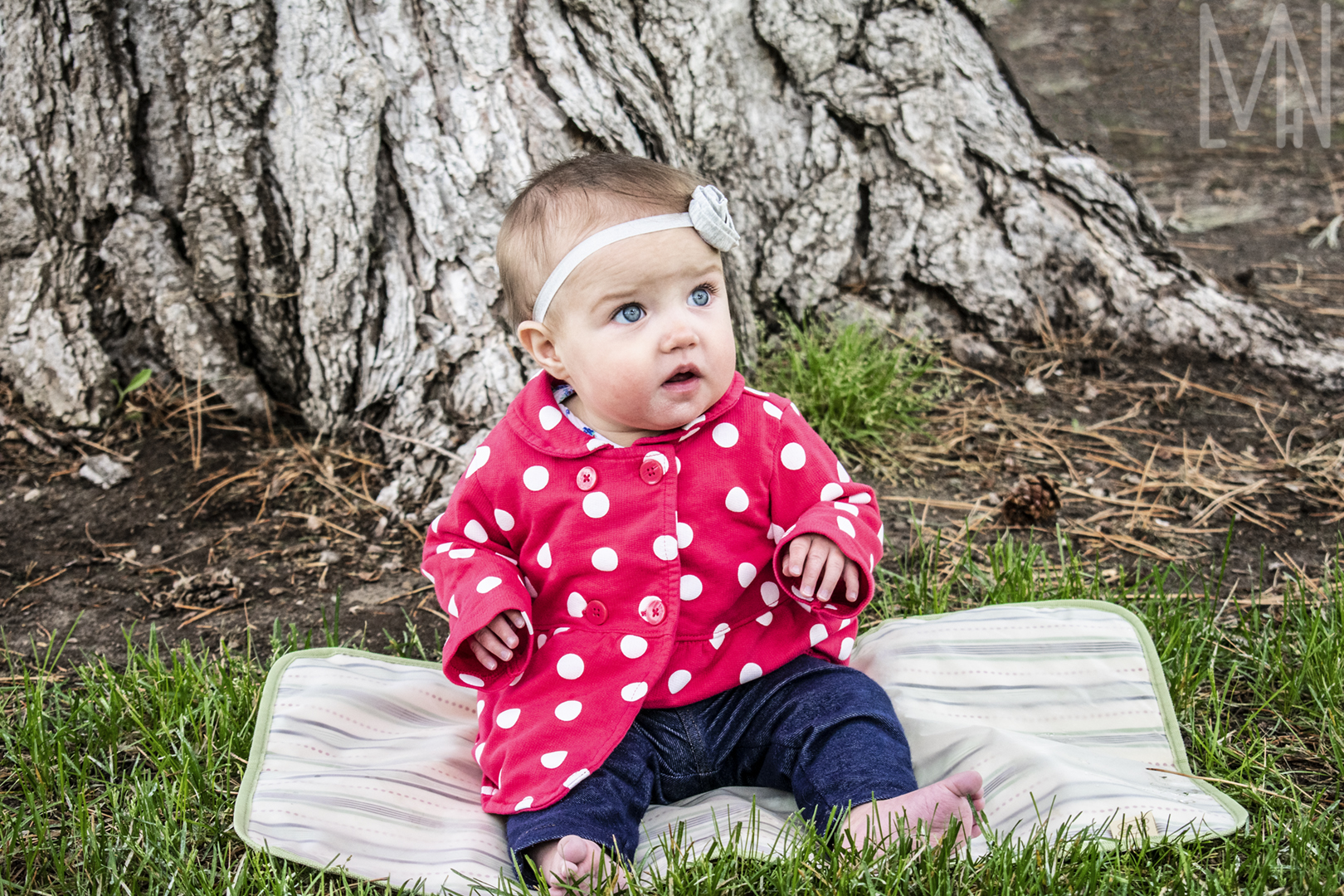
Pack Family Photos
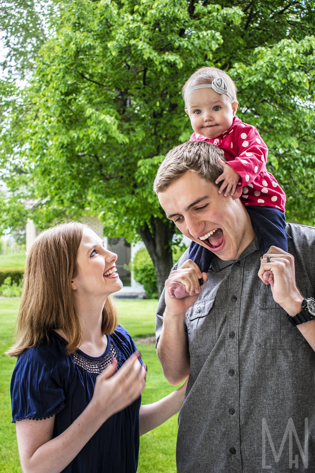
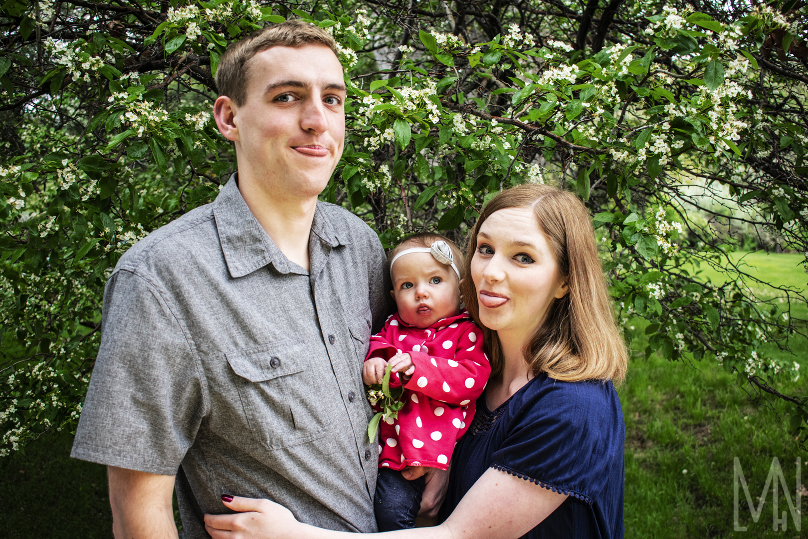
Photos of the Pack Family
Despite rainy weather and a long drive to meet me to do photos, The Pack Family was full of big smiles and positive attitudes! We captured some truly magical moments with this sweet family. It was really an honor to be asked to take these photos for them. In order to avoid some unfortunate weather, The Pack Family and myself took shelter under a nearby church. There were tons of plants and flowers around the grounds. This made for some fantastic backdrops! With the rain clouds balancing the light, it really ended up becoming a perfect photo shoot scene. Check them out below!
Do you need family photos? Rain or shine, I can capture some fantastic memories!
Need a few reasons to get some family photos done? Check out Bambini Photography’s reasons here!
Indoor Light Painting
Indoor Painting with Light
The thing I love about indoor light painting is that it’s very simple to do! All you need is a tripod, a flashlight, a camera, and something to take a picture of. This kind of style also falls under the Long Exposure Photography category. In order to capture a long exposure shot while using light painting, I simply left my shutter open for about 15 seconds (this was for every light painting photo you see below), and quickly shined my flashlight over the objects I wanted lit. You have to be careful though because if you use too much light while light painting, everything might end up being lit or perhaps too lit. It’s not a very good long exposure shot when that happens. That can either make the image look completely bright to where you can’t see anything, or incredibly uninteresting. It can look as if you just used a flash instead of a flashlight. I had to try light painting a few different times before I was able to capture the images posted below. Once you get the hang of it, you can really start getting creative!
Interested in seeing more Indoor, Long Exposure, Light Painting? Check out some of Frederic Paulussen’s work here!
Long Exposure
Using a Long Type of Light Exposure
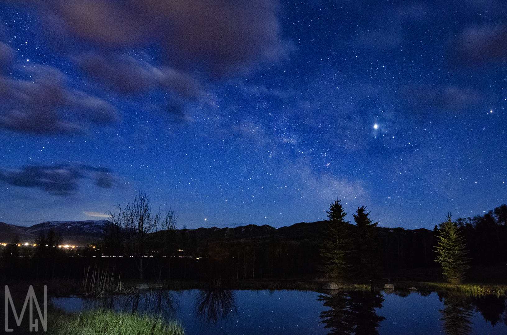
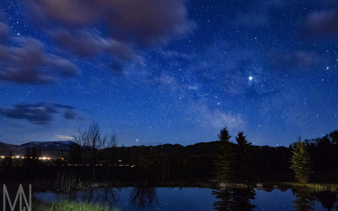
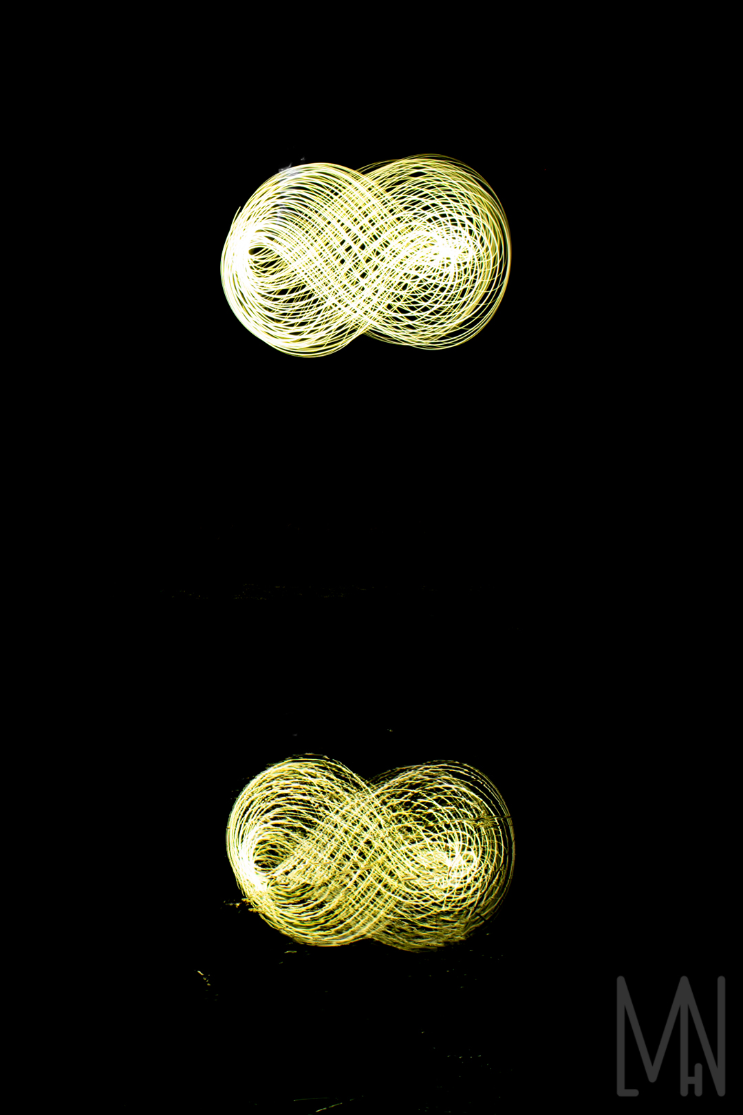
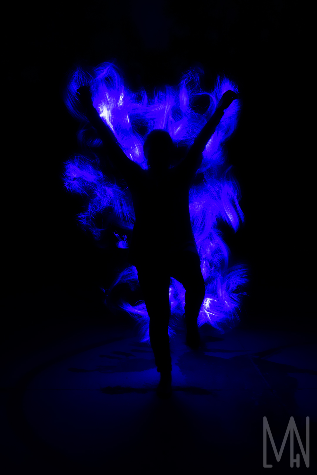
Creating these long exposure images were incredibly fun and required a great deal of creativity. The first long exposure shot was taken over a pond to capture the reflections on the water. We had a model hold lights attached to a bike tire and move them around while my camera was open for around 6 seconds. The long exposure created an infinity symbol and it beautifully reflected in the water. For the second long exposure image below, we had a model stand perfectly still while another person waved a light wand around them. My camera lens was open for around 10 seconds and I was able to catch this blue fire like image. The last image was my favorite long exposure shot. My mentor helped myself and a friend set up our camera for this shot. Not only did I capture the stars in the pond reflection, I had my friend light paint a bit over the pond to bring out some colors in the grass. I had my shutter open for around 10 seconds and was able to catch a bit of the Milky Way. It’s amazing to me how a long exposure shot can sometimes capture things we normally can’t see with our own eyes. Check out the final pictures below!
Want to learn more about Long Exposure photography? Check out this website!
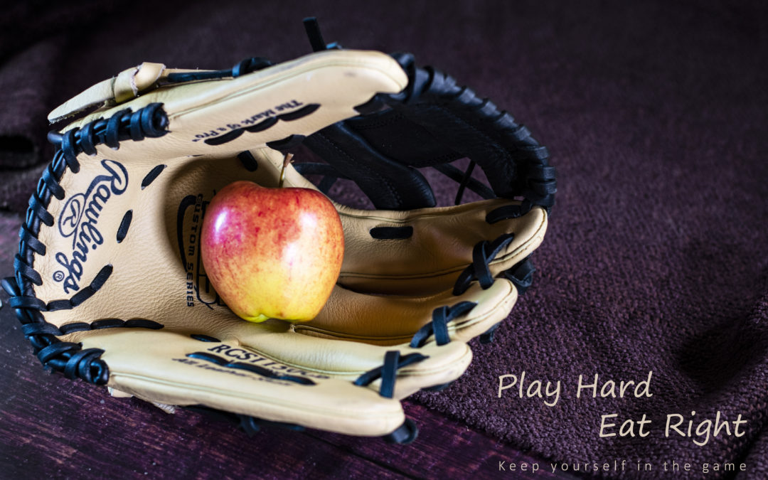
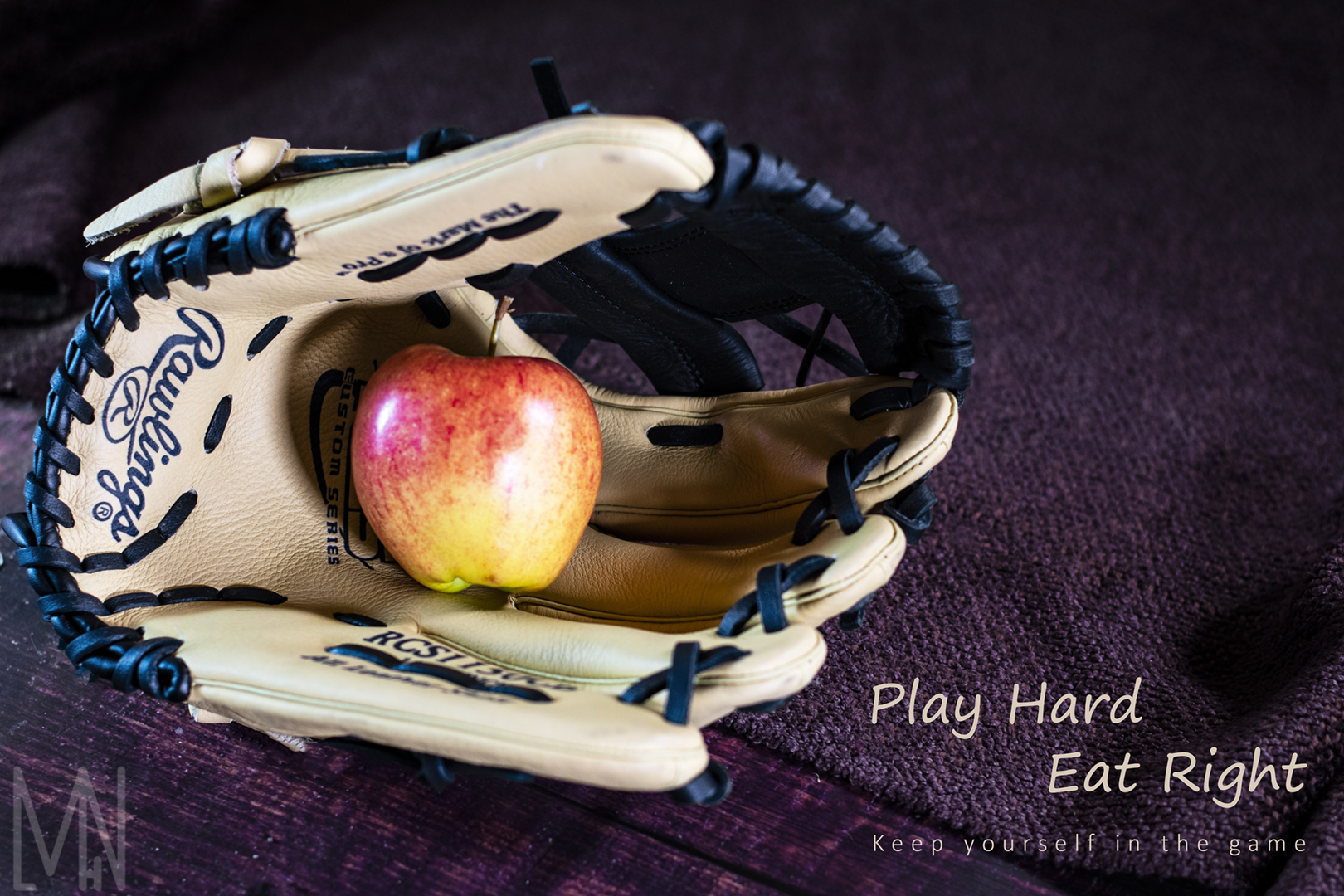
Conceptual Product Ad
Making a Product Ad That’s Conceptual
For my conceptual product ad, I decided to create a health promoting ad. I used a baseball glove and an apple to show that healthy physical activity and healthy eating go hand in hand. This conceptual product ad conveys a healthy lifestyle message. I was able to capture my Conceptual Product Ad by using my Nikon DSLR D3400 camera, a wide aperture lens, some basic LED lights, and various backgrounds pieces. After that, I took my RAW camera image of my Conceptual Product Ad into Photoshop and adjusted a few things to make the colors in the apple stand out more. I also wanted the image to have more depth so I increased the clarity and contrast. Below you can see the result of my Conceptual Product Ad.
Final Conceptual Product Ad
Conceptual Product Ad Original
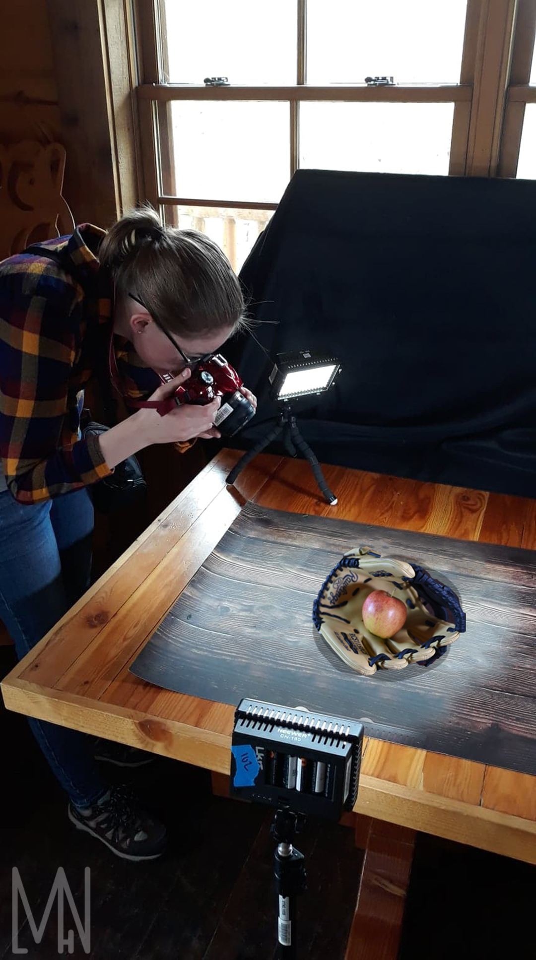
Conceptual Product Ad Set Up Shot
Full disclosure, I failed to capture an actual photograph of myself taking this picture. This image was taken at the same place around the same time. I quickly Photoshoped this image to give you an idea of what the set up conceptual product shot actually looked like.
Enjoy conceptual product photography? Check out David Kania’s work here!
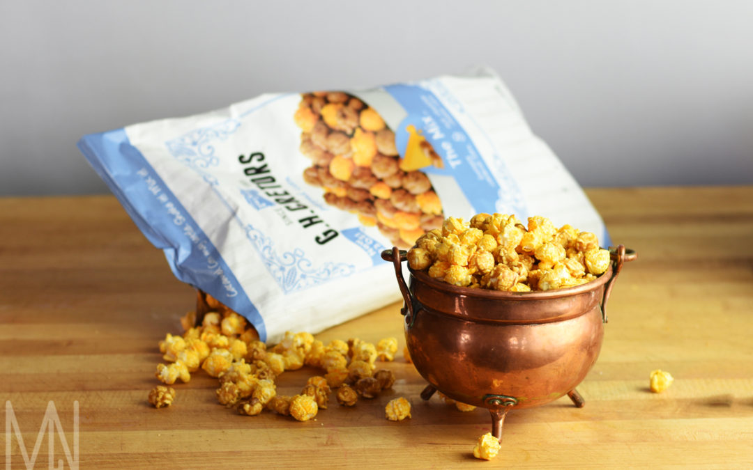
Product Photography
Various Photography Each Showcasing a Unique Product
For my product photography series, I really wanted to find unique ways to display each product placed. No two products are exactly alike and should be displayed in a way that makes the viewer feel something when they see the product. Sometimes the biggest challenge was deciding what items should be the products and what items should help emphasis the products. In the end, I believe I found a good balance for a lot of my products and created interesting and unique photos. For the indoor images, I used my Nikon DSLR D3400 camera, a wide aperture lens, some basic LED lights, and various backgrounds. For the outside images, I used a reflector to brighten up the sunscreen. I didn’t need any extra lighting on the Cliff Bar. After that, all I had to do was take my images into Photoshop for some quick editing and refining. Check out the results below!
Outside Product Photography


Inside Product Photography


Enjoy Product Photography? Check out Karl Taylor’s work here!
Movie Poster
Creating a Poster Based on The Movie Sabrina: The Teenage Witch
I decided to create a movie poster based on the show Sabrina: The Teenage Witch. To create the movie poster, I took a few creative liberties from the original movie poster. I found a copyright free image of the Universe and placed it behind a picture of myself and my cat Hal. I set up my Nikon DSLR 3400 and used the natural light and a timer to capture the picture. I then took my image into Adobe Photoshop and used the Magic Wand tool to carefully cut myself out of the background. I then used the feather tool to blend myself into the universe background of my movie poster. I then added some fun text to my movie poster that talked about the movie of my life (my final full semester on campus at college). This movie poster was fun to make and I feel I was able to create it in a way that represented who I am.

Original Movie Poster and First Draft


Like this movie poster? Then you’ll definitely like Kory Burrow’s poster! You can see his here!
Personal Branding
Branding Meghan L H Nelson Photography & Design to Make it More Personal
Branding yourself can be a difficult challenge. You often have to consider how you want others to view your brand. What will they feel when they look at your brand? What do you want your brand to say about you and your work? It’s a process to be sure.
Sketching and Logo Design
My favorite kind of photography is landscape and nature photography. Anytime I have the chance to go outside, I do it! I wanted to brand myself this way so I started with my logo. I wanted almost a mountainous brand while still keeping the logo simple. I have four initials in my name that I wanted to include but struggled to find a way to keep it from becoming too busy. I finally came up with a design that I felt encompassed all I wanted in my branding.


Extra Logos and Branding
After agreeing on a simple logo/watermark, I moved onto my main banner logo. Again, I wanted to focus my branding on the outdoors. I also had to consider colors and fonts in order to tie all my work together. I decided to go with more muted, earth tones so as not to distract my viewers from my images. I hoped that these colors would accent my images more than distract viewers from them. I also chose less flashy fonts that I hoped would brand me in a more simplistic way. Everything I did in choosing my branding, I did to make sure my photos would be highlighted and the mood of my site would spark adventure in the hearts of my viewers. I also created another watermark with my signature so that the viewers could learn my full name in association with my work.


Business Card Branding
My next step in branding was easier. I took my logos, designs, colors, and fonts and put them all into a card that reflected my work. I included a few diverse photos to give viewers a taste of what I’ve done in the past. It was a simple branding design but one that I believe will be very effective in helping potential clients know what it is I do and the overall mood that comes with it.

Branding Sheet
Below is my overall branding sheet showing all the work I put into my personal brand. Viewers can see it in mockups, what the watermark would look like on a photo, what colors and fonts I’m using, etc. Branding can be a fun experience! You just have to decide who you are and what you want to bring to the table.

If you’d like to see more branding work from another great designer, check out Tasha Larsen’s page here!
OSES – Ordinary Spot, Extraordinary Shot
How to Get an Extraordinary Shot from an Ordinary Spot
The purpose of this project was to find an ordinary place or item, then shoot it in an extraordinary way (or OSES). For my OSES project, I decided to try three different angles/photos. I have an assorted Tea Cup collection I inherited that contains a wonderful group of mismatch cups and saucers. I chose one of the Tea Cup sets to create an OSES picture of. I also had the same idea with my bamboo plant and created a unique OSES picture out of that. My final picture was taken outside. The Daffodils were in bloom outside one of my school buildings and I had the idea to take a picture underneath them. This created a unique OSES shot from, perhaps, an ant’s perspective. Below I have included my set up shots, the original ordinary spot photo, and the final OSES result.
Oses – Tea Cup


Oses – Bamboo


Oses – Daffodils


Check out more amazing OSES shots from fellow photographer Douglas Phan! You can access his blog here.
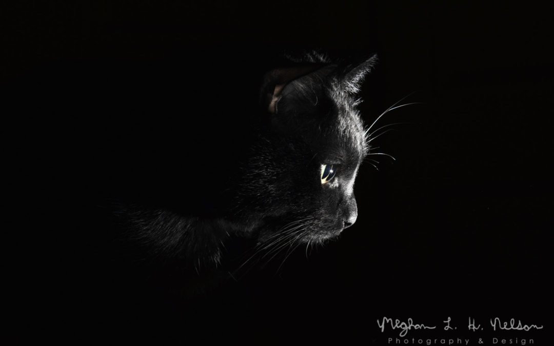
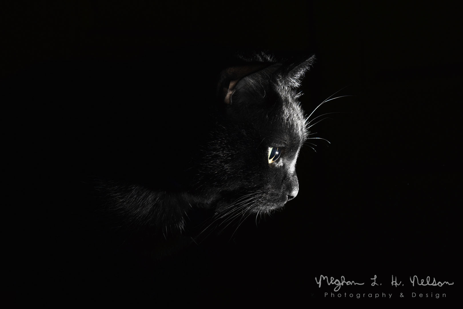
SQIBB – Studio Quality Invisible Black Background
My Attempt at an Invisible Black Background in Studio Quality
This was my first time using the SQIBB technique to take pictures. The invisible background effect is so easy to do and creates some amazing images! My favorite SQIBB photo was the one I took of my cat Hal (short for Halloween because of his Halloween like colors). Capturing a SQIBB of him was really difficult. Cats don’t often want to sit still and hate having a light flashed in their eyes numerous times. It took a while to get him to sit still. I was finally able to capture my SQIBB of him when my husband brought the light close enough to Hal’s nose. Hal really wanted to smell it! That gave me enough time to angle myself, set up my SQIBB shot and click the button. All of my other SQIBB shots turned out decently well but sometimes I think they best shots are ones you have to work for.


Set up shot for Cat SQIBB

Like SQIBB photography? Check out some of Karla’s work here!
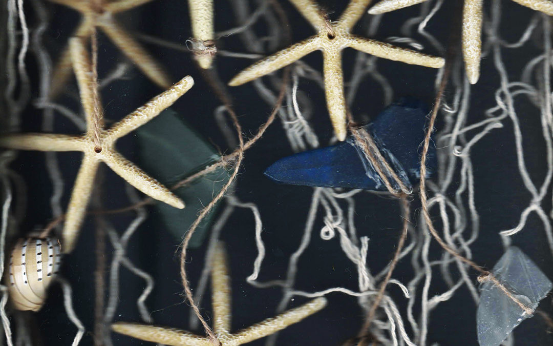
Underwater Sea Stars Scanography
Learning Scanography to Make Sea Stars Appear Underwater
This project helped me learn how to create images using something called Scanography. Scanography is when you arrange items (in my case, Sea Stars, Sea shells and twine) on a scanner and scan the image into your computer. I wanted to create something with more depth so I used some Sea Stars my husband had given me as a gift to create an underwater image. To make the Sea Stars appear to be floating underwater, I used the set I had connected to other items using twine. With the twine weaving in and out of the Sea Stars, I was able to give the illusion of weightlessness underwater. After my first scan, I realized it still didn’t look as realistic as I wanted it to. I then had the idea to place some of the Sea Stars further away from the scanner to make them appear more blurry. As you know, when items are underwater, they do tend to become blurrier the further away we get from them. This made the Sea Stars look a lot more realistic! The final item I needed to really sell the fact that they were underwater was to get a kind of dark blue background. I used my husband’s blue fleece jacket to cover all the items in my Sea Stars image. After that, it was just a matter of basic editing and colorizing. I love this because anyone can do it! It doesn’t have to look underwater if you don’t want it too but it sure created a realistic scene for my Sea Stars.

Original Images for Underwater Sea Stars


Interested in seeing more Scanography? Check out some of Peter Krohn’s work here!
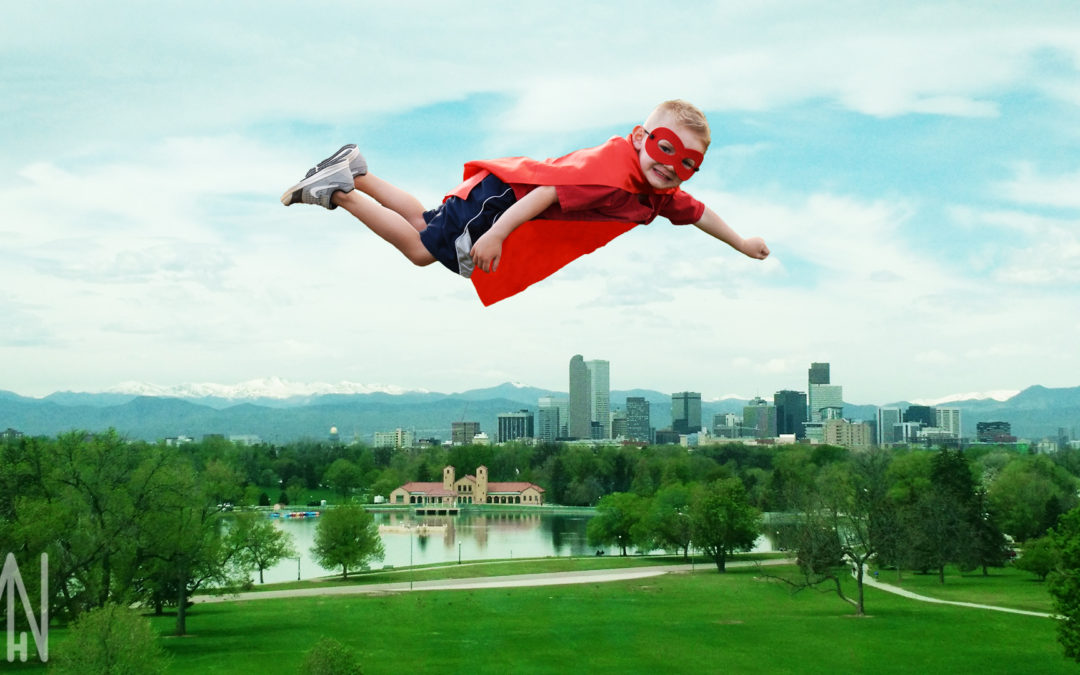
Superboy Over Denver Composite Photography
Creating Composite Photography Featuring Superboy Flying Over Denver
I’ve always had a passion for Composite Photography and was excited to try this creative kind of photography for this project. My cousin wanted a picture of her son as a Superhero (or Superboy), which gave me the idea to create an image of him flying over Denver. Denver is my hometown and I was able to capture the Denver Skyline while visiting there on summer. Superboy’s Grandma is also from Colorado so I thought creating a fun composite of him flying over Denver would make Superboy’s entire family smile. I’ve included some before pictures below and, as you may have guessed, I had to learn how to carefully cut Superboy out of his picture and place it in the image of Denver. My other concern too was that Superboy appeared to be flying away from Denver as he was facing the other way in the original image. I was able to turn Superboy around quickly in Adobe Photoshop using the image rotation tool. With Superboy flying towards Denver now, I was able to focus on cutting him out of his current background. The quick selection tool was my tool of choice in removing Superboy and I found after a bit of feathering, he fit perfectly into his new composite image. Now my cousin can smile every time she sees Superboy flying over Denver, coming to save the day.

Original Photos from Superboy Over Denver


Steve Greer has also done some work in concept photography. You can see his project here!
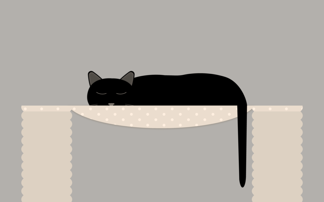
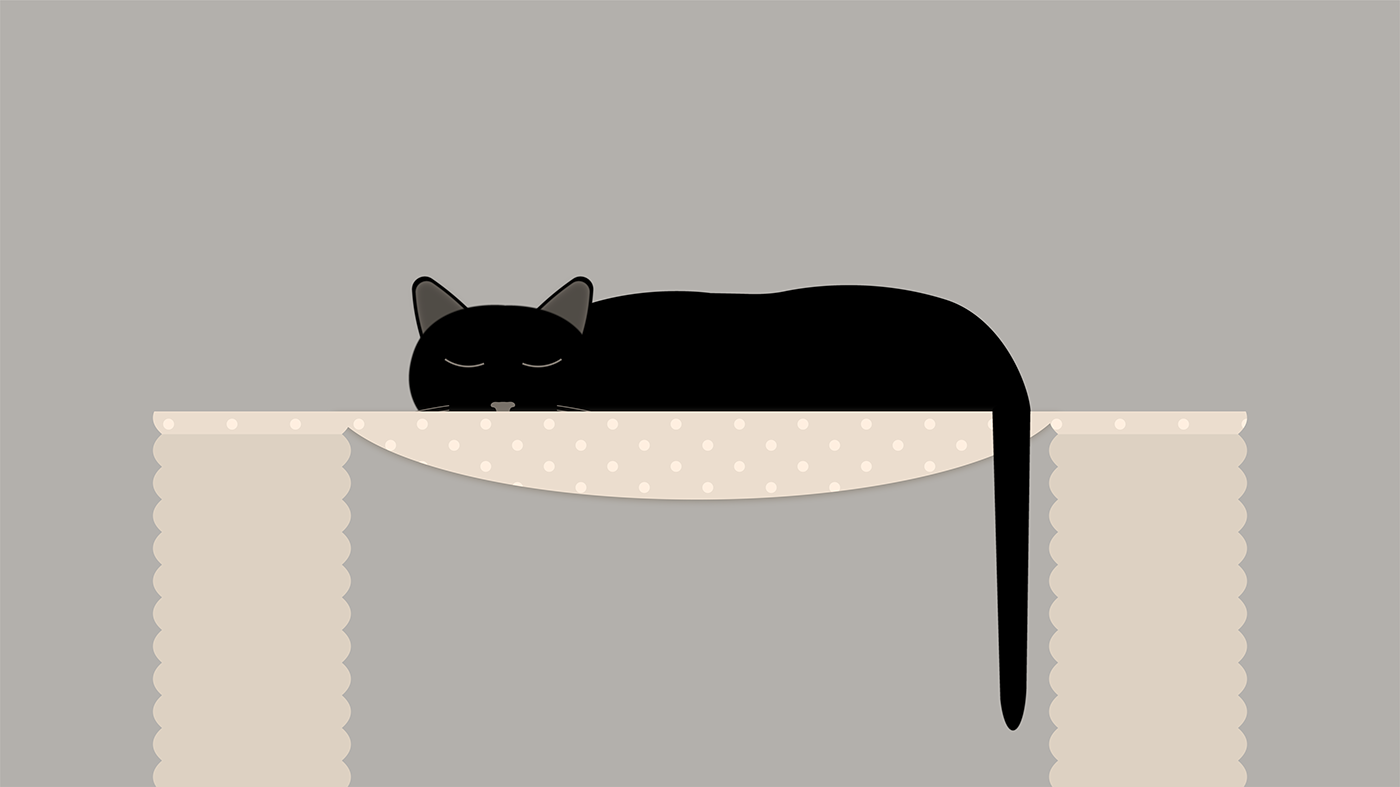
Sleepy Cat Animation

Concept and Objectives


Sketching Process
Incorporated Feedback
Final Animation
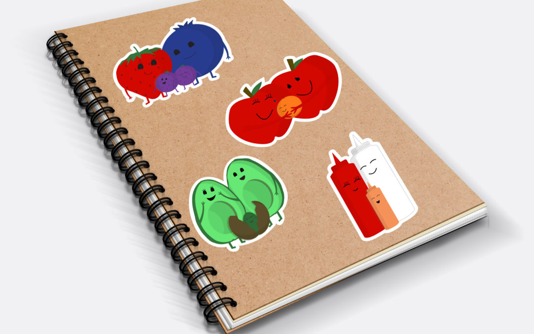
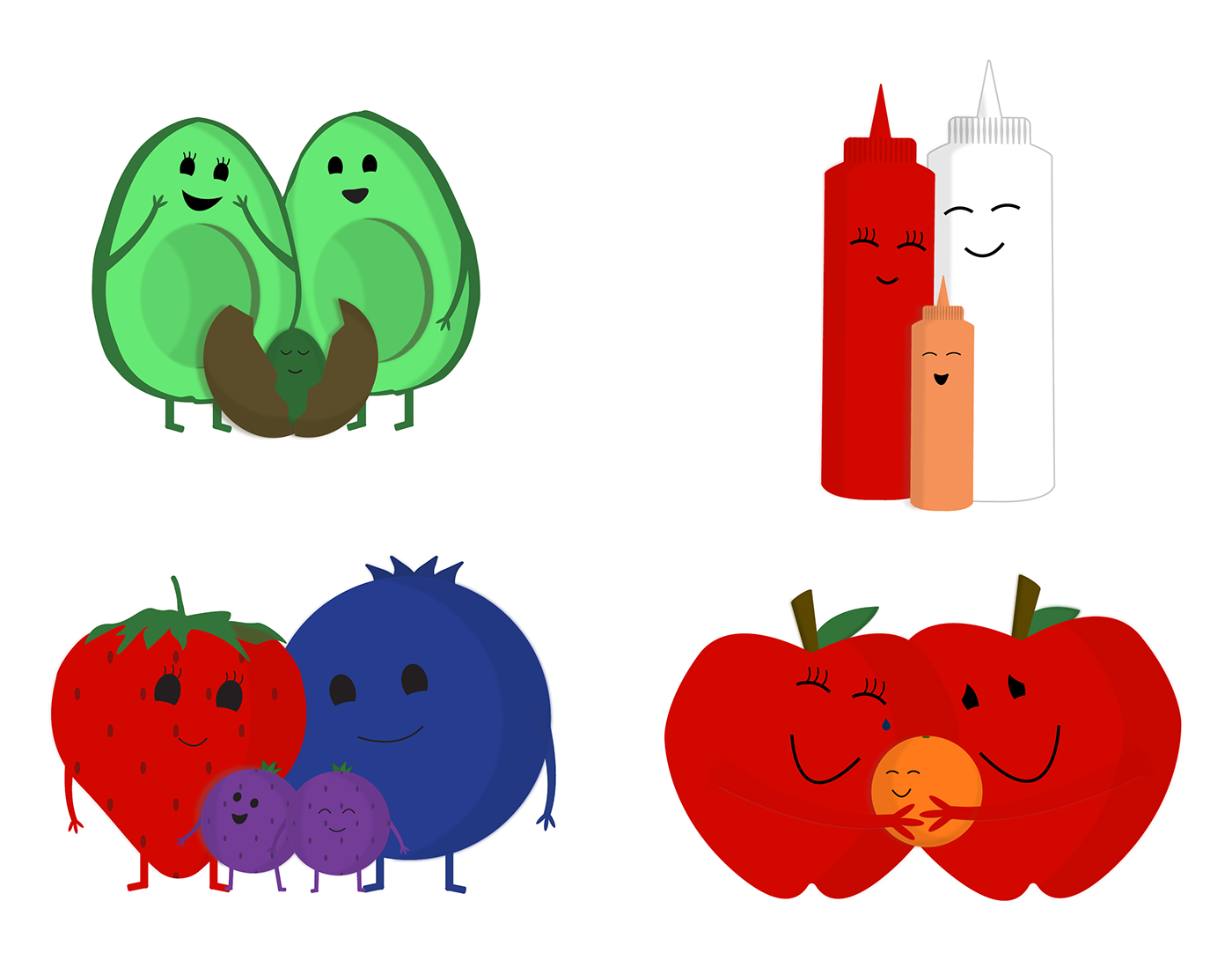
Food Family Stickers


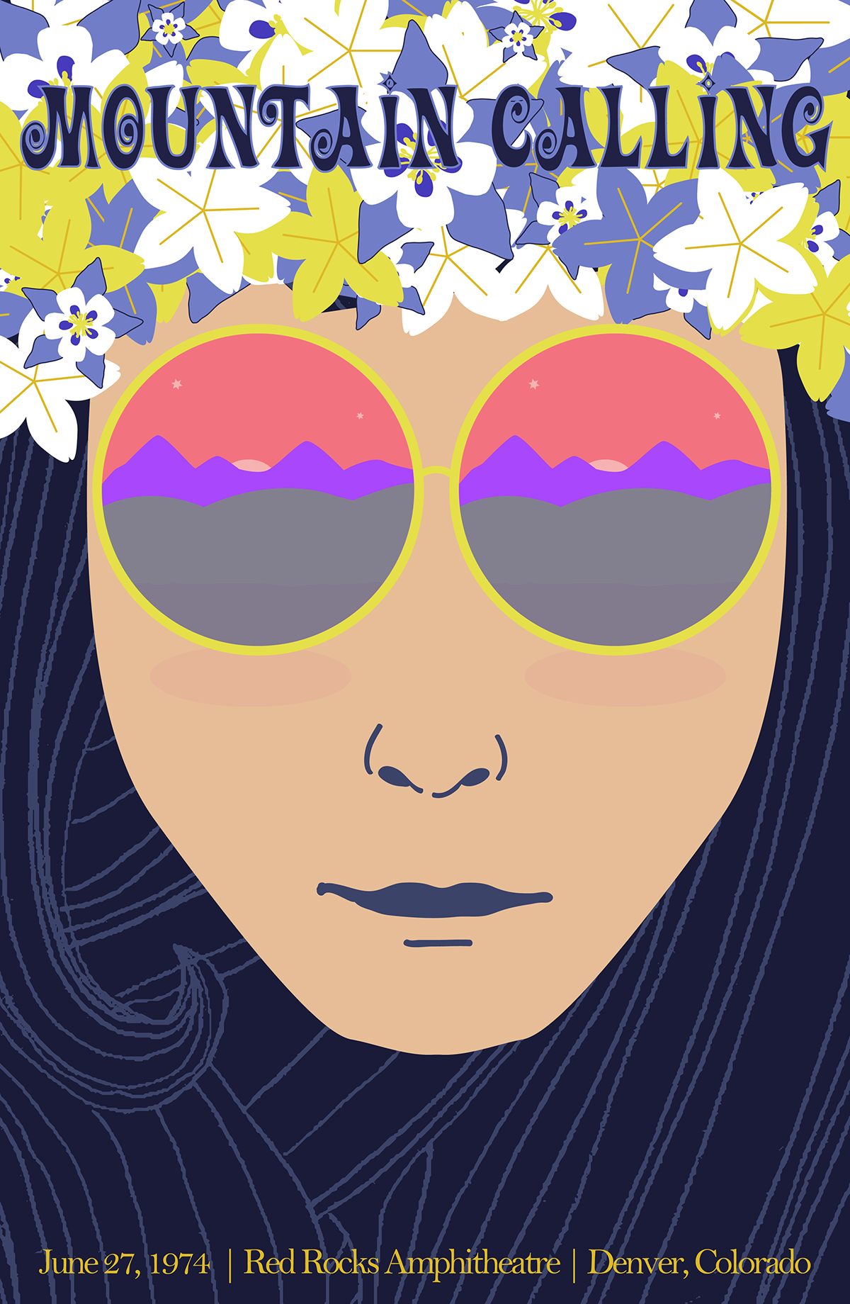
Gig Poster


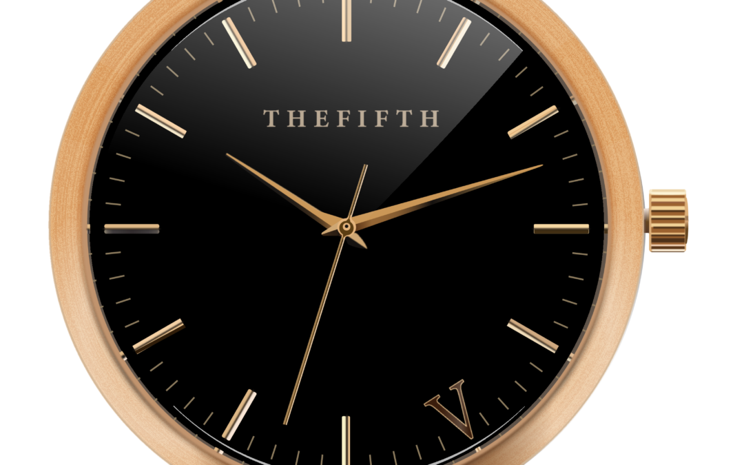
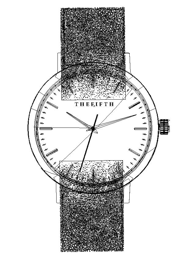
Watch This!


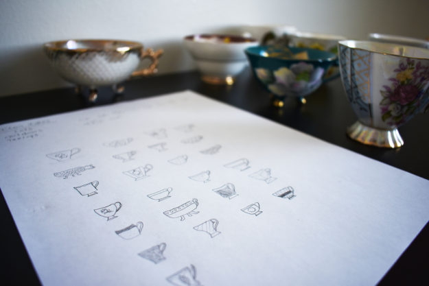
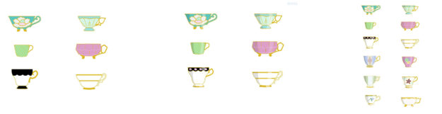
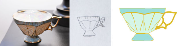
Friendship Cups
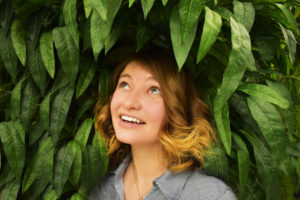
Welcome!
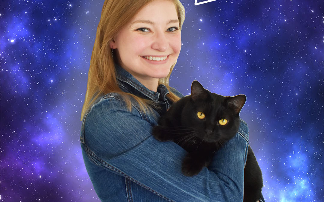
High quality photos and good times are just around the corner! Let’s make memories that will last a lifetime.