

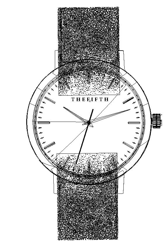
The purpose of this project was to create a watch in Adobe Illustrator that looked photo realistic. I picked a watch that I thought had a good balance of color, light and shadow that I could mimic. While this watch is not an exact replica of the image I’ve chosen, I’ve found its small differences have made it more unique and personalized. I really wanted to make it my own.

Sketches
My original idea was to create a pocket watch but after a few sketches and brainstorming, I realized I enjoyed working on a wrist watch more than a pocket watch. I started working on the finite details of a watch such as the hands and side nobs. I then experimented with watches of different shapes and sizes. In the end chose a watch that I felt best exemplified my best sketches.


Drafts and Critiques
I spoke to many people about how to improve my watch image. My biggest problem was the flatness of my image. I added the brushed gold look, thickened up the watch straps and the leather pattern on the straps, highlighted and shadowed my watch’s nob on the side, and added various gold highlights and shadows to the minute marks as well as on the outside of the watch. This improved the 3D affect greatly. The one who gave my greatest critiques encouraged me to add some shine to the glass part of the watch even though it was not depicted in the original image. This was a great challenge but after following his instructions, I managed to create a small light reflection on the surface.

I believe my vector watch is photo realistic. It includes many highlights, shadows, and a 3D affect that could deceive those (who do not look carefully) into believing this vector is an image. It has a good balance of light and shadow, many dense textures, reflections, and some soft blurs that tie the time piece together. Though it is not an exact match of the image I based it on, I believe it’s uniqueness is what makes it stand out more from its photographed counterpart.